Tam, K (2014). ‘The architecture of communication: the visual language of Hong Kong’s neon signs’, in Mobile M+ neonsigns.hk: an interactive online exhibition celebrating Hong Kong’s neon signs at http://www.neonsigns.hk. Hong Kong: M+, West Kowloon Cultural District Authority.
Read this article in traditional Chinese
Article as originally published
Slides from a keynote talk, Hong Kong Arts Centre, 28 May 2014
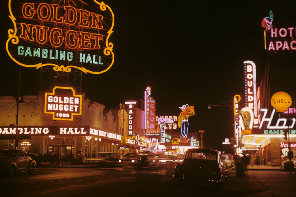
It is sometimes said that the wealth and prosperity of a city can be measured by how bright it is after dusk. Ask any tourist who has been to Hong Kong, and they will recall memories of the spectacular night view. ‘Pearl of the Orient’ is a term that has been synonymous with Hong Kong since at least the 1950s. The romanticism associated with this title of endearment is symbolised by Hong Kong’s eclectic and vibrant neon signs. They line Hong Kong’s major thoroughfares and neighbourhoods, making the city come to life especially after dark.
Written words and visual symbols are all around us, and in Hong Kong they permeate every corner of the city. Visual messages rendered in Chinese and English, manifested in a plethora of scales, stylistic variations, colours, arrangements, materials and degrees of transience, display our city’s energy and spirit. They represent who we are as a people, our aesthetic temperament and the life that we lead in this particular corner of the globe that is Hong Kong.
The technology of making neon signs was introduced to Hong Kong in the early 1930s. The burgeoning growth of neon signs, however, took place after the Second World War when Hong Kong was in a period of rapid economic regeneration. Neon was a perfect medium to advertise all kinds of economic activities, from restaurants, department stores and movie theatres to bars, nightclubs and saunas. Neon signs not only provided a solution to the increasingly keen competition for an ever-growing customer base with more disposable income and leisure time, but they were also a potent symbol of Hong Kong as an emerging economy and attractive tourist destination.
Signs and Hong Kong’s streetscapes
In 1972, architects Robert Venturi, Denise Scott Brown and Steven Izenour published the seminal architectural study Learning from Las Vegas. In a field that was dominated by the Modernist school of thought, Learning from Las Vegas was one of the first works to examine a kind of vernacular architecture that is defined not by the tangible forms of buildings but by textual and visual communication situated in space – in other words, signs. Venturi et al. write: ‘[The Las Vegas] architecture of styles and signs is antispatial; it is an architecture of communication over space; communication dominates space as an element in the architecture and in the landscape.’ 1Robert Venturi, Denise Scott Brown and Steven Izenour, Learning from Las Vegas (Cambridge, Massachusetts: MIT Press, 1972), p. 8. This concept of an ‘antispatial’ architecture dominated by communication is typified by nondescript buildings that are often set back from the road, far from pedestrian and vehicular traffic. When buildings are indistinctive and human activities are hidden from view, bigger and more exaggerated signs are needed in order to attract people’s attention and to strengthen the ‘sense of place’, especially when experienced from a moving vehicle, as in the case of Las Vegas in the 1970s.
Unlike Las Vegas during the 1960s and ’70s, Hong Kong’s urban development took a rather different course. Hong Kong has a high population density, and its vernacular architecture and urban planning tend to be pedestrian-centred, multifunctional and vertically oriented. Pedestrian traffic often rubs shoulders with heavy vehicular traffic, while shops and businesses occupy the ground floors of buildings, sometimes spanning several storeys above, with mixed commercial and residential uses further up in the higher storeys. Hong Kong architect and urban planner Peter Cookson Smith has closely examined Hong Kong’s organic and spontaneous street culture and how visual communication is one of the key elements that contributes to its unique urban identity. Smith writes: ‘Bland streetscapes are often unified and made pleasurable by layers of superimposed signage, incidental detail and communication devices, rather than more orthodox architectural unification through formalistic repetition of building elements.’ 2 Peter Cookson Smith, The urban architecture of impermanence: streets, places and spaces of Hong Kong (Hong Kong: MCCM, 2006), p. 48. Smith considers that spontaneity and a sense of disorder promotes growth and change that boldly subverts the framework of existing buildings. This ‘add-on’ approach is manifested in the bold and adventurous use of signage as communication in Hong Kong, with signs attached to buildings parasitically, as elaborated by Smith: ‘The iconography of consumption is used both physically and metaphorically to construct a street language, asserting a symbolic identity through its confrontational dominance.’ 3 Peter Cookson Smith, The urban architecture of impermanence: streets, places and spaces of Hong Kong (Hong Kong: MCCM, 2006), p. 73.
Calligraphy and signage
Against the backdrop of this unique urban setting of great density is China’s long tradition of integrating the art of calligraphy into architecture. Vertically arranged couplets, horizontal banners and fascias, as well as inscriptions, have adorned the entrance ways and interiors of halls, temples, residences and institutions for centuries. Artist, poet and writer Jiang Xun describes the importance of calligraphic writing in Chinese architecture: ‘Written forms have been coordinated with the functionality of architecture. In fact, ’ 4 Jiang Xun, Han Zi Shu Fa Zi Mei = The Aesthetics of Chinese Calligraphy (Taipei: Yuan Liu, 2009), p. 235. Original text in Chinese: ‘書寫線條與建築物的功能性質配合,事實上,書法也已經是建築設計美學重要的一部分。’ Calligraphy served for identification as well as artistic purposes, and was often inscribed by learned masters and calligraphers. Although neon signs are a foreign import, this Chinese signage tradition has been inherited and appropriated into the vocabulary of contemporary neon signs in Hong Kong, albeit on a much greater scale and in more amplified forms that reflect the city’s changing urban and architectural fabric. Mathias Woo Yan Wai, a Hong Kong-based cultural critic, has written about the role of Chinese characters in mixed-use buildings: ‘The “chemical reaction” between architecture and literature is the reason mixed-use architecture is a wonder of Hong Kong. Building façades are surrounded by writing and, from a functional point of view, words become symbols for pedestrians to know the different functions of the units inside the building. The words and their visual forms add dynamism to the nondescript buildings.’ 5Mathias Woo, Hong Kong Style (Hong Kong: Cite Publishing, 2012), p. 102. The English translation for this Chinese passage is missing. It has been translated from this original text in Chinese: ‘混合用途建築之所以是香港風格的奇景,是因為建築物與文學產生的化學作用,建築物的外牆被文字包圍着,功能上文字成為空間用途的代號,讓街上的途人能夠閱讀和知道個別單位的功能和用途。這些文字的組合、字款的設計,為平平無奇的石屎建築帶來了一種充滿動感和活力的景象。’
On a pragmatic level, signs provide environmental cues that help people identify and locate places and activities. Be they neon or some other type, signs are either extensions or inherent parts of buildings, injecting identity and character into otherwise homogeneous architecture and neighbourhoods. They may very well have been put there originally out of necessity, but more importantly, they are signs of human activity and ways of life, both literally and figuratively. Some signs are meant to be seen from a fair distance; some are meant to be seen from close range. Apart from those that are smaller in scale and displayed in shopfronts, most neon signs are designed to be recognised and read immediately, most likely at a high viewing angle above pedestrians’ heads. Due to their strong illumination, they can be seen with ease both in a moving vehicle and by pedestrians walking by at a leisurely pace. Neon signs are less about illuminating their surroundings than drawing viewers’ attention to the light source, which is a visual message in and of itself. The medium, indeed, is the message.
Hong Kong’s signscape: a typology
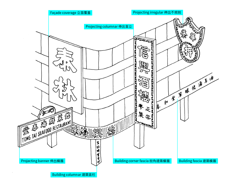
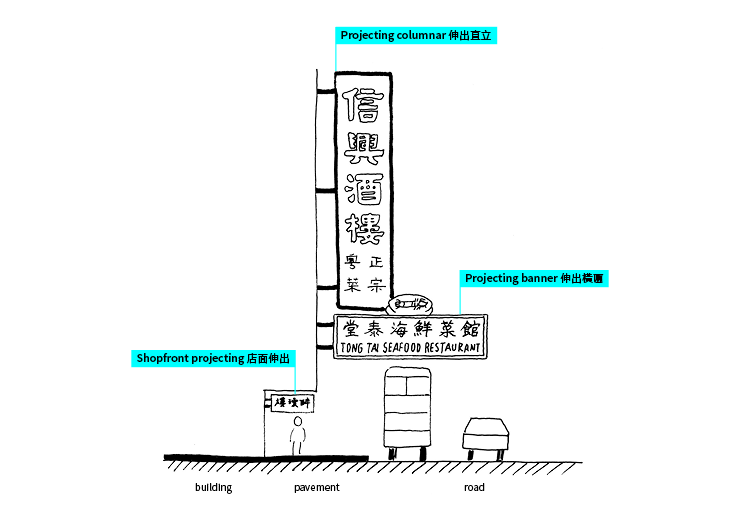
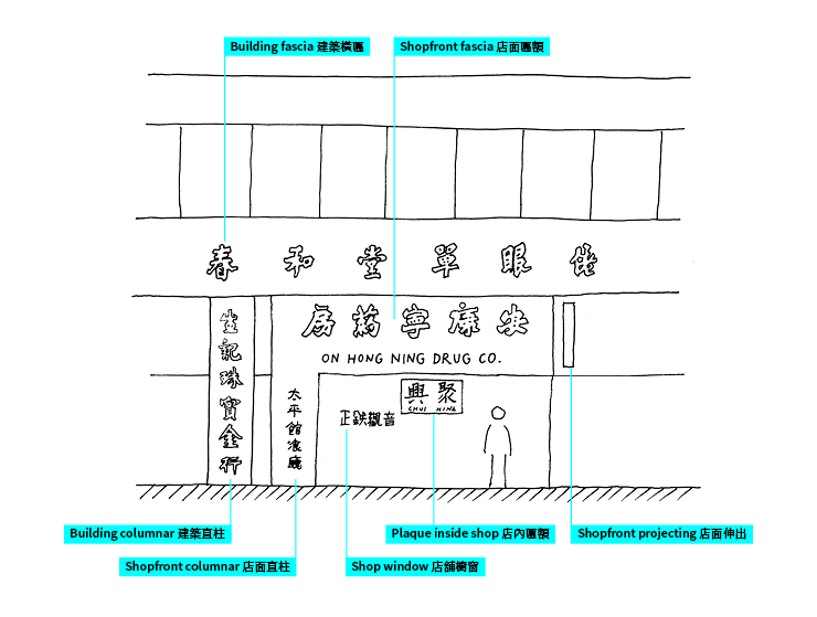
Amidst the eclecticism and chaos often associated with Hong Kong’s signscape, its manifestation in the city reveals a number of underlying patterns. Looking at how different types of signs interact with buildings, people and urban settings, a typology, or classification system, emerges. This typology represents the archetypes of 12 types of signs that may be found in Hong Kong, divided into three main classes based on how they are affixed to buildings: shop, building and extension. These types of signs recur in different permutations throughout the city. Through this typology a better understanding can be formed in terms of the visual expression, typographic design, aesthetic value, content requirements, construction methods, viewing modes and distances of these types of signs, as well as the contexts in which they exist in our urban environment.
Neon signs as extensions of buildings
Neon signs may fall into any of the 12 categories described in the typology, but they tend to appear most commonly in the form of ‘extension’ signs. Braced onto buildings with steel frames and cables, cantilevered signs are extensions of buildings, projecting perpendicularly from their façades and above the traffic flow.
Projecting columnar signs
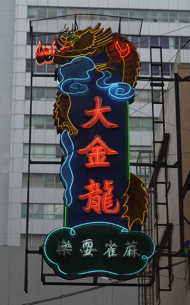
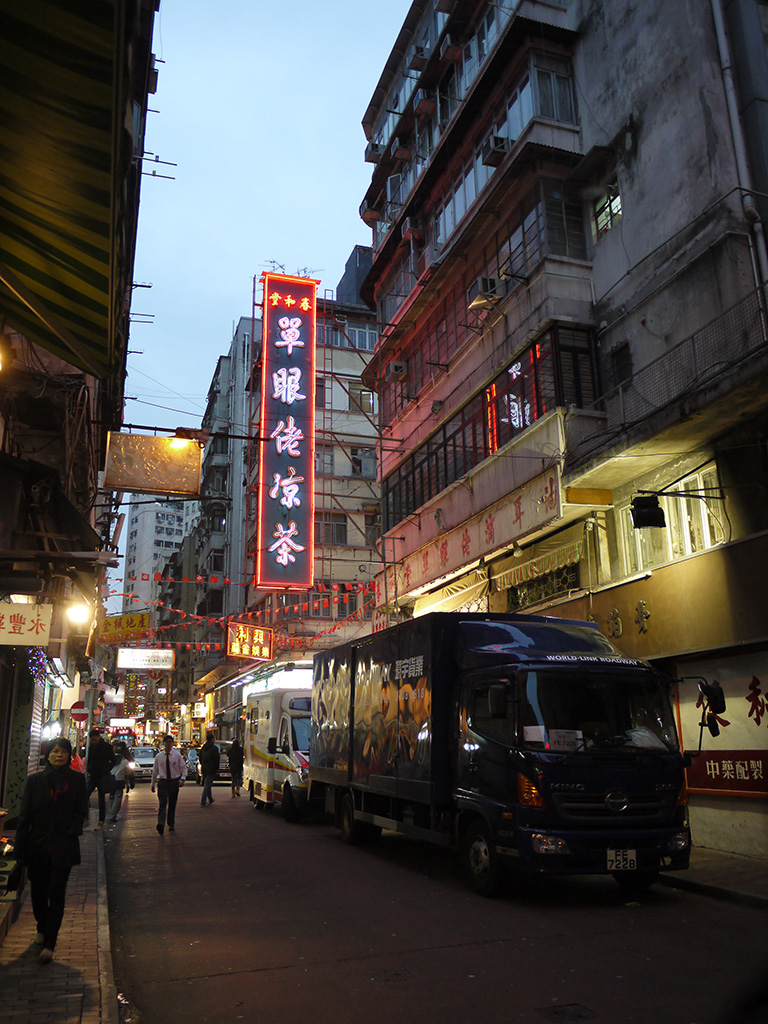
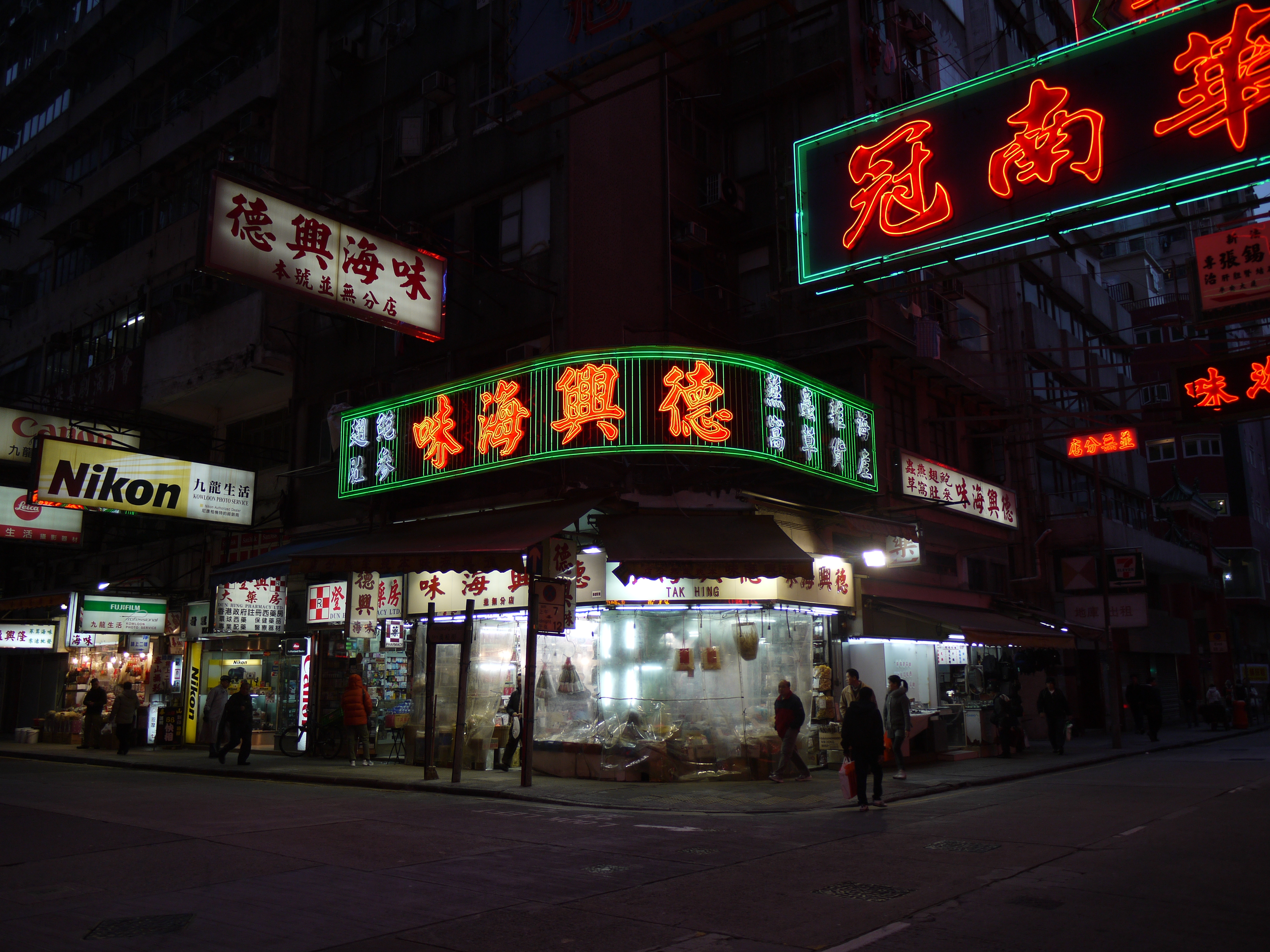
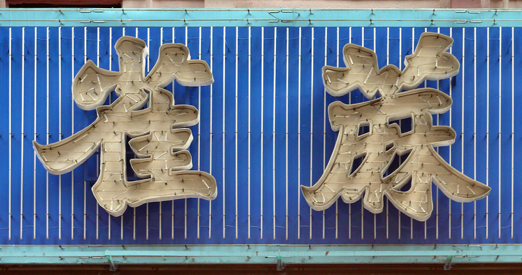
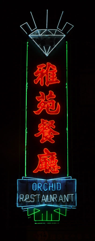
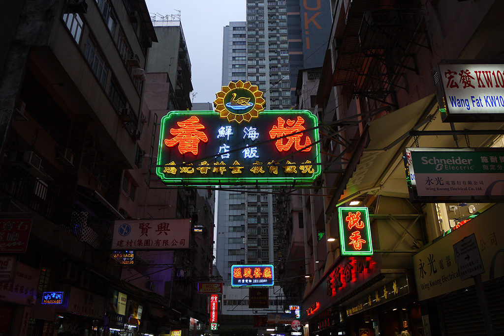
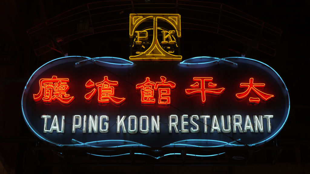
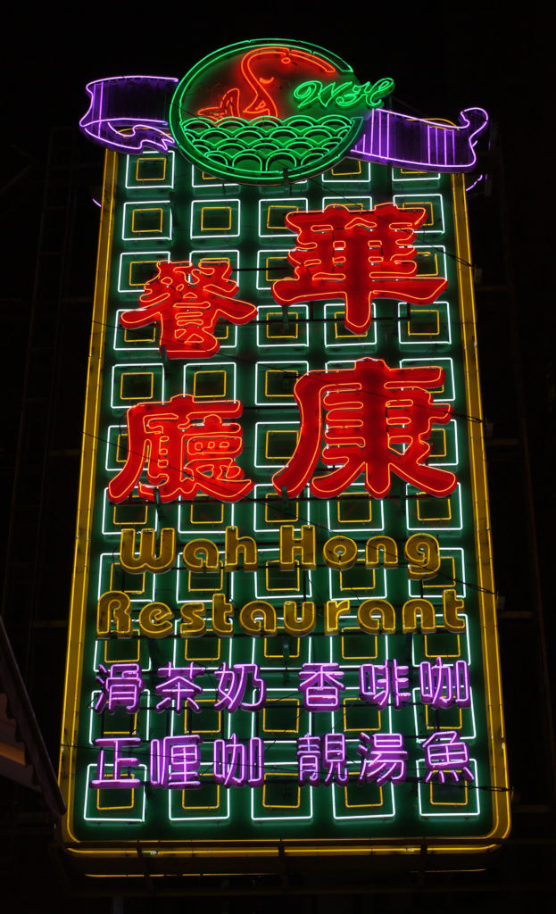
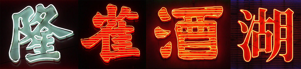
Projecting columnar neon signs are the most representative of all of Hong Kong’s neon signs. They not only inherit the tradition of neon theatre signs commonly found in towns and cities throughout North America since the 1930s, but they also honour the Chinese tradition of couplets and shop signs that hang vertically by doorways or on pillars of buildings. Since Chinese can be read easily in both horizontal and vertical configurations, columnar signs in Chinese characters function better than their English counterparts, on which letters are stacked vertically atop each other, often hampering legibility and graphic impact. Moreover, projecting columnar signs extend outwards along the sides of high-rise buildings perpendicular to the direction of vehicular and pedestrian traffic, allowing maximum visibility and graphic impact. They are usually placed on major thoroughfares, or at locations where there is an unobstructed but narrow line of sight in-between buildings. They can be easily spotted from several hundred metres away, appearing to float in midair against the evening sky.

In its most basic form, the projecting columnar sign may consist of only a plain rectangular shaft. There is always a border around the sign, usually double-lined or sometimes decorative, so that it stands out from the busy background. The shape of the shaft may be something other than a simple rectangle. Cascading, bursting, curvilinear or other irregular shapes were prevalent in the middle of the last century, a nod to the Art Deco tradition. The backgrounds of the shafts are either left blank or filled with a variety of geometric patterns.
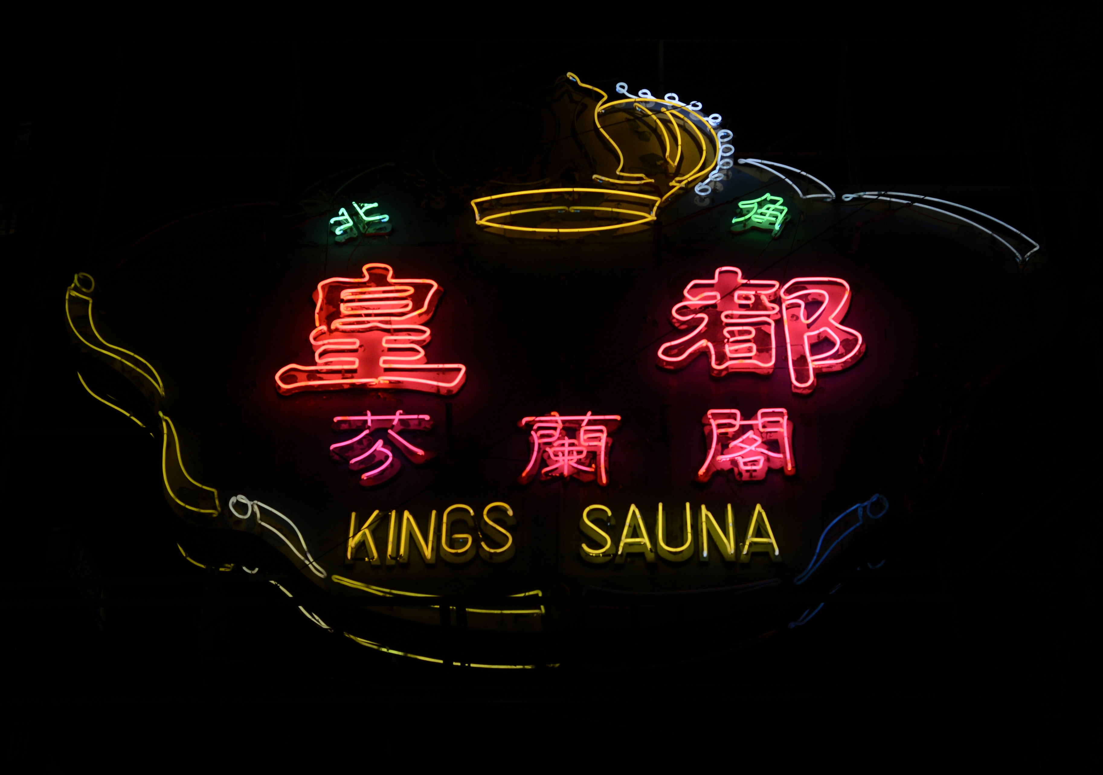
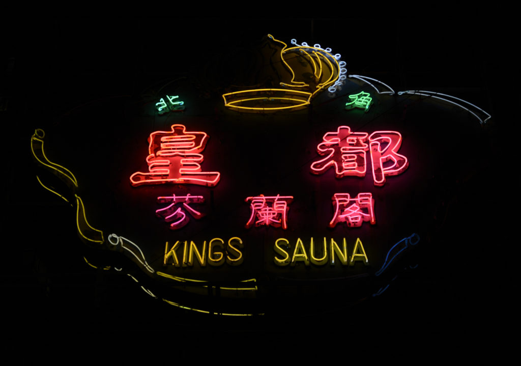
The basic form of the shaft is often adorned with a business logo or pictorial element on the top (known sometimes as the ‘crown’). For example, jewellers might use a line drawing of a shining diamond to convey their line of business; a Hakka restaurant that specialised in salt-baked chicken would use a drawing of a whole hen. Mascots that represent businesses might also be used — for example, a deer for ‘Deer Garden Restaurant’. These pictorial elements are always simplified line drawings that are iconic and therefore immediately recognisable.
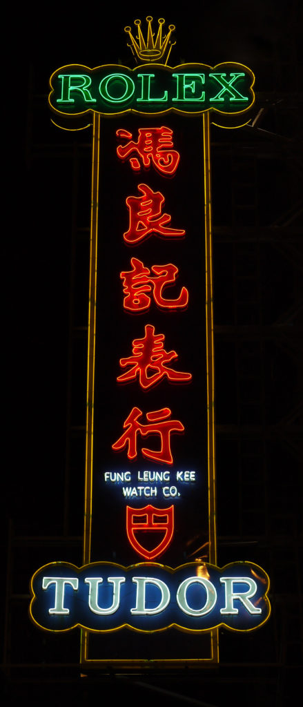
At the bottom of the shaft, there is often a wider base (known as the ‘pedestal’), which usually contains the English name of the business, or other subsidiary information in Chinese or English. It is usually much smaller in size compared to the characters on the shaft, since at its lower height it is meant to be read at a relatively closer distance. This bilingual treatment favours the Chinese language, which receives more graphic attention, as Chinese are assumed to be the main clientele of the business.
Projecting banner signs
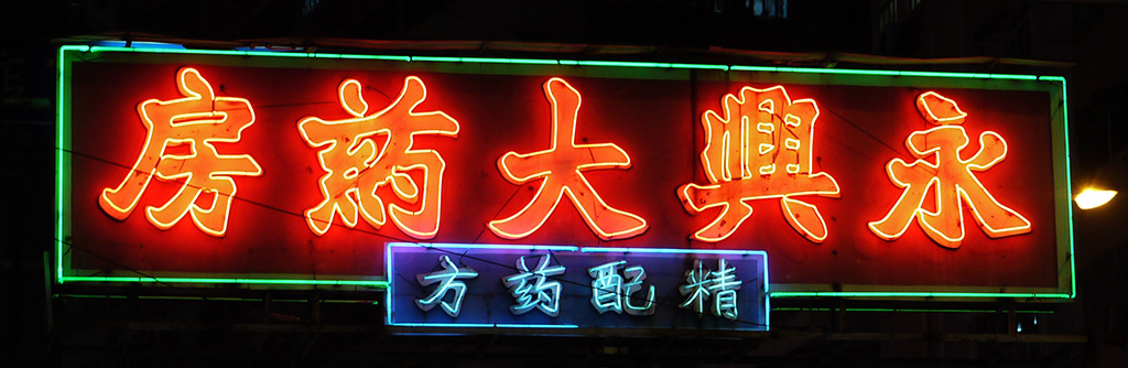
Cantilevered signs projecting out from buildings may also be horizontal, at various scales and heights. These banner signs sometimes span quite far over the road, so as to accommodate the length of the message and to maximise visibility. Compared with the projecting columnar signs, banners are designed to be recognised from a closer viewing distance, especially when installed at a lower height. Banners may also consist of a crown with a pictorial element or logo. Sometimes a ‘tab’ is appended to the bottom of the sign, containing the English name of the business, a slogan or other subsidiary information.

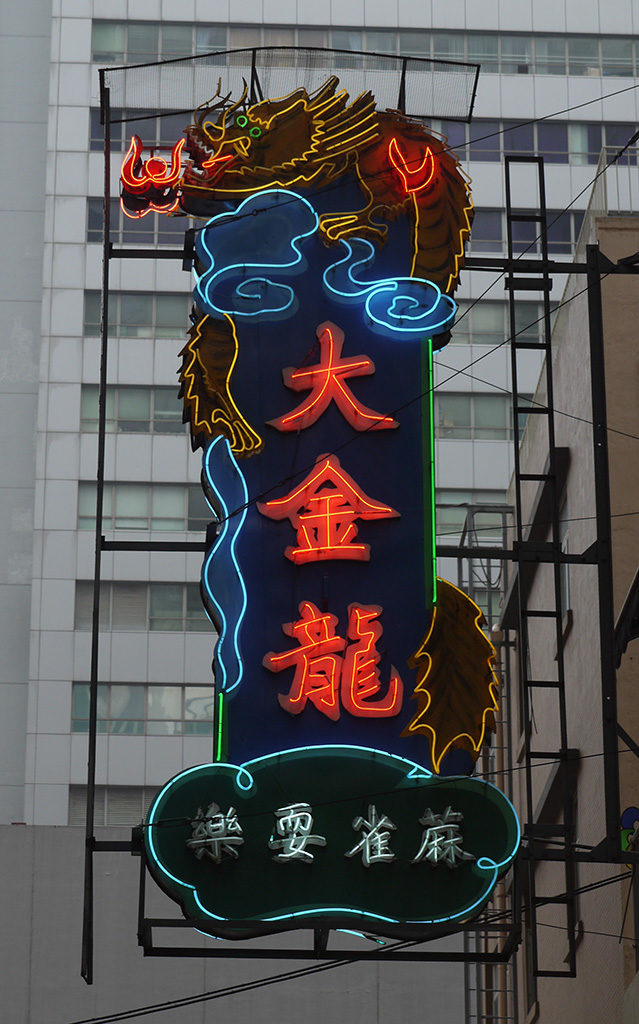
Projecting irregular signs
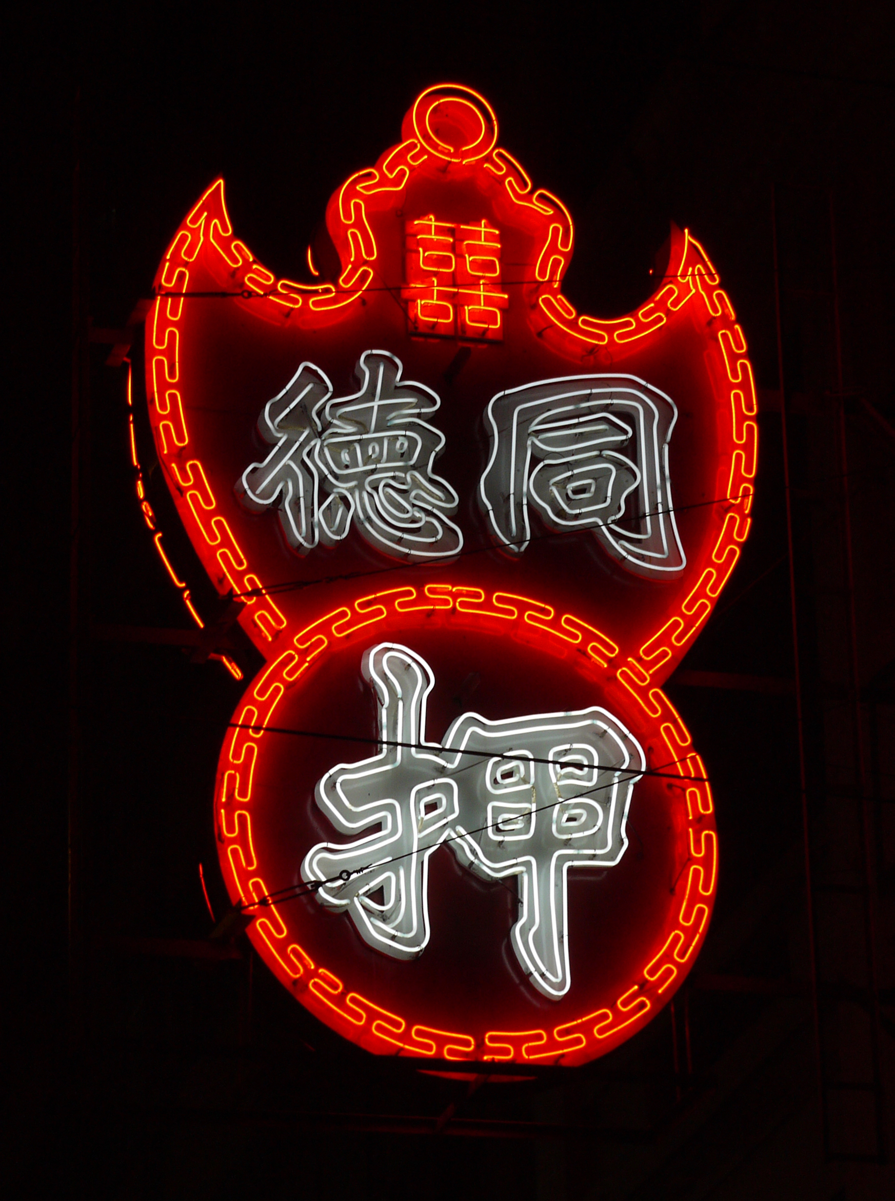
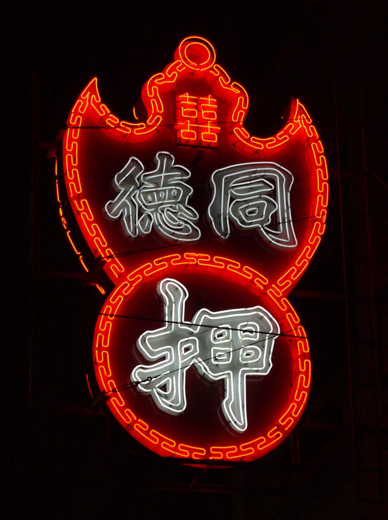
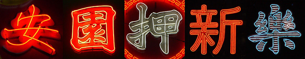
Projecting signs may also be irregular in shape: for example, the neon sign for Sammy’s Kitchen on Queen’s Road West is in the shape of a cow, conveying the restaurant’s steak speciality. The sign for Lo Fu Kee Congee and Noodles in Central is in the shape of a fish, representing their specialisation in fish congee. Pawn shops use an iconic symbol of a bat carrying a coin in its mouth, representing good fortune. The character for ‘pawn’ and the name of the shop are integrated into the symbol. The shape of the sign itself becomes a distinctive, easily recognized symbol as it stands out from the rest of the environment.
It is unlikely that businesses made concerted efforts to create a harmonised view with each other’s neon signs, say, along Nathan Road. In fact, the opposite might be true: each business wanted to outsize and outshine the others in an extremely competitive environment. Curiously, many businesses are courteous enough to not deliberately obscure their competitors’ signs entirely. Reasonable distances are kept between the signs, and the mixture of columnar and banner signs not only serves a practical purpose in this sense, but also accidentally creates a cascading effect that is multilayered and dynamic. This organic development can be seen as being better than any deliberate planning or legislation, and as a testimony to ingenuity in Hong Kong.
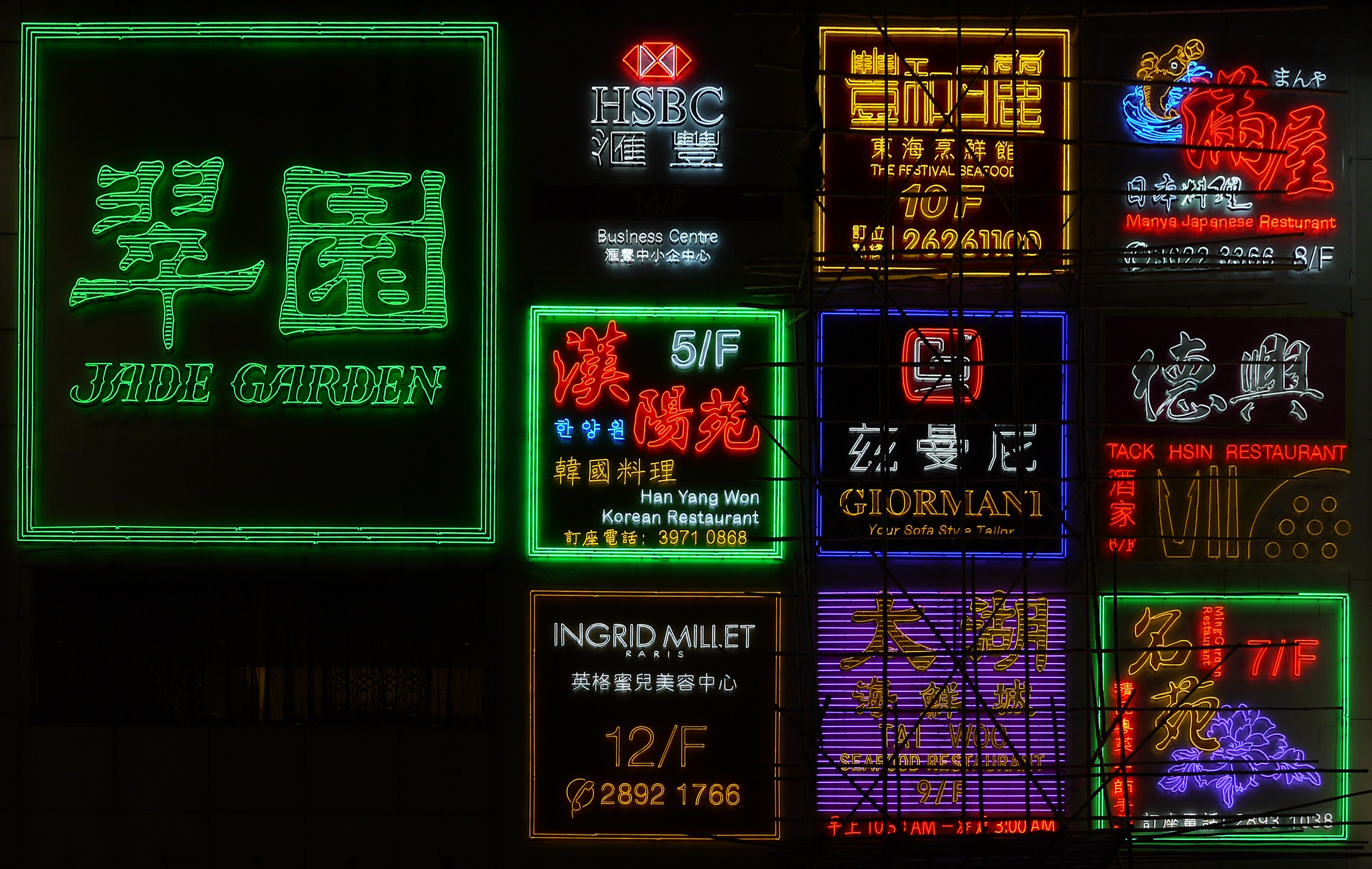
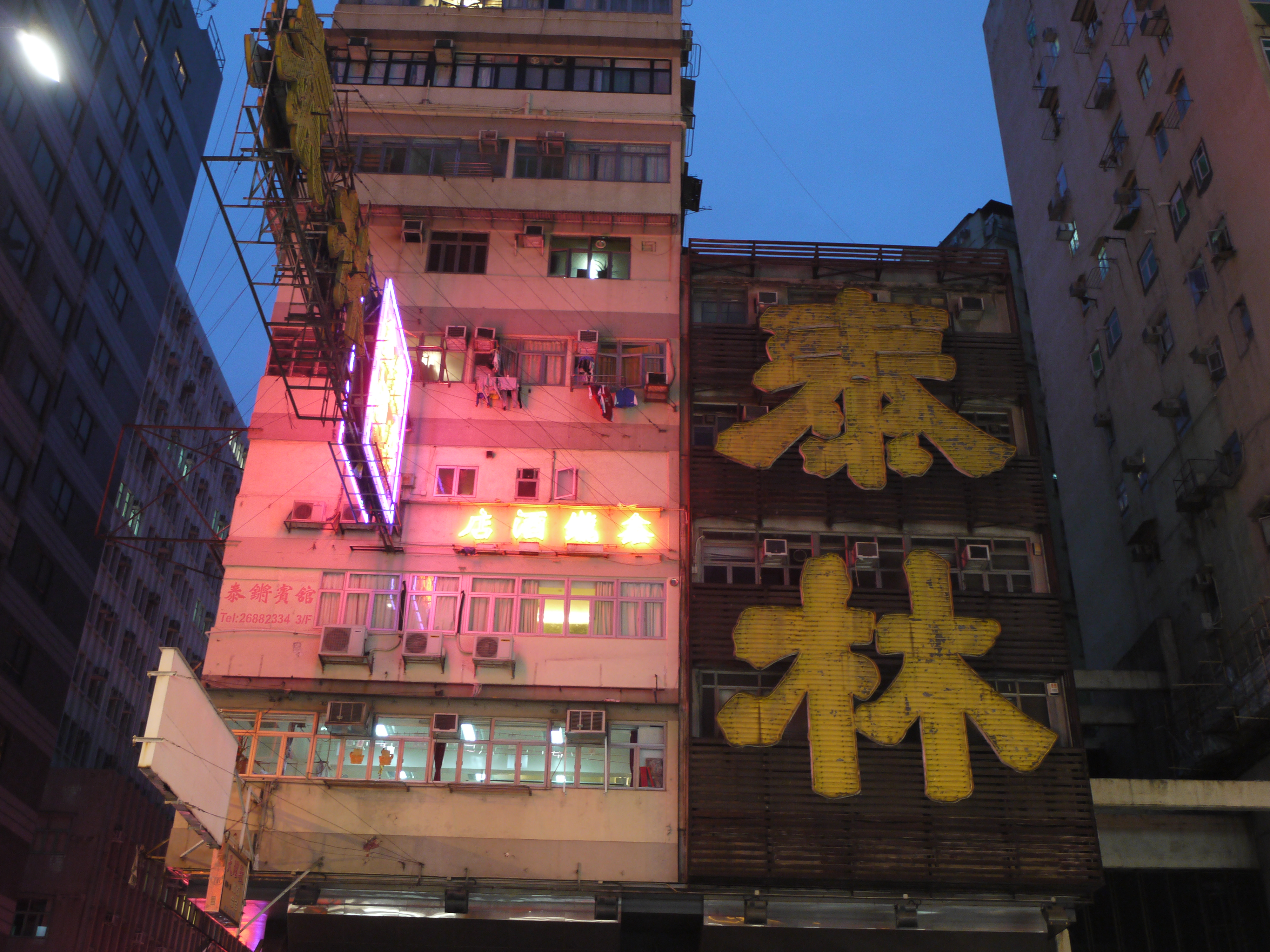
Neon signs on buildings
Neon may also be used on the façades of buildings, visible to pedestrians on the opposite side of the road or travelling in a moving vehicle. The shapes of these signs tend to articulate the shape or structure of buildings: (building fascia); (building columnar); (building corner fascia); or , including windows (façade coverage).
In the case of the façade coverage sign, an entire façade or building is effectively turned into a sign in and of itself, drawing attention to the building. The façade sign of the now-defunct on Nathan Road, a shop that sold home appliances, covers the entire façade of a six-storey building, with two Chinese characters each with a height of around six metres, rendered in Lishu calligraphy.
Neon signs on shopfronts
Neon plays a less important role at the street level, where pedestrians are very close to the shops. If neon is used at all, it tends to be on a very small scale, attracting the attention of potential shoppers and drawing them into the shops. In neighbourhoods where traditional tenement buildings with overhangs extend above pavements, the scale of shop signs depends on how high the overhang is above the pedestrians. To ensure they can be seen from across the street, neon signs tend to be positioned at heights above pedestrian traffic.
Design and production of neon signs
Neon signs usually consist of a base panel made with sheet metal, upon which the glass neon tubes are affixed. Text and other graphic elements are extruded and cut out of sheet metal, then welded onto the base panel and spray-painted in various colours. Sometimes ridges are welded along the contours of the text and graphics, for the neon tubes so that light can be contained within the shape of the characters or symbols, improving the definition of the graphic forms. The colour scheme of the base panel is often different from that of the neon tubes, so that the sign appears different under daylight than when it is lit at night.
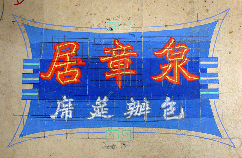
Designs for neon signs are usually rendered at a reduced scale by a graphic artist for client approval before production begins. These are very detailed colour renderings executed in gouache paint with a fine brush, showing the design of the base panel as well as the configuration of the neon tubes. Translucent overlays are sometimes used to simulate the effect of the neon tubes on top of the base panel when lit.

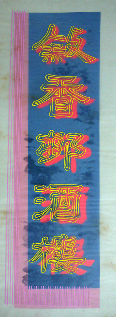
Sometimes a calligrapher is hired to first render the Chinese characters in reduced scale in a requested style. This work is then transferred onto the colour rendering. After client approval, the calligrapher provides full-scale characters rendered either with a large brush or in the form of an outline, keeping in mind the strokes’ thickness when executed in neon. Sometimes the colour renderings are manually enlarged to full-scale with the use of a grid. These full-scale drawings are then used as templates for the neon master to craft the glass tubes by hand.
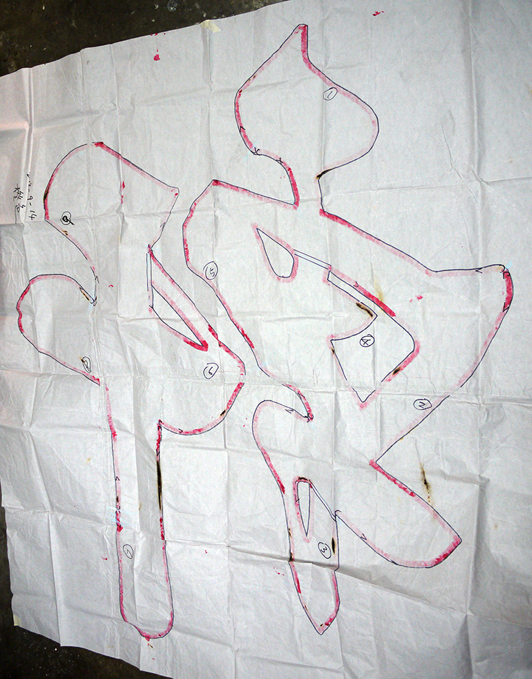
Using these full-scale drawings as guidelines, the neon master has to make careful plans as to the length of glass tubes needed and where and how to bend them so that the final result is as faithful to the graphic artist’s vision as possible – while not burning his hands. Considerations also have to be made as to how the tubes are connected with each other and to the power source.
Typography in neon signs
Words are central to the design of a typical neon sign: for identifying the business with its name as well as communicating the nature of its products and services in the most concise way. Typography (broadly defined as the style and arrangement of lettering) is perhaps less about pictorially expressing the nature or type of business than it is about the clarity of a written message and the atmosphere or ambiance that it evokes. The qualities that can be associated with different styles of typography may include reliability, tradition, distinction or formality, for example. Typography is never a pure form of artistic expression; it is influenced by technical factors such as production methods and materiality; pragmatic concerns such as legibility, scale and viewing distance; as well as prevailing aesthetic trends and the inheritance of visual traditions.
A neon sign as a whole is meant to create a visual impression as much as it is meant to be read, functioning as a symbol or landmark in its own right. When considering the design of neon signs, immediacy is key: sidewalk pedestrians and passengers in moving vehicles do not have enough time to decode a complicated visual–verbal message. Good neon signs tend to have a simplicity in their use of words as well as their visual forms, with ample negative space so that the message is not muddled when viewed from a distance.
The influence of Chinese calligraphy
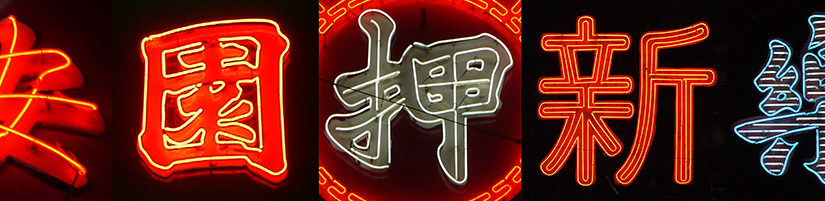
Chinese characters lend themselves very well to neon tubes, especially calligraphic forms, commonly used in neon signs up until the late 1990s. Though sharp turns in certain scripts and excessively cursive characters tend to pose tricky problems for the neon craftsmen, calligraphic script continues to be a style of choice.
Kaishu has long been favoured for Chinese characters in neon signs. Kaishu (literally ‘standard script’) is a calligraphic script that originated in the Han Dynasty (206 BC–220 AD) and reached its height in the Tang Dynasty (618–907 AD). Exemplars from master calligraphers of times past are often imitated and reinterpreted by sign-makers.
Many styles of Kaishu exist, but the Beiwei (or ‘Northern Wei’) style has been the most common in Hong Kong, used in neon as well as other types of signs. Well-known local calligrapher, teacher and sign-writer Au Kin Kung (1887–1971) was responsible for popularising Beiwei in signage. Compared with Kaishu from the Tang Dynasty, Beiwei is asymmetric in construction, with heavier stroke weights and a lower contrast between thick and thin strokes, and is more angular in form, reminiscent of stone inscriptions. Stroke endings and beginnings are emphasised. Beiwei has a rustic sensibility that works very well in terms of legibility at a large scale and when viewed from long distances. It is a style that is exuberant, lively and dynamic yet very pragmatic. Beiwei is widely used for many different types of business, ranging from restaurants and nightclubs to pharmacies and pawn shops.
Besides Kaishu, another style of calligraphy often found in neon signs is Lishu, which originated in the Qin Dynasty (246–207 BC). Lishu is a historical calligraphic script that is horizontally compressed and slightly less formal compared with Kaishu. Calligraphers such as Tse Hei (1896–1983) specialised in a very bold and rounded Lishu. It is a popular choice for Chinese as well as Western-style restaurants, conveying an air of honesty and informality.
In recent decades, digital typefaces have taken over calligraphy, and the results are sometimes less than desirable. Since most digital typefaces are designed to work at a much smaller size, in print, the graphic impact is all but lost on an architectural scale.
English Lettering Styles
While Chinese characters are often rendered in a range of calligraphic forms, the typography for English words tends to be simpler in style. The use of capital letters has a long tradition in architectural lettering in the Western world. Narrow sans serif capital letters are the norm when combined with Chinese characters, providing a good contrast to the Chinese calligraphy, and offering a dignified and monumental quality. As Chinese names are often shorter in length, the smaller, condensed letterforms also bring the two languages closer, though the legibility invariably suffers for those who do not read Chinese. Possibly due to the complexity of the letter constructions, serif styles are not often used for neon signs. The styles of sans serif letterforms are reminiscent of European ‘grotesque’ typefaces from the nineteenth century.
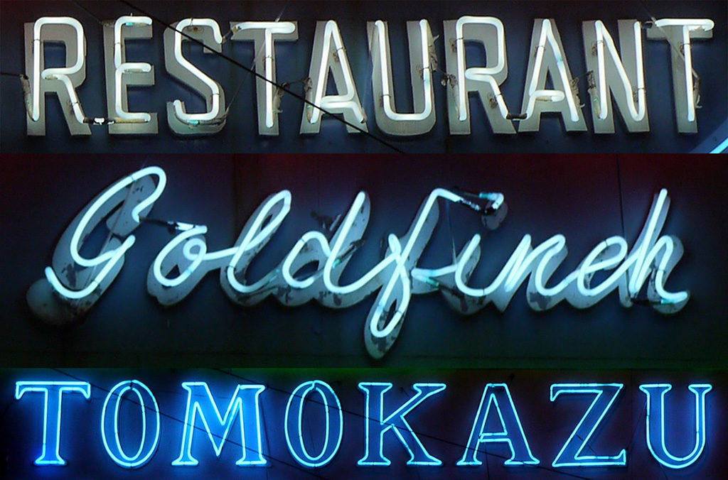
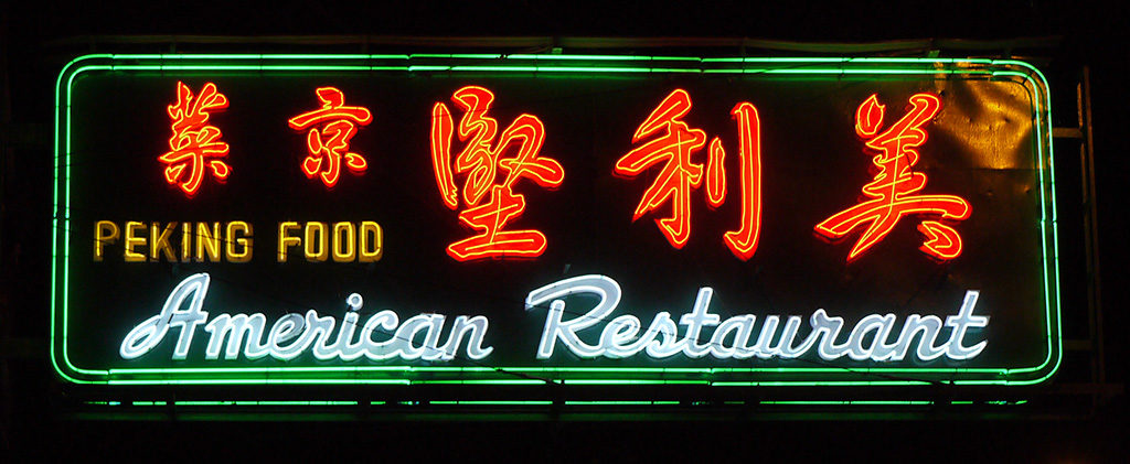
Another style of lettering often seen in neon signs is cursive script in a variety of forms. Cursive scripts mimic handwriting, and are perhaps seen as the English counterpart to Chinese brush calligraphy. When combined with Chinese calligraphy, the bricolage of styles is perhaps not the most harmonious visually, but it is nevertheless characteristic of Hong Kong and representative of certain periods. Cursive scripts can be seen as less formal and tend to be a popular choice for entertainment venues.
in both Chinese and English were fashionable from the 1930s until around the 1960s, and were largely influenced by the Art Deco style that was prevalent in Shanghai. It is a style that is relatively easy to make in neon tubes, but as with most things fashionable, this style has all but disappeared in Hong Kong with only a few examples remaining.
Whether in Chinese or English, letterforms are rendered either as single strokes or in an outline, depending on scale. Letters or characters that are under 50mm in height cannot be easily rendered in outline. Very large letterforms are often ‘filled in’ with single or multiple contour lines or with parallel neon tubes.
Looking forward: where do we go from here?
As we have seen in this essay, neon and other types of signs shape our urban experiences in Hong Kong through not only their visual language but also how they interact with architecture, the urban fabric and people’s ways of life. This ‘architecture of communication’, however eclectic and spontaneous, has an underlying pattern that addresses viewing requirements and therefore prescribes visual form. Neon, an agreeable and infinitely malleable medium, not only continued an aesthetic sensibility originating in North America, but it adapted to the local context by inheriting the rich traditions of Chinese calligraphy, thanks to the boldly inventive local neon craftsmen. All of these influences in turn have produced a vernacular visual culture that is unique to Hong Kong, creating a memorable and highly meaningful urban experience as we know it today.
In the past decade or so, we’ve seen a steady decline of neon signs in Hong Kong. The romanticism and almost surreal streetscape once created by the soft glow of neon signs is sadly being displaced by oversized billboards making blatant statements of globalisation and rampant consumerism, forever changing the face of our city. The large variety of neon signs that represent diverse independent, locally owned businesses are gradually being replaced by chain stores and global brands. Hyperreal photoshopped images of human figures and consumer products rendered in lifeless oversize inkjet prints are the new norm, covering entire façades of buildings. Lit with flood lighting, they make it sometimes difficult to differentiate between night and day, leaving little to the imagination.
The spirit of this essay is not to lament over a ‘lost art’ or to wax nostalgic over a glorious past. It is about forming a clearer understanding of the value and significance of neon and other types of signs in Hong Kong so that we are able to continue this heritage well into the future — transforming it, reinterpreting it and taking it to new heights. It is hoped that this essay will initiate many future discussions, and that it will spark an interest in the appreciation and preservation of an important part of our visual culture.