Typography is my main area of expertise; it is primarily where my passion lies as a design practitioner and academic, a subject that is very close to my heart. I am particularly into detail typography and typographic structures and systems. My approach is very workmanlike and pragmatic, and concerns mostly with finding the most fitting form for textual content. Style is seen as something that naturally emerges from this process rather than a purely artistic pursuit.
Since the first typography class I taught back in 2003, I have been running this project for my students at various levels. The idea of this project came when I was eating out with some friends at a restaurant called Alibi Room in Vancouver, and in the restaurant there was a small library of movie screenplays lying in a corner. I thought to myself: turning these crude documents (set entirely in one style and weight of the monospaced Courier typeface, an industry-standard format) into highly polished, publishable books would be an excellent assignment for my typography students.
I found the text document for the screenplay for the movie Brazil written by Terry Gilliam (of the famous Monty Python contingent), Tom Stoppard and Charles McKeown, one of my favourite movies of all time. Before the text could be used for professional typesetting, the file would have to be thoroughly cleaned up and prepared. This process alone would force students to look closely at the structure of content so that they could give the text an ideal form for professional publishing.
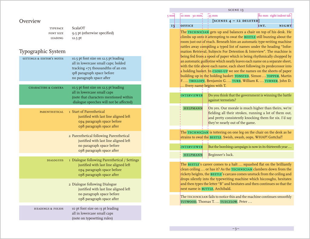
This project also gives students advanced training in the use of the InDesign software: tabs, indents, spacing, leading, paragraph indications, styles and so on. The structure of the text is complex and, in order to design it successfully, students must work systematically. However I do not see this as a purely technical exercise, but a way of thinking critically and making systemic design decisions. This working methodology would prepare students for things like designing for structured content for the web and other kinds of interactive and editorial projects, and places the importance of content squarely in the centre of any design task.
The brief also trains students to look closely at details and the subtleties of typography, and to pay attention to minute spaces, punctuation usage and the craft of setting type. Students also need to gauge how explicit or subtle typographic cues need to be for readers of such publications — not exactly a (linear) novel, but not a reference work either. Do I create a strong contrast so as to aid navigation amongst the scenes within the book, or let ‘typographic distractions’ be as minimal as possible so that readers can focus on the content and read in a somewhat continuous manner?
An iterative process is essential for this project: to go through cycles of testing, refining, and correcting, until a final solution is arrived at. It takes a lot of patience and focussed attention, which graphic design students these days often lack. The final submission of this assignment is a dummy book with a series of spreads as well as a full set of specifications for the design. This is a deviation from what students often think of as a ‘final product’, which can be confusing at times. The idea that a design is not a one-of-a-kind object that a designer creates, but a set of instructions for others to follow, is increasingly important in (communication) design education. This year, I have even attached a small exercise of an HTML- and CSS-based e-book demo page to the project, extending the project from print to screen, planting the idea of parallel or multi-platform publishing in their minds, linking typography with interactivity and screen-based media.
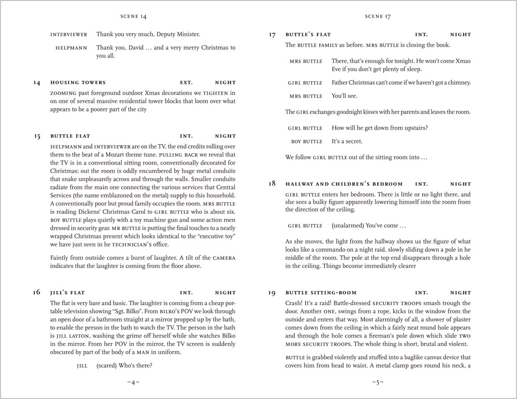
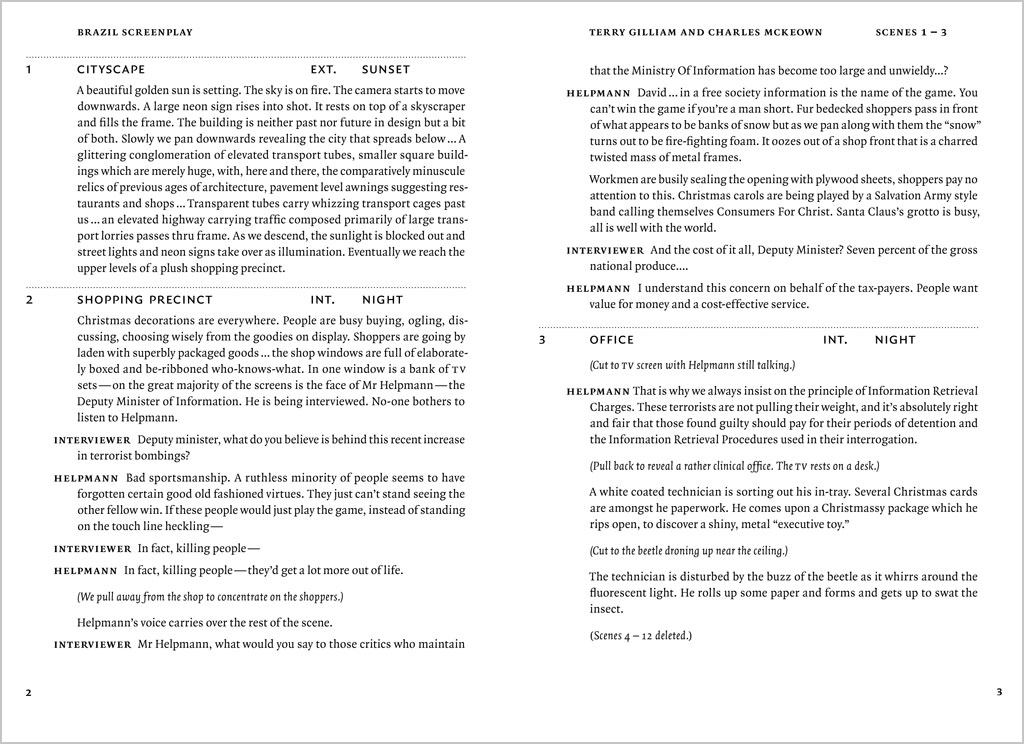
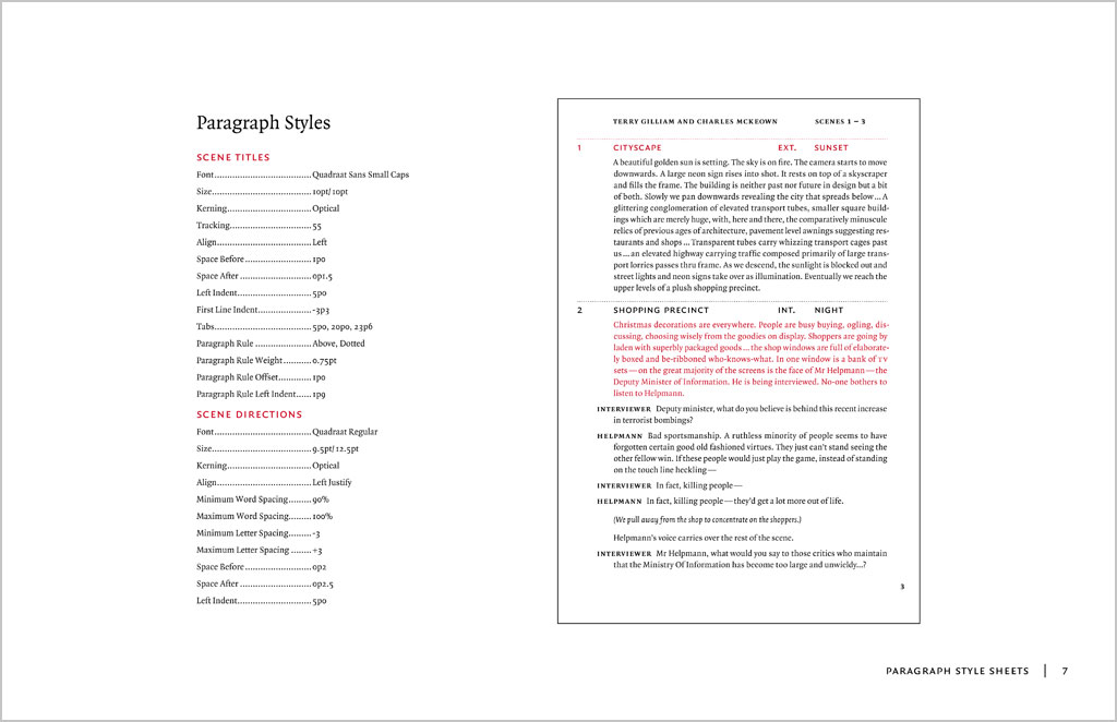
Several years ago I took the time to work on this assignment myself. I have chosen to use a sanserif typeface (Quadraat Sans) for the entire text. This is a deviation from the norm, but I do find that Quadraat Sans is an extremely smooth-reading typeface for text that is as good as a serif, though unconventional for this genre. The text is quite minimally cued, read somewhat like a linear text, only with the character names and scene headings (slugs) in bold. A baseline grid is used. The specification document is here. Hopefully this would inspire my students, though it should not be seen as the one and only ‘perfect’ solution – many possibilities abound.

Screenplay project brief
Download this project brief in PDF format
You may adopt this brief for your class, but please credit me
What is a screenplay?
A screenplay is the script for a film or television production. It outlines every scene, provides direction for each shot and contains all dialogue spoken by each character. A screenplay used in the film and television industry follows a strict format (see subsequent pages), often written using screenwriting software with a limited set of typographic variables. This format is used for all members of a production team include the actors, camera crew, directors, producers, etc. However, when screenplays are published as books for a general readership, the industry standard format does not have to be observed. A playscript is similar but for theatrical productions.
The brief
Design and devise a comprehensive set of typographic specifications for the the interior typography of a paperback screenplay series, to be sold at bookstores for a general audience who are interested in films. The series shall be titled ‘Contemporary Cinema Classics’, published by Working Titles Press. The same typography will be applied to all subsequent titles of the series.
The manuscript for Brazil, a screenplay by Terry Giliam, Tom Stoppard and Charles McKeown written in 1985 is provided for producing a prototype and typographic specifications.
Format
- Binding: Paperback (soft cover), sewn binding
- Trim size: Open, but probably similar to a common paperback novel. Wastage should be minimal; a full sheet should be utilised.
- Paper stock: A cheap, off-white offset stock or newprint
- Colour: Black and white only (screens allowed)
- Typefaces: One seriffed typeface for the main text, or with an additional sanserif
Design criteria
Comfortable format, ease of reading, economy of space, clarity of typographic hierarchy, craftsmanship, correct use of punctuation and typographic conventions, clarity of typographic specifications.
You may only use one single text frame for the running text. All spacing adjustments should be done internally, using indents, tabs and paragraph spaces. Additional text frames may be used for the folios (page numbers) and running heads.
Deliverables and submission format
Dummy book
A booklet showing a minimum of six sample spreads of the text pages, as well as primilary matter such as half-title, title page, copyright/colophon page, table of contents as well as introduction, plot summary and cast (same material as for the exercise).
Specifications
A booklet that explains all typographic styles, measurements and design instructions in detail, to be used by the production team when executing the design. A4-size, or slightly bigger than the format of the book.
Key stages of development
A PDF document showing several key stages of your design development, with annotations.
Deadline
Final submission on Thursday 26 February. Hard copies to the General Office before 18:00. PDFs through Blackboard before 23:59. Critique on Friday 27 February at 09:30.
The process
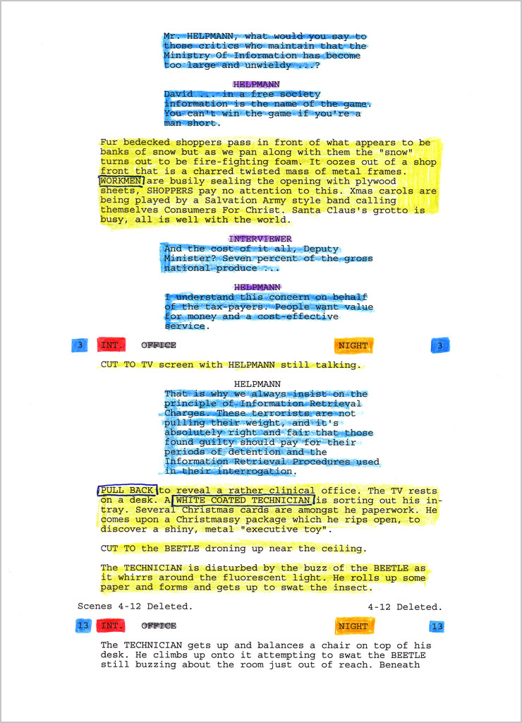
- Analyze the text: print out several pages of ‘Brazil screenplay text (raw)’ document. Read through and understand how the entire text is structured. Colour-code and number the each component of the text, make an inventory.
- Use the ‘Brazil screenplay text (cleaned up)’ document for typesetting.
- Planning & layout: decide on a suitable size of the book based on economy and reading comfort. Consider margins, column widths, folio, running heads, etc.
- Trial settings in InDesign: print and evaluate various typefaces, point sizes, leadings and column widths.
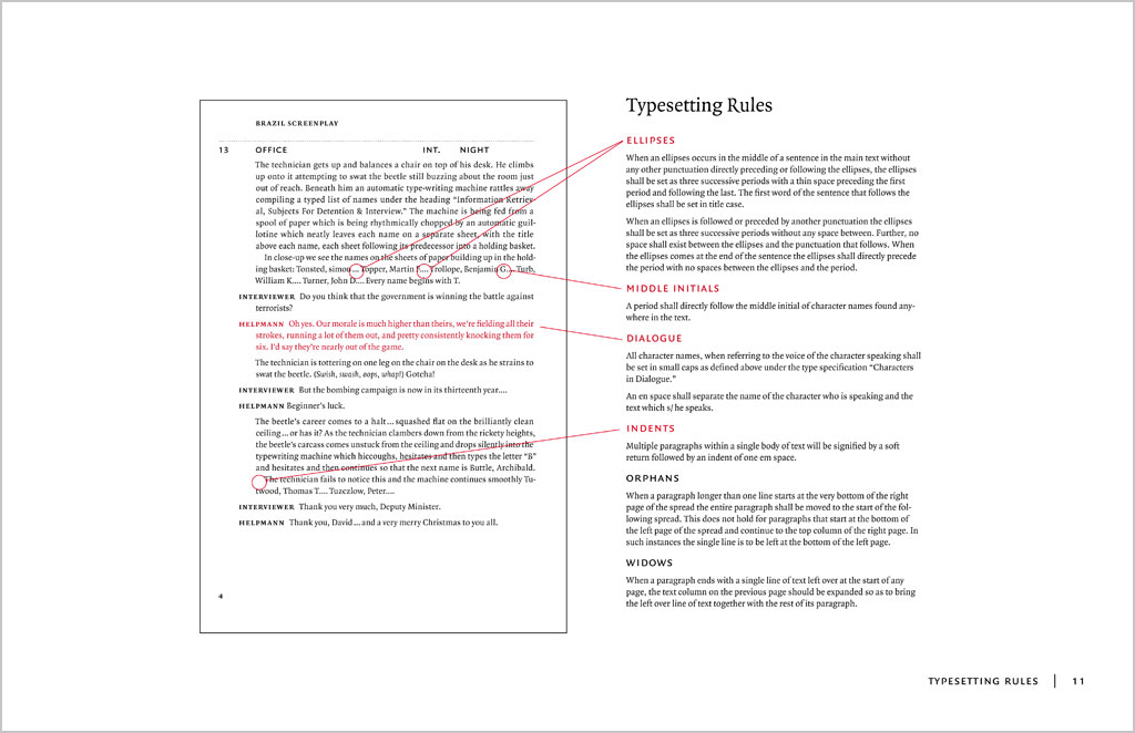
- Detailed typography in InDesign: establish a typographic system using graphic and spatial cues, set up paragraph and character styles, correct typographic details.
- Test & refine: print out trial layouts periodically and continuously make refinements
- Produce specifications: once design is finalised, document all styles and typographic instructions and produce the specification document.
(Keith Tam, January 2015)