I was invited by Thomas Girard of uniqueways.ca as a guest on his audio podcast channel. The format is the same for all guests to his podcasts: they answer 20 preset questions. The full transcription is published here. It was done automatically with otter.ai, an excellent automatic transcription service (though I had to do some editing still). Hope that at least some my thoughts would resonate with you.
Thomas Girard: Uniqueways with Thomas Girard emerges with people from all walks of life, who through their own unique angle, succeed and flourish. Enjoy the ride and welcome to Uniqueways an audio podcast.
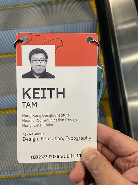
Hey everyone, welcome to Uniqueways with Thomas Girard, an audio podcast. We’ve got an exciting guest from Hong Kong today. An information designer, typographer and academic who is currently the Head of Department of Communication Design, and Director of Centre for communication design in Hong Kong design Institute. Distinguished Research Fellow at the Type Lab of Shanghai Academy of Fine Arts at Shanghai University, with previous appointments as Associate Professor and Director of MA information design at reading in the UK, and leader of the communications design discipline and founding leader of the information design lab at Hong Kong Polytechnic, among others. We’re welcoming Keith Tam today. Welcome, Keith.
Keith Tam: Thanks very much, Thomas. Thanks for the invitation.
Thomas: My pleasure. If you’re ready, we can just go right into the 20 questions.
Keith: Yeah, sure.
Thomas: The first question is, tell me a little bit more about yourself. What do you do?
Keith: I think before anything else, I always consider myself a designer. I was trained as a communication designer, or the older way of saying this would be graphic designer, but my focus is mainly on typography and information design. Those are my primary interests. I’d like to say I’m an academic, but maybe I’m more of an administrator these days, I manage things. I lead an academic department, and I founded and run a research centre, the Centre for Communication Design. A lot of things are involved in that kind of role. A lot of management and admin stuff. But on the side I still do some consulting. I still practice a little bit and I research. I’m working on a project right now with another designer. It’s a book design project, complex typography. I try to write almost on a daily basis, but I don’t think I publish enough. I write in my blog. I have a blog called (non)material text. I give talks. I research. And lately, I’ve been doing some exhibitions. I do a lot of different things.
Thomas: Sounds great. Keith was my instructor at Emily Carr University 20 years ago.
Keith: 20 years ago really? It doesn’t feel that long, to be honest.
Thomas: I bite my lip with my comments here. Number two, what’s a key piece of knowledge that makes you different?
Keith: I thought that was a really tough question, because I guess we’re all unique in a way. Maybe you can say that I’m ‘third culture’, as in I don’t belong anywhere, but I belong everywhere. I think that’s probably an interesting one for a lot of people. And I thought of a word: ‘praxis’, which I thought really describes me quite accurately. This word means ‘theory in action’ or ‘theory in practice’. I don’t know if that’s something like what you’re looking for in this question.
Praxis: theory in action, theory in practice
Thomas: Yeah, absolutely. We’ve been with the other guests trying to brainstorm new words. It seems that we’re at a loss for words with a lot of what we’re trying to get at. I think ‘praxis’ is a great one.
Keith: Yeah. Another thing is I have a loud voice and I have a loud laugh. A lot of people tell me that. I don’t know, if you’ve met me, you probably already know this piece of information.
Thomas: It’s intimidating. It’s an intimidating laugh. I like it. It’s just, you know, you got to handle it, you know? Okay, number three. So why this of all things? Why do you do what you do in terms of career, in terms of life?
Keith: When I think back it’s pretty inevitable that I do what I do today. I guess the influence goes back a long way. Actually, since I was little. My dad studied graphic design, he was a fabric designer. He did a lot of freelance work at home. Every evening, we’d finish dinner, we’d clear the table, and he’d get his paints out, papers and tools and whatnot, and start working into the night. And that had a big influence on me really early in my life. I was really fascinated by what he did. Especially the typographic stuff that he did, he had a whole stack of Letraset in his drawer. And he’d let me use the ones that he finished with, and he taught me everything like how to kern and how to do everything properly like a professional does. And I remember, one day, I asked him, ‘can I be a designer?’ And he said, ‘Of course you can. You’re already a designer’. So I guess you could say, from that day on, I have been a designer. And I was probably around 10 years old. I could have been younger, I don’t remember exactly. And another thing is, I went to Emily Carr to study communication design. I started as a foundation student. Unlike a lot of my peers, I’m guessing, I spent a lot of time in the library at Emily Carr. In those days it was on Granville Island. And I read a lot of things. The classes that I enjoyed the most were the history and theory classes. I was already doing some part-time jobs at that time. And quite early on, I was thinking, maybe I don’t want to practice. I enjoy the thinking part, the writing part and reading about design thinking about the practice. And I knew that a regular design practice job won’t satisfy my curiosity. It’s kind of like something inevitable that I’m doing this today.
Thomas: I was also very early on in deciding on design. My choice at that time was industrial design, but like you ended up in communication. Would have been about 18 years old then.
Keith: I wanted to study architecture, though. And my dad was saying – in those days there weren’t a lot of degree programmes in design – and he said, maybe you want to study architecture in university. And then I was trying that, but I guess I didn’t make the grades. I didn’t actually do the public exams in the UK. So I moved to Canada and and got into Emily Carr instead.
Thomas: I had a similar route. That’s interesting. This one some people struggle with but I know you’ve got your sets of answers here. This one is: what does your future look like?
Keith: I don’t have a crystal ball. And it’s actually great that we don’t have crystal balls because we can shape it any way we like really. I do believe that we have some control. Although I don’t really plan ahead that much. I just go with the flow usually. So maybe there’re going to be surprises. We, as designers, try to envision better futures. And that’s what we do as a profession. Designers try to put visions into action as well. So we could do that as well for our lives. I don’t know, it’s hard to answer this one. What do you think?
Thomas: I just finished a five year plan. And as soon as I finished it, everyone asked me what my next five year plan was. But to be honest, that’s the only five year plan I’ve ever made in my life. And it was really hard to make that and it was really hard to go through it. And I couldn’t immediately come up with another five year plan. I’m still debating about what am I doing? Not sure.
Keith: Right. Well, as I said, I’m not big into that. I don’t have five year plans or whatever. I have weekly plans or yearly plans, maybe, but I don’t usually look that far into the future.
Thomas: That makes sense. Okay, here’s a fun one. So let’s talk about location. How does the notion of place play into what you do?
Keith: I like that question a lot. But again, it’s a difficult one. I used the word ‘third culture’ earlier. And I consider myself a world citizen, because I’ve moved around quite a bit. So, I guess we call this sort of people, ‘adult third culture kids’, ATCK. I feel that I belong to a lot of places, but I also don’t belong. I can feel at home in many places, but also feel isolated. I heard your TEDx talk as well. And the airport is kind of like a third place, isn’t it? You can say a non-place, or a transitory place. In a way, I feel like that. I moved to the UK to study in the 90s, really early on. I was 13 then. And it was a different world in those days, because you had to write physical letters and send them by post. You didn’t have internet or mobile phones, and things like that. The closest thing was a fax machine. You could send a fax instantly. Distances were a lot greater than they are today. Now with the internet and everything we’re very connected with everywhere in the world. So place, you can say, is not as important as before, because we’re so connected. But for me it’s still important because places create meanings. Because we have people who are connected to us at different places, and stories and history and culture. These are all very influential, I guess, in shaping a person’s thoughts or way of life. I’ve lived in the UK for a bit but I’ve never felt a strong connection to the country to be honest. I’ve been feeling like an outsider. Although there are a lot of people there that I care about, a lot of my history is there. But Hong Kong definitely has a special place in my heart. I’m here now. Because I was born here and my family was here, and it’s still a very unique kind of place. And Canada of course, Vancouver, for me has a very special meaning. And it’s home for me. My parents are there, my relatives and my friends are there. I went through a lot in Vancouver as well. So these two places are always special for me. So place is definitely important, but also less important at the same time.
I feel that I belong to a lot of places, but I also don’t belong. I can feel at home in many places, but also feel isolated.
Thomas: The non-place book – Mark Argué, the anthropologist – his book just arrived. It must have been out of print for awhile and it’s just very timely.
Keith: Yeah, I should read it. Do you feel that as well?
Thomas: I do. After giving that TED talk, I started to have a stronger relationship with places that have less identity. Airports, movie theatres, taxi cabs. And I kind of grew up that way too.
Keith: Yeah, of course, you have a connection to Hong Kong too.
Thomas: Absolutely. I mean, places like Hong Kong, year 2000, really strong sense of place for me there. Other places Vancouver, not so much could be any place.
Keith: Vancouver does have its kind of non-placeness, in a way. I think in a way, that’s also good. Because there are many possibilities, because it’s so diverse, right? I remember, in one of my classes in Vancouver. Other faculty and I were co-teaching, and we counted how many languages were spoken in the class, there were 13 spoken in one class. I was like: ‘wow, this is amazing’. Also in such a diverse place like Vancouver, it means that cultural norms, and a lot of our expected behaviours, values and things like that, you need to really get through that. There’s no single accepted way of doing things. There are many different ways of doing things and many different ways of thinking. And that diversity really is inspiring to me.
Thomas: I just recently had an option to go to India and leave Vancouver for a bit.
Keith: India is very interesting . . .
Thomas: It is interesting. I had a guest this morning who made me feel really good about deciding to not go to India. And now I’m talking to you and I’m feeling like maybe I should have gotten. Strong sense of identity in that place.
Keith: Well, maybe you can connect to India virtually. You never know, maybe you can take the job virtually. I have imagined having virtual jobs in different places. That’s an actual thing now, isn’t it? It’s happening. To me, that’s very interesting. I have a job in India, I have a job at the same time in Hong Kong. How interesting that would be.
Thomas: I’ve been doing it for three geographic locations at the same time. It’s pretty confusing.
Keith: It is. There’s still the time difference. That’s really hard to work out. I’m at nine o’clock now. It’s difficult to do business with Vancouver. In Hong Kong, for example I’m nine o’clock in the morning, and you are six o’clock in the evening. With the UK is difficult too because our five o’clock is their at nine o’clock.
Thomas: That kind of disconnect with places that happens, I know what you mean. Number six here. If you had to start from scratch, what advice would you give to your former younger self?
Keith: Are you talking about career-wise or . . . ?
Thomas: Career, life. It’s up for interpretation.
Keith: I’m actually thinking the opposite: what can I learn from my younger self? What did I have when I was younger that I don’t have anymore. I often think about that. When you’re older, you kind of lose that sense of purity and innocence. Or that braveness of not afraid to voice out things, because you don’t really think too much about how other people feel. I don’t know, maybe. There’s a boldness in my younger self that I probably don’t have now. We’re too safe as we get older. We think we’re getting wiser, but in a way, we need that sense of innocence to drive us forward, to be creative for example. I try to remind myself of my former self, that kind of energy and that kind of purity or innocence, or boldness. I think of it the other way. I kind of grew up quickly. I went to the UK quite early on in my life, so I grew up quickly. I was a little bit precocious, you can say. I’ve always been a little bit of an oddball. Not so much nerdy, but liking things that other people didn’t understand. Or not really into popular culture or the mainstream stuff so much. Maybe my advice to my former self would be to embrace all of that. Not to think too much about what other people think. But I think it’s more important the other way around: to remind myself of my former self constantly.
There’s a boldness in my younger self that I probably don’t have now. We’re too safe as we get older. We think we’re getting wiser, but in a way, we need that sense of innocence to drive us forward, to be creative.
Thomas: I can relate to that. Being in Vancouver, you really learned that people care about popular culture so much. As a young, trying to be cool, trying to be hip kid. The popular culture seems like the obvious bad choice, like why would you ever do that? And later I realise, oh, that’s how you fit in.
Keith: Yeah, that is how you fit in. Although I didn’t really try too hard to do that I suppose. I still don’t. Looking at kids these days, the younger generation of Gen Z these days, there’s a lot more diversity than before I think. I think because what we’re exposed to is so diverse as well. Whereas before we watched the same TV shows, and now everybody’s finding, you know different things to watch and to read and to listen to, so I guess things are a little bit different now.
Thomas: I have a thousand questions to respond with, but I won’t. What’s a day in your life like?
Keith: My day is pretty boring. If you’re talking about weekdays, I actually work an office job. And most of my time is spent in my office. But the interesting thing is I interact with my colleagues a lot. Students and colleagues and industry partners, because we have a lot of external projects. I meet a lot of people, and that’s what really gets me going. When I’m desk-bound, I work on emails, like a lot of people do. I work on administrative stuff, I do the budgets, I do some planning, I do paperwork for the Department and the Centre. They’re boring but these things ultimately benefit students. It’s part of being an educator. One thing I really enjoy doing, but probably not a lot of time I have for is to strategise and initiate things and to be creative about what I do, to brainstorm things. Because sometimes on a day-to-day basis, you’re just trying to put out fires. I still try to build in time to do that and with my colleagues as well, to brainstorm and to strategise. That that part I really enjoy. I don’t really teach so much these days, sadly. I’m still very interested in teaching but the nature of my job doesn’t allow me a lot of time to do that. But I still sometimes teach you know, a professional course outside of my day job. I enjoy that. Research, of course, look at stuff in our archive, think about projects to do, that kind of stuff.
I should leave a little bit earlier. When it gets to about five o’clock, I think, oh, maybe I should think about leaving soon. And then before I know, it is six o’clock, six-thirty or seven. And then I go home and have dinner with my spouse, and watch some Netflix and whatnot. That would be a very typical day for me. Of course weekends I won’t do any admin stuff. But I still read and do other things and go to the beach. So yeah, not not terribly interesting, I guess it’s a pretty regular kind of office job, if you will.
Thomas: We just had a guest, Dr Garnett Hertz on the show. His knee-jerk reaction to ascending into academic administration is to go to the skate park and do graffiti. That’s pretty funny.
Keith: Swimming, for me, is a really good way of clearing one’s mind. Walking in the city is also good. I think these two things really help. It makes you more creative. And it helps you figure out problems. When you’re just swimming laps, your mind is clear. When you have stuff that you can’t figure out, after a swim, sometimes it’s solved. Walking is the same. Walking, looking at what people are doing, looking at trees and the light, and just the beauty in the city. It really helps.
Thomas: My neighbourhood community centre pool is like this Olympic level pool. It’s pretty wild. It happens sometimes in Vancouver. And I remember that from Hong Kong.
Keith: Our pool here is not like Olympic size.
Thomas: Number eight, lifelong learning is a popular topic, how do you stay up to date?
Keith: It’s really hard. When you have a busy day job, it’s hard. At work we have a staff development programme, we can sign up for different things, and they pay for it. It’s really good. We do that. Reading things online, books and magazines and things like that, to keep updated, that’s an easier thing to do. To build some of that into your day, I do that. It’s hard because there’s so many new things happening, especially in the field of communication design. Everybody’s talking about metaverse. I hardly know anything about it. I read a McKinsey report the other day, and suddenly it makes sense now. I try to keep up, but it’s really hard. I subscribe to two magazines. One of them is Eye magazine. A lot of graphic designers really like that magazine. I still want to keep up with my own field, my own practice. The other one I find really valuable is Harvard Business Review. They don’t just talk about business, actually. They talk a lot about work, leadership, management, self development, and the new technology stuff as well, and how that impacts on business. That’s all very useful and very inspiring for a communication designer to think about. 20 years ago I wouldn’t have been interested in reading a business magazine, but now I do.
Thomas: I get a printed version of the London Review of Books. It must be my dad who’s sending those to me. Because I never subscribed but I keep getting them. It’s refreshing to get some print.
Keith: Yeah, you should call him and thank him for that.
Thomas: No doubt. Okay, I’m excited about this next one. What tools do you use? Are you more digital? Are you more pen and paper? And I’m excited about this because you use a typewriter.
Keith: Yeah, I do. I use quite a few typewriters, actually. I still think paper is a great technology is one of the greatest inventions. Pens too. But I’d like to think I am digitally savvy. My first Mac was in ’93, actually. So I’m pretty comfortable with software. I’m not a techie at all, but I’m pretty versed with using digital tools for my creative work or for my work. I don’t know, there’s something about older technology that can still have a value in what we do these days. I started a blog – it was a Covid project – in March 2020. To think about material text and non-material text and how that affects the way we write, the way we edit and the way we publish. So much of it is technology because a lot of the text that we produce – text as in words – we do it digitally. We use text messaging, we we type in word processing software. A lot of it is digital now. Of course there are benefits to that because everything is instantaneous, and you can sync across different devices and easily share with other people and publish even. But does it mean that text on paper has no more value? I think it still does actually. Part of it is I have a love and fear of writing. Maybe I have more of a fear of publishing, than writing itself, writing for publishing. And I find that part of the reason why I procrastinate in writing digitally is because I go back to edit instead of writing. I think too much about what I’ve written instead of what I’m going to write. I spend too much time tweaking stuff where I should be moving forward. After discovering the manual typewriter, because you can’t go back and change a whole paragraph – not easily anyway – it forces me to go forward. And I fell in love with that way of writing. I did learn to type on on a manual typewriter when I was little, I never had to use a typewriter to write long prose at all, because by the time I was in high school I was already writing my English essays on the computer. So I think there’s still a value in older technology. These different modes of text production actually impact on the way we think. And on the way we ideate, on the way we write on the way we we we consume texts even. I’m very much into that. I also like pens. I have a large collection of fountain pens and writing tools, I really love that. There’s something about handwriting as well.
I wrote answers to your questions quite quickly and sent it back to you, right? Now actually have a printed copy of my responses, but I have markups using a pen, adding things and just jotting down further thoughts on that printout. Annotation is important, and it’s easier when it’s done by hand. And the printed and handwritten words on this piece of paper actually helps me to shape my thoughts.
Talking about digital tools, I do use an iPad, I use a I use a note-taking out called Goodnotes. It’s a Hong Kong startup. It’s an excellent app for taking notes and sharing and marking up PDFs. I use it when I go to a lecture or conference or something. I can take notes, but I can also take a picture of the slide, and in real time put that into my notebook and annotate on the side. That really is useful. But that doesn’t mean I don’t use a paper notebook. I do that too. I use paper a lot. I use Keynote a lot, because I have to give a lot of presentations. But now I like using Google Slides even more, because I can collaborate easily with other people. I often have to create slides or documents with my colleagues. And Notion is really good. I’ve started using it for a while now. I probably just know maybe 1% of the features in Notion. Do you use Notion, Thomas?
Thomas: I know about it. It does come up a lot.
Keith: What’s so good about that is you can create databases, which you couldn’t easily do before. You can create a database of images, bits of text and quotes you’re researching about. That’s really handy. But it’s so complicated. It’s really hard to keep up with it. You can do a lot with it.
Thomas: Some of our audience would be early on in typography. I was wondering if you could add something about digital typography and pen-and-paper typography or something?
Keith: Okay. I use InDesign a lot. I do letterpress sometimes. Not extensively, but I I do know a bit about the craft of letterpress printing. Letterpress printing and typesetting with lead type . . . InDesign still has a foundation in that. And the fact that everything is a modular unit of lead helps you to develop a very tangible way of understanding space, marks on paper and indent and leading. It’s a very tangible experience in letterpress. That kind of experience, when you bring it to the computer, that craft is still there actually, but it’s a little bit more elusive on the computer. In fact, it’s all pixels and light and things like that. That letterpress experience really gave me some grounding, or enhances the way I handle typography on the computer. Typography might sound like a really specialised craft or discipline. But everybody practices typography. Everybody who writes practices typography. Whereas 30 years ago people might not have thought about that. It might have been more specialised. But now it’s very accessible. I can talk about this all day but it’s going to take too long. I see a relationship between the traditional art of typography with the way we’re handling information on the web now – HTML, CSS, database, XML – all of that stuff has something to do with typography. We often think of those things as tech or UX or things like that, but really, it has its roots in typography. It’s just that we think of the way we handle textual information now – or non-textual information, pictures even, databases. We see that as UX or programming or whatever, but I really see a strong relationship with our age-old craft of typography that we can learn a lot from and can transform into.
I see a relationship between the traditional art of typography with the way we’re handling information on the web now – HTML, CSS, database, XML – all of that stuff has something to do with typography. We often think of those things as tech or UX, but really, their roots are in typography. I really see a strong relationship with our age-old craft of typography that we can learn a lot from and can transform into.
Thomas: With my students, whenever I mentioned typography, they would go to Google Fonts and pick Montserrat. So eventually I just told them just go to Google Fonts and pick Montserrat, like everybody else. And then they started probing me, they’re like, ‘oh, what other options are there? What is this typography?’
Keith: That’s a good way of stimulating their thoughts. Just to throw something at them and see how they’d react, that’s good. But I guess for beginners, or for a lot of people who don’t know much about typography. To them, the typeface is the most important thing, but very often it’s not. Very often it’s how you structure information, which is also part of typography. For my master’s classes in the past, I had a project where they had to do the information architecture of an online shopping site. At first glance it has nothing to do with typography. But the thinking behind it with information architecture does have something to do with typography, because you’re structuring information.
Thomas: Absolutely. Okay. Number 10. How do you deal with work–life balance? People have struggled with this question recently.
Keith: Maybe I don’t deal with work–life balance. Maybe that’s not relevant anymore.
Maybe I don’t deal with work life balance. Maybe that’s not relevant anymore.
Thomas: That seems to be the common knee-jerk reaction is work–life balance. ‘Don’t ask me that. I don’t do that’.
Keith: The traditional way of thinking about work was: work is something that you don’t want to do. Work is a chore, is torture, whatever. A nine-to-five job is torture. After work you go and have a drink, and do what you enjoy doing. Work is not something that you enjoy. And that’s why you have to take holidays. You go you go on a trip. You work till you’re 60, you retire and then you have a good life. Why wait till 60? It’s absurd. Why wait till you’re 60? Why not do it now? Of course not everybody are in jobs that they really love doing. I’m lucky enough to be in a job that I like doing. But at the same time, I still have a lot of things that I have to put up with in my job that I don’t like. I’ve heard this term ‘work–life harmony’. I don’t know where I heard this recently. It’s how to live with it, actually. I do work in an office-based job. There are goods and bads about about being in that kind of workplace. But even with my office job, there’s a lot of flexibility in how I spend my time. I already said that as a rule, unless it’s really, really pressing, I try not to do admin work in the weekend. But for stuff like brainstorming ideas about a project, the research part of what I do, I happily do that in the weekends and evenings, because those things are fulfilling and enjoyable to do. Or even what you would call ‘staff development’ stuff. When I read something, that doesn’t mean it’s work. I want to grow, that’s why I’m learning new things and reading something new. That is enjoyable in itself. And it should not be seen as a chore. When I talk about work–life balance like this, I’m sure a lot of people don’t agree with me, and it probably would offend a lot of people, because I know a lot of people are not in a job like this. And we have to be aware of that, too.
You work till you’re 60, you retire and then you have a good life. It’s absurd. Why wait till you’re 60? Why not do it now?
I have some friends, maybe they should be on on the show as well. They have an initiative called Making Meaningful Work, I’m good friends with them, Daniel Szuc and Josephine Wong. They have designed tools and learning programmes surrounding how to move from sleepwalking to sparkling at work, to put it simply. I think that’s a very nice way of putting it, it’s very simple. We are focusing on the transactional aspects in our work, the daily routines, the paperwork, and all the boring stuff. But what they’re thinking is, it’s not about looking for a meaningful job. But to insert meaning into the work that you do, whatever you’re doing. It’s going to take too long to go into details. But I find that thinking is really healthy, I think that kind of thinking is not ‘oh, I need to quit my job and I need to volunteer’, because you can actually do something meaningful, even with your current job, without changing too much of it, but changing your mindset about it. And thinking about the tasks that you do, thinking about the larger issues that surround the tasks that you need to perform, I think that’s very important too. I might be filling out of form, but what does that mean, that might be for a scholarship application for a student. Think about the greater meanings of what you do instead of the really boring routine stuff that you have in front of you.
Think about the greater meanings of what you do instead of the really boring routine stuff that you have in front of you.
Thomas: To bring it to a basic level, one of my students commented that design is not a job for me, it’s a kind of a way of life or something like that. In a way, I wonder if that’s perhaps how it is for you as well.
Keith: Yes, it is. It definitely is. But it goes further than design. Because of my role, I don’t just deal with design stuff. I deal with students and their learning experience. Ultimately it’s their learning experience. It’s preparing for whatever comes after. The meaning is there, regardless of whether they end up being a designer or not, I still have to deal with that.
Thomas: That’s great. We’re going to have to have you back and get the full take on all of this. Number 11: if you weren’t doing what you do now, what would you be doing? And it could be career-wise or life.
Keith: I mentioned architecture before, I’m still interested in that. But I’d probably be too bad at math to be a good architect. But I like architectural theory. I like the way of thinking about buildings and communities and how people use spaces. If there’s a chance I might go and study for an architecture degree or whatever. I’m increasingly interested in publishing. Anything to do with words and language. I’d love that. And broadcasting. I’m interested in that too, also has to do with communication. The easiest way to move into might be to be a full time designer again. That’s also interesting, especially UX design, information design, that kind of stuff. I also think about working with animals because I do like animals a lot. I imagine having a farm or something, but I don’t think I can deal with the nasty stuff that goes with that.
Thomas: This morning, we had Al Jones on the show, whose job title is Curious Human. That’s a great episode. You should check that out. He talked a lot about graduate studies and more graduate studies.
Keith: Well, I still have a PhD that I started nine years ago that I didn’t finish. So yeah, that is in my future I guess.
Thomas: Okay, number 12: what would you not like to do? And I guess, again, we’re talking about career or life.
Keith: I don’t want to be unhappy. That’s for sure. I, I don’t think I can handle a medical job. I can’t deal with blood and all of that stuff. I might be able to be an entrepreneur, but I probably won’t be able to be an accountant or a business developer. I don’t have that kind of mindset. I don’t like dealing with numbers as the main part of my job. I do need to deal with numbers with my current job. But if that’s exclusively what I need to deal with, I wouldn’t like that because I am more more interested in a more human side of a job. So if it’s just number crunching, I won’t be happy with that.
Thomas: 13 – is 13 still unlucky? I don’t know about about that. Is it an unlucky number? When I was growing up 13 was very unlucky? I don’t know.
Keith: I was actually talking about that with Cherry last night.
Thomas: Are you kidding? The number 13?
Keith: Yeah. I don’t know how it came up. I just said I don’t like that number. And she said, ‘you’re so westernised’. I said, ‘no, it’s not because of that. I just don’t like odd numbers in general. I like even numbers.’ I actually said I prefer the number 14 to 13. 14 is unlucky [in Chinese culture]. But actually 14 sounds a lot more pleasant. We live on the 14th floor actually.
Thomas: What’s your your favourite word, quote or sentence? This is number 13. So take it as you will.
I love this quote: ‘Love, work and knowledge are the wellsprings of our lives. They should also govern it.’ by Wilhem Reich. I already touched a little bit on that with your questions about lifelong learning and work–life balance. I find that those three things probably sum up everything about life really, in a very general way.
‘Love work and knowledge are the wellsprings of our lives. They should also govern it.’ — Wilhem Reich
Thomas: Least favourite word quote or sentence.
Keith: I thought a little bit about that one. I don’t know, it sounds odd, but I think ‘design’ is one of my least favourite words. Although I call myself a designer in the beginning of the show, but really I don’t like it so much because of how people use it. And when I say ‘I’m a designer’ . . . I remember I was in London on a conference trip, and I was chatting with a a stranger in a cafe, ‘I’m here on a design conference’. And she said: ‘Yeah, London is really good for fashion and things like that’. I’m not a fashion designer. I’m probably as far from a fashion designer as one can be. The word ‘design’ is misused a lot. I think you probably find that as well.
‘Design’ is one of my least favourite words. I don’t like it so much because of how people use it.
Thomas: Yeah, I can relate. It’s not ‘design’ that bothered me. But it was ‘designed’, like it’s something that you do to something. When I was younger, that was really a problem. I couldn’t deal with that.
Keith: Yeah. Like, ‘Oh, there’s no design in this chair’, for example. What do you mean there’s no design? There’s always design. Design is the most fundamental thing about being a human, isn’t it?
There’s always design. Design is the most fundamental thing about being a human.
Thomas: It’s not mascara.
Keith: Yeah, exactly. Design is just is, right? I can’t think of anything that’s human made – I’m not talking about the natural environment, I’m talking about things that are made by humans – that are not designed. It’s impossible. I was talking to a designer who’s really into typography, Hong Kong-based. And I said, ‘You know, typography can change the world. Typography does change the world.’ And they said, ‘No, I don’t think we can do that. We’re designers. I don’t think we can do that.’ I was like, ‘What?’ Our whole civilisation is built on typography. I mean the broad definition of typography. Not letterpress printing. As soon as you need to make language visible, as soon as you need to make [language] seen, you need to make decisions about form. And that’s when typography happens, right? It’s not laying out a page. It’s not flowing text into a text box, right? The broader definition of typography, and it’s the same thing with design.
I can’t think of anything that’s human made hat are not designed. It’s impossible.
Thomas: Right. You hear this kickback that Don Norman was getting for saying that he wouldn’t do small design projects anymore. He wanted to do these world changing projects. And there must have been a comment flood after that. And he just crashed. Poor guy.
Keith: It’s great that he’s doing that, because a lot of our problems in the world now are systemic. So we need to think systemically increasingly. Whereas before, design was more about making things, producing things. Now it’s more about planning things. That’s why I think the Chinese word for design [設計] is really good, because it actually has planning and strategising in it. It’s not about the form, it’s about the act. But I still do think though, systemic, yes. But even if we’re making a small thing, we are kind of envisioning a small future and making a small change in the near future. It is also important. Small steps are important too.
A lot of our problems in the world now are systemic. So we need to think systemically increasingly. Whereas before, design was more about making and producing things. Now it’s more about planning things. That’s why I think the Chinese word for design [設計] is really good, because it actually has planning and strategising in it. It’s not about the form, it’s about the act.
Thomas: I was bingeing on some podcasts, and I stumbled on Mauro Porcini’s podcast who’s the VP of design at PepsiCo. And he was hosting John Maeda. John Maeda was a little bit cranky. He wasn’t very happy to be on that cast. I think he thought it was a small project.
Keith: You need to send me a link to that.
Thomas: Absolutely. Number 15: If you had to pick one word to describe yourself? What would you be able to? Oh, yeah. Are we? Is it praxis? Here we go.
Keith: Well, actually I wrote down ‘in-between’. That was my first reaction. But ‘praxis’ is good. But the ‘in-between’ part has to do with third culture as well. Kind of hard to define or don’t want to be defined maybe. Or you can say, in between theory and practice, or academia and design, or in between word and deed, and in between a lot of different things. I like that state.
Thomas: I was on a call this morning about TED. And so we were talking about airports. And there’s a great Hollywood movie called The Terminal with Tom Hanks. And the airport administrator says that he’s stuck in a crack, and why would he stay in a crack? And he’s talking about the airport as a crack. And it made me think of this idea of crack is something completely . . . like very broad and it has lots of possibilities. And I never thought of it that way until today.
Keith: I like that, because I like things being ambiguous and blurry. I actually think we should be cautious of things that are so well defined that everybody know what it means. I like that state of blurriness or ambiguity, because there are a lot of possibilities, and you’re not defined by the status quo. Although it’s hard to be in that kind of state, because people generally like putting things in boxes. That state is really full of possibilities.
I like things being ambiguous and blurry. I actually think we should be cautious of things that are so well defined that everybody know what it means. I like that state of blurriness or ambiguity, because there are a lot of possibilities, and you’re not defined by the status quo.
Thomas: I could talk about this for a long time. What’s a dream you’re chasing?
Keith: Very simple: to be happy and satisfied. I know that sounds really corny. We all want to be in that state, don’t we?
Thomas: It’s so Canadian? Canadians are very happy.
Keith: Yeah, it is, isn’t it? And to live a meaningful life. That’s also very corny. But ultimately that’s what we try to do. But yeah, It doesn’t mean that you will never be sad and unsatisfied or unhappy. Or not meaningful. That’s also part of life as well.
Thomas: What keeps you up at night?
Keith: I’m sleeping pretty well these days, because there are no unresolved issues at work. There are no looming deadlines yet. We just made a deadline yesterday is no looming deadlines. I think it’s usually the things that need my brain work [that keep me up at night]. For example, I need to I need to do a conference presentation. Now we need to record a conference presentation, right? It’s even more pressure than doing it live. I worry about these things. After I’ve recorded it, I’m fine. But if I’m still trying to figure out my argument, and I can kind of I can’t put it together in a sensible way yet. It keeps me up. That would keep me up. Or if it’s an essay I need to submit. There’s a deadline, and I still haven’t figured out what I’m trying to say. That keeps me up.
Thomas: I have something 20,000 unread emails. And so I wiped my iPhone in hopes that I can I can get rid of that. And then the iPhone automatically makes me keep them. So I still, like 21,000 or something.
Keith: I use Microsoft Outlook. And I’ve had an email backup problem that I haven’t solved yet, but that won’t keep me up at night. I’ve left it basically. It’s on my old work computer. Actually I’ve forgotten about that. I need to deal with that next week, probably.
Thomas: Okay, so final stretch. 18: What inspires you?
Everything? I know, it’s an easy answer. But people, their ideas, what they do, what they create. Human beings are great. They’ve made a lot of very interesting things, even if they . . . I’m recently reading a book. I won’t say who the author is. It’s driving me nuts because I think the arguments have no basis. But it’s inspiring still. It still makes me think. A lot of things that humans make. They are inspiring. And environments. Definitely inspiring. Places, architecture, cultures. I can’t really think of anything that wouldn’t in some sort of way inspire me.
Thomas: Any advice you’d like to share?
Keith: I’m not big on advice, because everybody’s different. But I have a quote I’d like to share: ‘Work is love made visible.’ That’s from The Prophet, Kahlil Gibran. I think that has to do with work, but it doesn’t have to be ‘work’ work. It could be other kinds of efforts that you make to do things. I find that inspiring for myself. And that’s what I want to share.
‘Work is love made visible.’ — Kahlil Gibran
Thomas: That’s great. And number 20, everyone’s favourite. How do our listeners keep tabs on you? Where do we follow you? Where do we check out your stuff?
Keith: The single point of contact would be the website, keithtam.net. There you’ll find articles, my email addresses, my other blogs and my Medium, Behance and LinkedIn and whatnot. That’s probably the easiest way to find me.
Thomas: So much gratitude. Thank you so much for joining us today. Thank you.
Keith: No problem. It’s been a pleasure.
Thomas: We have to have to have to book you again. And have you back because this could be like 10 episodes. I don’t know why it isn’t. And we’ll have to keep tabs on the the guests you recommended.
Keith: I’ll connect you guys. They are actually UX consultants too.
Thomas: Okay, perfect.
Keith: But the funny thing about them was I had a client from more than 20 years ago in Vancouver I was contacting to talk about some kind of . . . she’s a management consultant. Maybe she is also a guest you want to have on your show as well. Dawna Jones, my longtime client, I was chatting to her about some other things and then she was saying, ‘Oh you should meet Dan and Jo’. I met up with them. I thought it was going to talk UX with them. And they ended up telling me about Make Meaningful Work, which I thought was really good. I’ll put you in touch.
Thomas: Okay, perfect. Thank you so much, Keith. And we’ll be in touch. Thank you.
Keith: All right. Thank you. Bye!
Thomas: If you like today’s podcast, I encourage you to have a listen to other episodes. You can easily find them at uniqueways.ca or wherever you find podcasts. You can also find us on social media. And thank you. It’s you that makes this great and it’s you who these are for. Stay tuned for more Uniqueways.