Trust in Chinese–English bilingual documents: a heuristic for typographic decision-making

Tam, K (2017). ‘Trust in Chinese–English bilingual documents: a heuristic for typographic decision-making’. Typography Day Sri Lanka 2017 conference proceedings. Katubedda, Sri Lanka: University of Moratuwa.

Download full text in PDF format

Abstract
This paper explores the notion of trust in bilingual documents. A heuristic is presented, examining various levels of decision-making carried out by the producer and designer of a bilingual document that will influence the perception of trust on the reader’s part. The seven interrelated considerations are (1) producer (2) script (3) reader (4) context (5) genre (6) content (7) production. Although some of these decisions are purely strategic and invisible to the reader, this paper argues that they can always be inferred in a bilingual document’s graphic presentation. Decisions on graphic presentation work across all seven levels of consideration, establishing the status relationship between two languages as well as providing cues for readers to access a document’s rhetorical structure in myriad ways. Examples of Chinese–English bilingual documents from Hong Kong are used to illustrate the discussions. The heuristic aims to promote further discussions and research on bilingual document design issues as well as to guide practice.

Document

What is a document?

The term ‘document’ is used in this paper to consciously align with what can be termed as the ‘rhetorical tradition’ of writing and graphic design: that the primary function of a designer is to serve the needs of the intended audience or user (Schriver, 1997, p.59). In this paper, a ‘document’ is defined as a physical or digital artefact that contains text, images or other elements, produced for the purposeful communication to specific groups of users for a specific context of use. The term ‘typography’ or ‘graphic design’ have deliberately been avoided, as they are often ambiguous and prone to misinterpretation. The focus of the discussions here is goal-oriented communication rather than visual expression.

Designing for strategic reading

The kinds of document that this paper examines can be classified as of the ‘reading to do’ variety: reading with the intention to perform a task (Schriver, 1999, p.209). They are designed for ‘strategic reading’ – reading in a non-linear fashion involving active reading and rereading, scanning, skimming, and searching (Pugh, 1973) – so that readers can easily find what is relevant to them. This mode of reading is selective, meaning that the content is likely to be broken down into many different components, cued visually through typography and layout, so as to facilitate information searching. One could argue that the reading mode of bilingual documents are always strategic or selective, as there are always two language options available to the reader, regardless of genre or structural complexity.

Trust

What is trust?

According to the Oxford Dictionary (n.d.), ‘trust’ is defined as: a ‘firm belief in the reliability, truth, or ability of someone or something’. Trust is a quality that describes the relationship between two entities. In establishing a theory of interpersonal trust in the communication process, communication theorist Kim Giffin provides a formal definition of trust: ‘reliance upon the characteristics of an object, or the occurrence of an event, or the behaviour of a person in order to achieve a desired but uncertain objective in a risky situation’ (Giffin, 1967, p.105).

Trust in documents

Waller and Delin (2003) use the term ‘cooperative document’ to describe documents that form a two-way interaction between an organisation and its customer. In documents, trust is established through its content, graphic presentation, as well as material quality. The degree to which a reader relies on a document based on its visual characteristics falls under the remit of a document designer, since his primary concern is to assist readers in achieving their objectives. In documents that include more than one language or script, uncertainty and risk come into play: the needs of two or more groups of readers with different linguistic abilities will need to be duly addressed, or communication would be obfuscated, engendering mistrust.

Trust in bilingual documents: intertextual and visual parity

I propose that trust in bilingual documents is principally concerned with intertextual parity, achieved through visual parity in the graphic presentation. Intertextual parity in bilingual documents can be understood from two angles: (1) the connectedness between the various text components within one language; and (2) the cross-language textual and visual coherence and consistency of the text components. The status relationship between the two languages is the main factor which affects this parity.

Graphic presentation of bilingual documents

Graphical and spatial cues

The primary function of the graphic presentation of textual content is to articulate the text in order to make meanings clear to readers. Graphical devices and spatial organisation are used to achieve this (Walker, 2001, p.11). Typographic attributes such as typeface, type size, colour, etc., as well as spatial organisation are used to visually code and cue various components of a text, so that the reader is able to understand the relationship between these components and to navigate between them.

Rhetorical functions

Bateman (2008) describes the concept of ‘rhetorical structure’ in his genre and multimodality framework as: ‘the rhetorical relationships between content elements: ie, how the content is “argued”, divided into main material and supporting material, and structured rhetorically.’ (Bateman, 2008, p.19)

Waller (1982) suggests that typography is a form of ‘macro-punctuation’ with four essential functions: interpolation (insertion of cross-references); delineation (marking where a unit of text begins and ends); serialisation (sequences and structures); and stylisation (indication of different voices, genres, or modes of discourse that deviate from the main argument) (Waller, 1982, p.151–158, paraphrased).

Typographic genres

Waller has argued that there are ‘typographic genres’ that originally arose out of design imperatives that were once functional, but have now become resources that document designers can draw from ‘to signal the genre of a document, and trigger appropriate expectations, interpretations and strategies amongst its users’ (Waller 1999).

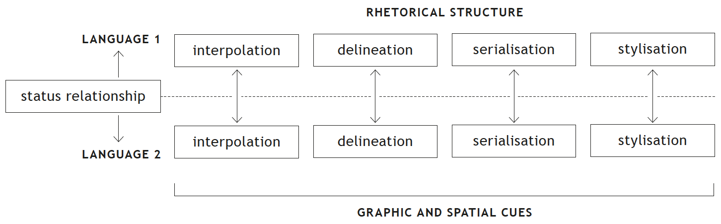
Graphic presentation in bilingual documents

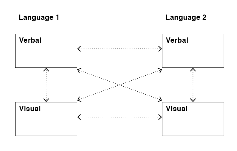
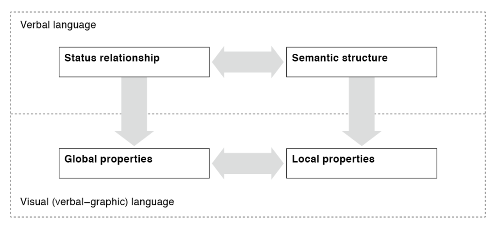
All of the issues discussed above are as relevant to bilingual documents as they are to monolingual ones. However, the theories above have yet to be applied and further developed for bilingual documents. If we accept the above views of document design where we endow verbal content with a layer of graphic presentation that serves a rhetorical function, then this rhetorical complexity would be greatly amplified when more than one language or script coexist in the same document (figure 1).

Figure 1 A diagram showing the complexity of interactions between verbal and graphic language in bilingual information.

A heuristic for bilingual documents

A heuristic describes a systematic way to consider the key features of a problem, a term originally used by Aristotle (Schriver, 1999, p.272). The heuristic here attempts to unite considerations from the document producer (ie the client or commissioner of the project) and the document designer in engendering trust. The premise is that reader’s trust would be compromised if factors are not carefully considered. Seven levels of considerations are listed in this heuristic: (1) producer (2) script (3) user (4) context (5) genre (6) production and (7) content. Each of these considerations and the ways in which they are manifested in the graphic presentation of bilingual information will be discussed below. These considerations are not mutually exclusive but are interconnected.

Producer considerations

This concerns a document producer’s conscious decision to include or exclude a particular language, or to prioritise a certain language. The parity of status between two languages in a bilingual document may be influenced by three factors: political intentions, legal requirements, and the internal policy of an organisation.

The choice of including more than one language in a document is in itself an indication of inclusivity. However, the graphic relationship between the two languages would indicate whether there are status differences between them. Disparity in type size, weight, column width, colour, etc. might render one language more difficult to access and to read, resulting in mistrust.

Figure 2 Textual and visual parity was the aim for this spread from Laws of Hong Kong, describing the legal status of Chinese and English in Hong Kong as co-official languages. Note the difference in paragraph lengths in the two languages, the rather unconventional use of slanted Chinese characters, and the use of a bolder Heiti (equivalent of sans-serif). Original size 297 × 210 mm.

Script characteristics

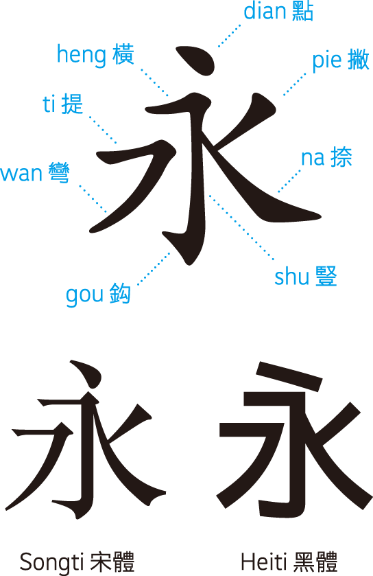
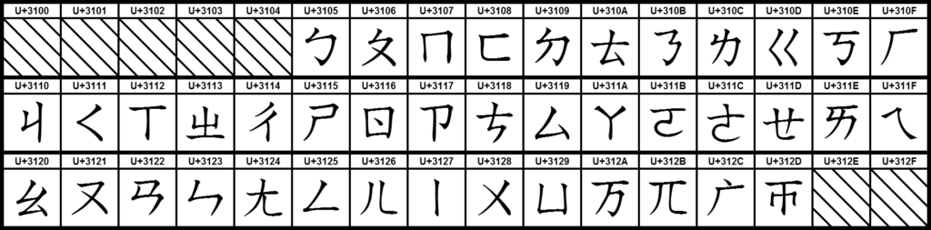
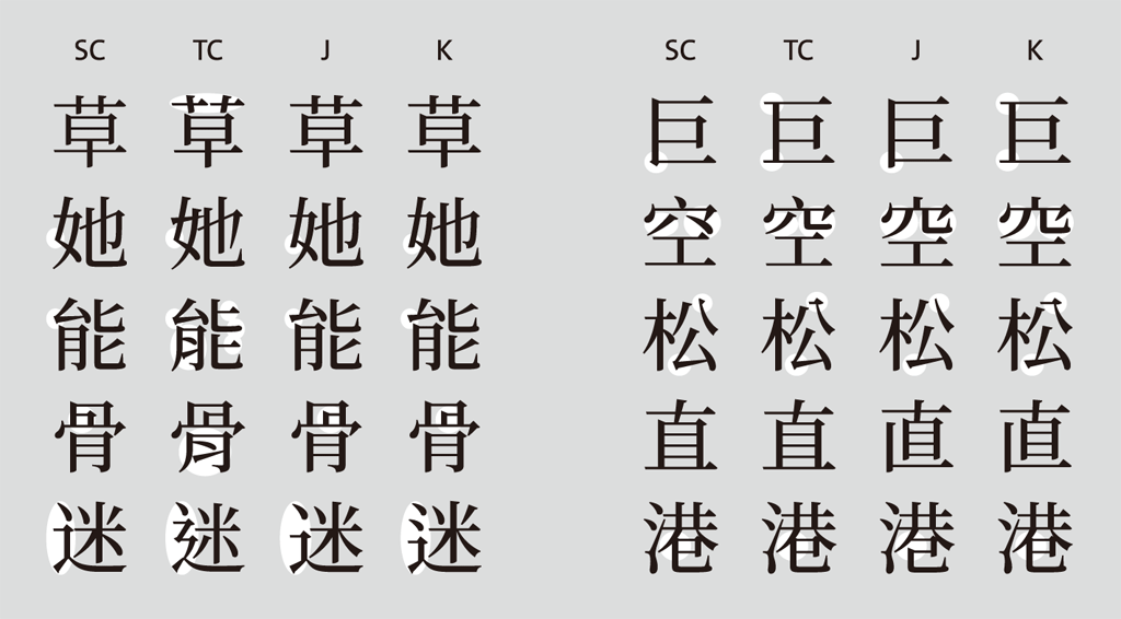
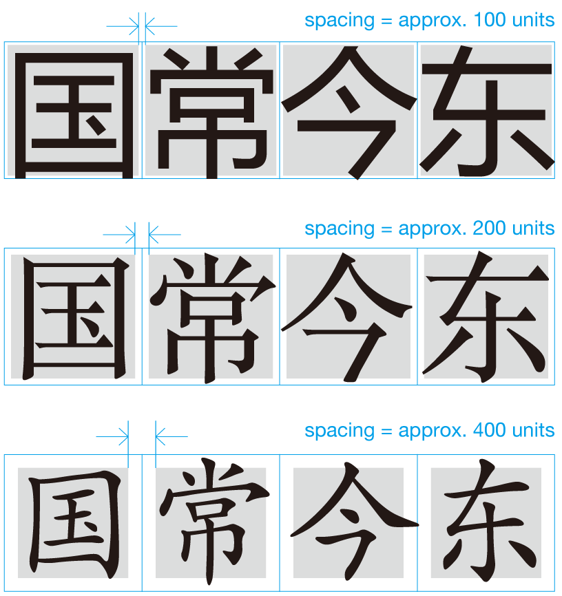
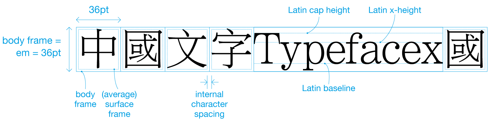
Script characteristics refer to the comparison of linguistic and visual features of two scripts . In the case of Chinese and English, they are divergent on both linguistic and visual levels. While English is an alphabetic language that uses 26 phonetic signs of the Latin alphabet to build words, Chinese is a logographic script where each character represents an idea as well as a sound. Words can be one to several characters long, but not separated by word spaces. Characters are made up of one to 64 individual strokes, making them vary widely in density. The number of Chinese characters currently documented in the GB 18030–2005 encoding standard is totalled at 70,244 characters (Lunde 2009: 86), though the frequently used character set is around 4,808 characters (Lunde 2009: 81).

The visual form of Chinese and Latin scripts are distinctly different. Chinese characters are mono-width, with each character occupying the full em square. There is no concept of baseline, and all characters are optically centred within the em square. When set in the same point size, Chinese text would appear visually larger and graphically more salient than Latin text. While English orthography calls for two variant forms of the alphabet, small and capital letters, Chinese orthography has no such equivalence.

Since the information density of Chinese characters is higher than that of English, the same passage of translated text in Chinese would take up less space than its English counterpart. In a study conducted by George Sadek and Maxim Zhukov, the Chinese translation of a selected English text was found to only require 61% of the area occupied by its English counterpart (Sadek and Zhukov 1997, p.3). This rather large difference in text extent can result in visual disparity on the page.

Figure 3 The areas that both the Chinese and English versions of the text are equal in this example. The Chinese text is set in a larger point size, and it seems that the character spacing has also been expanded in order to achieve this. Original size 410 × 274 mm (spread).

In view of these distinct differences, it is difficult to achieve linguistic and visual parity between Chinese and English. If the two scripts are intended to be perceived as equal in status, careful graphic and spatial considerations will have to be made in order to reconcile this disparity.

Figure 4 A self-addressed reply envelope for the Hong Kong Census in 2011, showing the address of the government department in English and Traditional Chinese. Each language follows their respective conventions. The Chinese is set vertically, with the address lines in a different order from the English (region, district, street name, street number, building name, floor number, department name, office name). It is interesting to note that Hongkong Post do not require letters to be addressed in both languages. Also, note that the building name has no Chinese equivalent, and is rotated 90 degrees within the vertically-set Chinese address. Original size 221 × 151 mm.

Reader considerations

Bilingual documents are designed for readers that represent more than one linguistic group. Readers may be monolinguals, who are only able to read in one of the languages used in the document. But they are also likely to be bilinguals who are able to read the other language to varying degrees, and have specific preferences for reading one language over the other. My speculation is that even monolingual readers would be influenced by the graphic presentation of content in the other language, because even when the reader cannot understand the text, they will be able to make comparisons between the visual cues or codes in the other language with that of his own language to understand its rhetorical structure, and interpret what that might mean. A disparity of graphical cues used to articulate the content structure of the two languages is likely to compromise trust, as cross-language comparison would be difficult.

Whether to integrate or separate the two languages graphically and spatially would influence not only the efficiency of information searching by readers with varying bilingual proficiencies, but their impressions of the document as well as genre associations (further discussions below). Further research is needed to verify this observation.

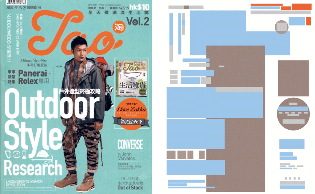
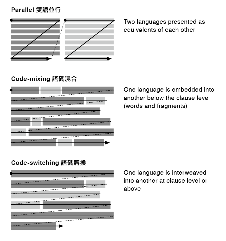
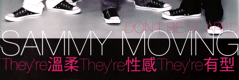
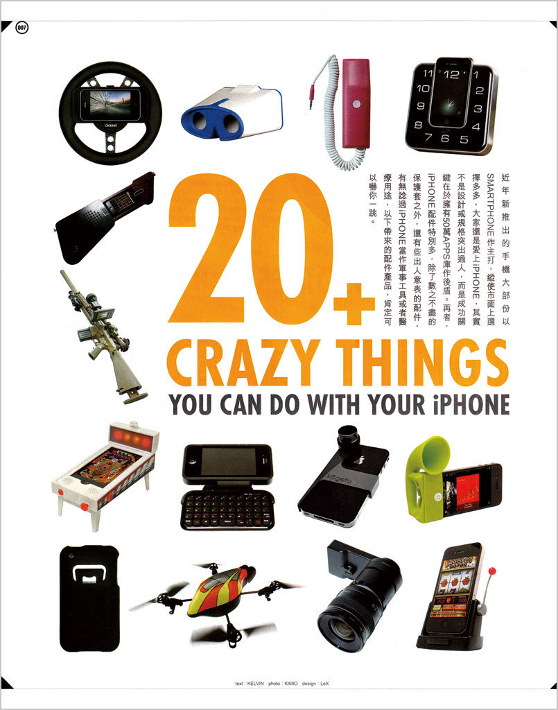
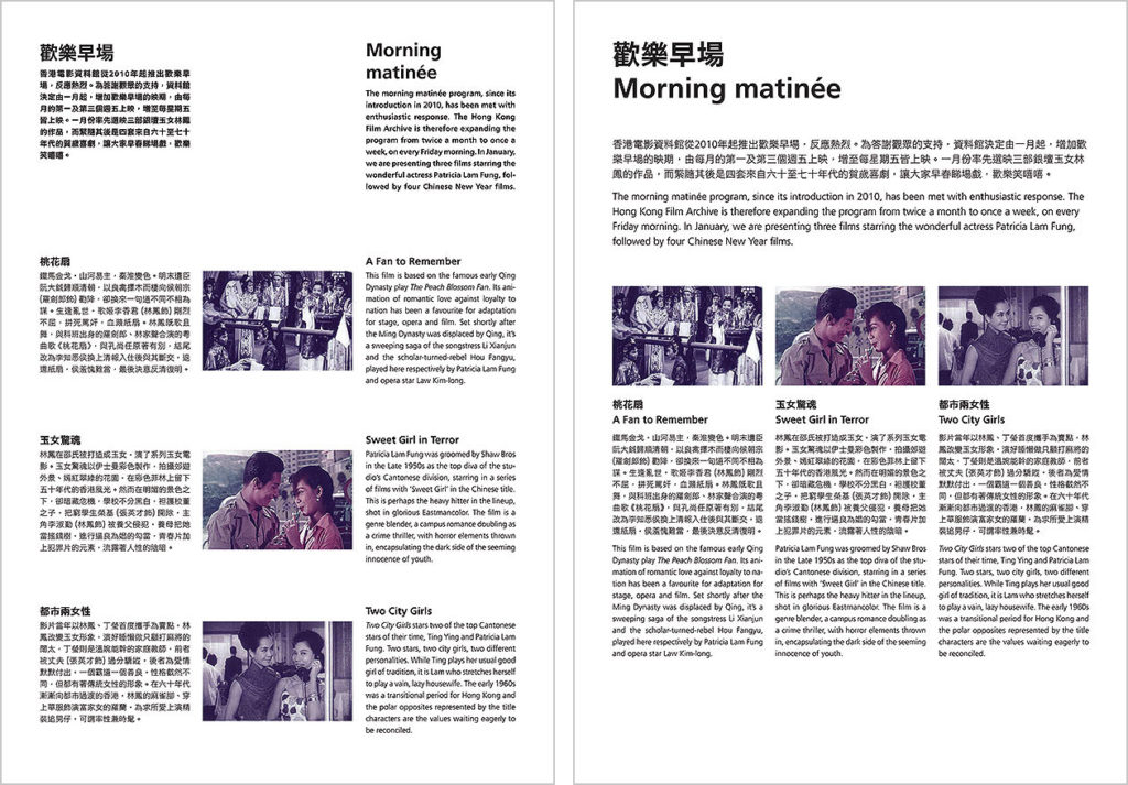
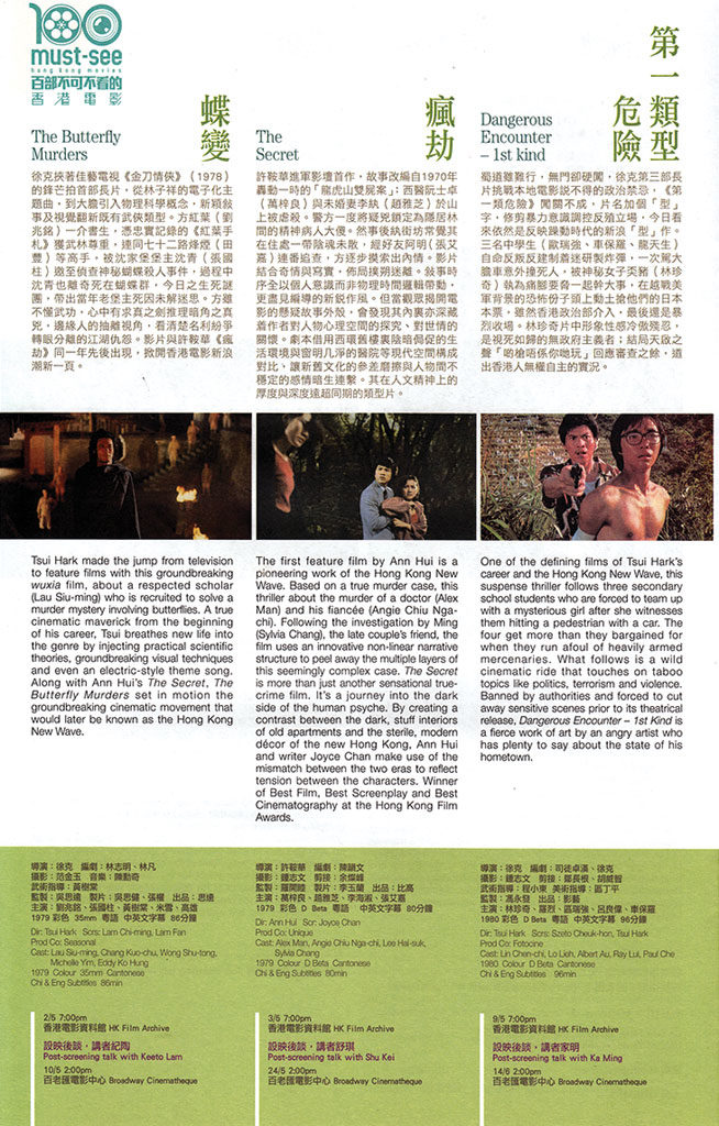
Whether to provide full parallel translations, partial or summary translations, or utilise ‘code-mixing’ or ‘code-switching’ (terms borrowed from linguistics) would depend on which linguistic groups a bilingual document is directed at. For example, while younger balanced bilinguals in Hong Kong would have no trouble reading a magazine that frequently inserts English words into a primarily Chinese text, or switch completely to English seemingly at random (figure 6), monolinguals would find this frustrating, as they cannot fully understand the content, creating mistrust.

Figure 5 While the English message of this old public sign consists of only two words, the Chinese text spans 35 characters, written as a rhyme. The smaller characters show the issuing department. The great textual and visual disparity would make the English monolingual reader feel that they are provided with incomplete information, weakening trust.
Figure 6 A magazine targeted at a young readership who are likely to be bilinguals. Code-mixing and code-switching are used throughout. Monolinguals would find this difficult to comprehend. It is interesting to note that most headlines are in English. Original size 212 × 271 mm.

Context considerations

‘Context of use’ refers to the situation where a document is used by the intended readers in order to achieve their desired goal. Different channels of delivery for documents, such as print, screen and environmental signage have different characteristics and constraints which would affect how bilingual information can be graphically presented. Different contexts of use also determine the conditions in which the document is used, such as reading time, distance, image quality, etc.

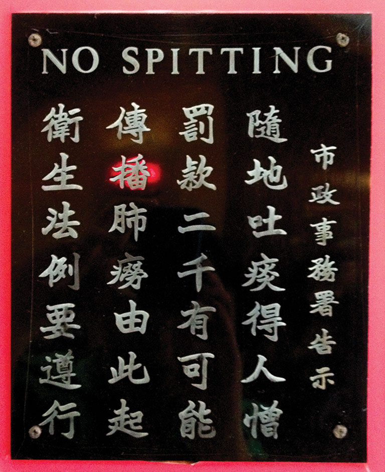
For example, bilingual road signage needs to be read quickly and from fair distances, and responded to in a timely fashion. Under these critical conditions, a disparity in status between the two languages (for example the two languages rendered in differing sizes or colour) would likely to disadvantage one language over the other, engendering mistrust as well as compromising safety.

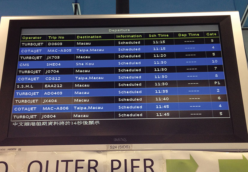
Another example would be displaying bilingual information on a small screen. The narrow width means that the two language would not be able to be put side by side, but forced to be stacked one after the other, or shown when an interaction is invoked. If cross-language comparison is an important criterion, this would become a serious constraint that could lead to mistrust. The stacking or sequential order of the two languages would also cause readers to lose track of the overall structure of the document, and create a disparity in status between the two languages.

Figure 7 This dynamic display at a ferry terminal shows one language at a time, with a note at the bottom of the screen telling readers that the Chinese version will be shown in 14 seconds. The constraints of the screen size and resolution do not allow both languages to be displayed on a single screen, but in a situation where time is of importance, this might compromise trust.

Genre considerations

Wallers’s concept of ‘typographic genre’ mentioned above (Waller 1992) refers to the combination of variables including spatial organisation, type size, typeface, typographic cues, page format, etc. that contribute to a genre’s convention. The conventions of document genres are rarely prescriptive. Some genres have more established conventions, for example the newspaper, and others less so, for example a pamphlet. This is most likely to be cultural and specific to different locales. For example, a Hong Kong newspaper would use a rather different set of conventions from a British newspaper.

In bilingual documents, genre conventions are less established. Several strategies are possible in the graphic presentation of bilingual documents: (1) genre conventions from one language may be ‘borrowed’ and adapted to the other language; (2) the two languages apply their own respective genre conventions and combined together; and (3) a compromise is made in an attempt to create visual parity. It could be argued that all three strategies would result in a third set of genre conventions that may or may not be recognisable to the monolingual or bilingual reader.

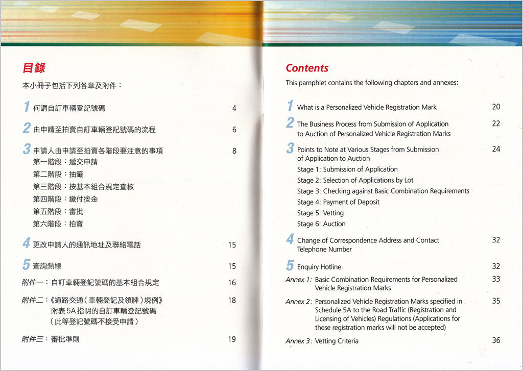
In a previous study with 16 participants who self-identify as balanced bilinguals (equally versed in reading English as they are in Traditional Chinese), Tam (2014) has found that participants showed hesitations when asked to name the genres that they associate with two pairs of bilingual documents, and acknowledged the influence of content when trying to associate the documents with genres. The range of named genres was wide, but there was a general trend to associate the layouts where Chinese and English are separate as ‘leaflet’ and where Chinese and English are integrated as ‘magazine’ (Tam, 2014, p.8) (figures 8a and 8b).

Figures 8a and 8b Participants tended to associate 8a as ‘leaflet’ and 8b as ‘magazine’ (Tam, 2014) Original size of study material 210 × 297 mm.

Content considerations

Content considerations are the most closely related to the graphic presentation of bilingual information. Graphical and spatial cueing of content is best understood by typographers and graphic designers as ‘information hierarchy’, but hierarchical structures are not the only way which various text components can be relate to each other, as we have seen in section 3.2 above. These functions or rhetorical relationships are articulated through the systematic use of graphic devices and spatial organisation, and have direct influence on how readers access the content of the document.

There are two access patterns for bilingual documents: (1) To prioritise the selection of language, then move onto the rhetorical structure within a language; and (2) To prioritise the overall rhetorical structure in both languages, then offer a choice of language in each rhetorical component. The first pattern spatially separates the two languages, while the second pattern integrates content from the two languages spatially. The integrated approach better supports cross-language comparison (figures 10). In a previous study (Tam 2014), it was found that while balanced bilinguals from Hong Kong exhibited no significant difference in their performance in information searching tasks in separate and integrated bilingual layouts, the participants responded to the integrated layouts more positively than the separate ones. Further research is needed to examine whether there are any differences between monolingual and bilingual readers of bilingual documents.

Figure 9 This document prioritises language selection, where Chinese and English are presented separately across a spread. The English version appears after the Chinese within the pamphlet. Note that there is intertextual and visual parity across the two language, with graphic and spatial cues consistently applied. Original size 292 × 210 mm (spread).

We have briefly looked at intertextual and visual parity as a principal concern in bilingual documents. This should be the aim whether the languages are separate or integrated. Content in both languages that belong to the same rhetorical component should use similar — if not identical — attributes for cueing the component, even when the scripts are very dissimilar. In my previous work (Tam, 2012) I developed a comparative descriptive framework for Chinese–English bilingual typography. In this framework, I made 76 comparisons between the graphical and spatial attributes that are commonly used to articulate Chinese and English text. The framework indicates that many of the graphical devices that are commonly used for articulating English (Latin script) text is simply not available in the Chinese script, or cannot be considered equivalents. However, spatial organisation or graphic devices that are extrinsic to the typeface (for example line rules, borders, colour, etc.) can successfully be used to delineate and group bilingual content into rhetorical clusters. The most salient graphical and spatial cues used to signal the overall rhetorical structure that are comparable across the two languages would benefit both monolingual and bilingual readers, engendering trust by making cross-language comparison accessible.

Figure 10a and 10b This bilingual document prioritises rhetorical structure through a consistent use of graphical and spatial cues to create intertextual and visual parity between Chinese and English. Original size 210 × 297 mm.

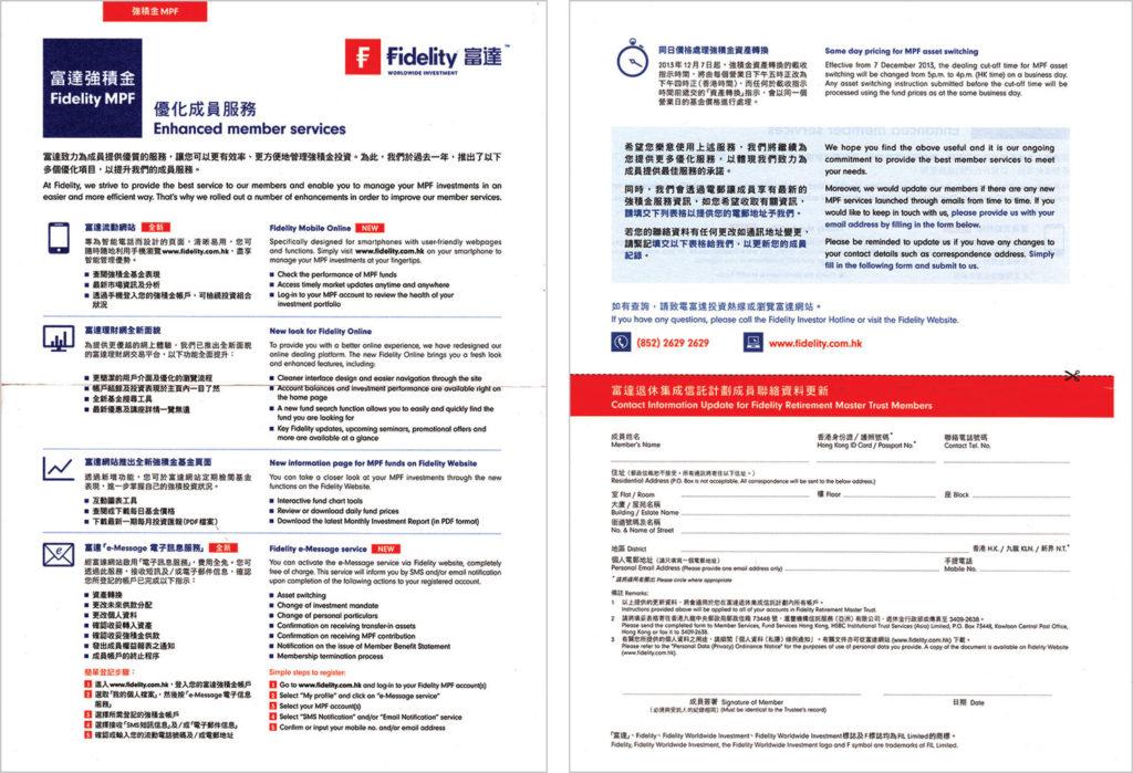
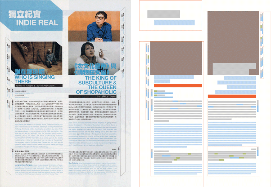
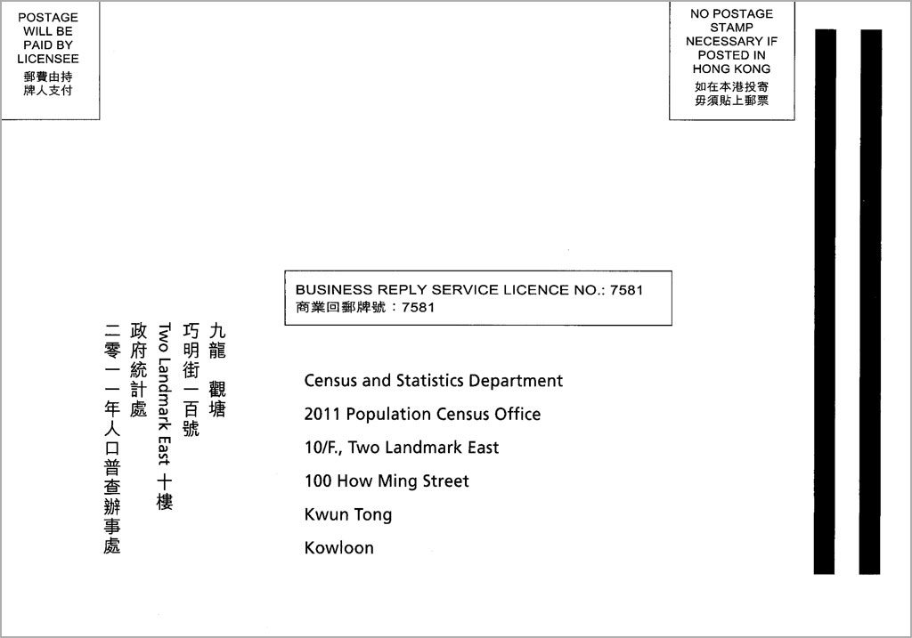
Elements that are shared between the two languages, for example images, numerals, dates, prices, checkboxes and text fields in forms etc., are often cues that signal the access structure of the document overall. The spatial arrangement of these shared elements and their relationship with content in each language is therefore crucial in information searching. Trust would be compromised when these shared elements cannot be used effectively for accessing the document (figures 12 and 13).

Figure 11 The relationship between different kinds of rhetorical functions of text across two languages. If the two languages are equal in status, the graphic and spatial cues that are used to differentiate the rhetorical structure would be similar in both languages. If the status relationship between the two languages are unequal, the graphic and spatial cues would show disparity across the two languages (adopted from Waller 1982).
Figure 12 The images are shared between Chinese and English, but their placements segregate the subheadings in English with the associated paragraphs, thus weakening the overall rhetorical structure. Original size 190 × 296 mm.
Figure 13 The checkboxes in this bilingual form are directly adjacent to the Chinese text, with the English text directly after it. The form design favours Chinese readers rather than English. Original full leaflet size 205 × 210 mm, detail is shown here.

Production considerations

Technical constraints can sometimes result in the lack of parity between the appearance of the two scripts in a bilingual document. This is more often a problem for two scripts that are very different (such as Chinese and English), but usually less of a problem when two languages share the same script. The visual disparity due to technical constraints may undermine the authority or credibility of the document due to a difference in formality between the two scripts, or when the two scripts exhibit differing genre attributes. Walker (2001) suggests that ‘it is sometimes the case that hand-made/machine-made is a factor in determining formality’ (Walker, 2001, p.43). When one script is rendered in machine or digital typesetting while the other handwriting, a visual disparity occurs that may lower the status of the handwritten script (figure 14).

Figure 14 A Chinese association newsletter in the UK showing Chinese text handwritten directly on camera-ready copy generated with desktop publishing software, then photocopied. The visual disparity caused by the lack of Chinese typesetting software at the time makes the Chinese text less formal than the English, undermining trust from the primary linguistic group that this document is intended for. Original size 297 × 210 mm.

The unavailability of translation, writing or typesetting expertise in a particular script may also lead to a disparity of textual and visual quality between two scripts, resulting mistrust between a certain language group and the document producer. ‘One motive for producing books in two languages is to increase the status of minority languages but ironically, inadequate attention to typography, translation and production values can sometimes mean that the minority language is perceived as being less important than the other.’ (Walker, 2001, p.49).
The availability of resources would also determine whether full, partial, or summary translations can be provided in a document. Partial or summary translations might communicate mistrust, as readers of the partially translated language might feel that their needs are not catered for.

Conclusion

The paper has put trust squarely at the centre of discussions on bilingual documents, analysing how intertextual and visual parity engenders trust through the graphic presentation of bilingual information. The paper has explored the notion of trust within the theoretical context of document design, or what can be termed as ‘user-centred information design’. It has presented a heuristic for typographic decision-making, how different levels of considerations are realised through graphic presentation strategies. I took a ‘broad stroke’ approach to the discussions, focussing on what can be called ‘macro-typography’. It is hoped that this paper will provide a theoretical foundation for further empirical investigations on the subject of bilingual document design.

References

Bateman, J. A. (2008) Multimodality and genre: a foundation for the systematic analysis of multimodal documents. Palgrave Macmillan, New York, USA.

Giffin, K. (1967) The contribution of studies of source credibility to a theory of interpersonal trust in the communication process. In Psychological Bulletin, volume 68, number 2, pp.104–120.

Lunde, K. (2009) CJKV information processing, 2nd edition. O’Rilley, Sebastopol, CA, USA.

Oxford Dictionary (n.d.) Definition of trust in English.
Available at <https://en.oxforddictionaries.com/definition/trust> [accessed 25 January 2017]

Sadek, G. and Maxim, Z. (1997) Typographia polyglotta: a comparative study in multilingual typesetting (2nd edition). Association Typographique Internationale, New York, USA.

Schriver, K. A. (1997) Dynamics in document design: creating texts for readers. John Wiley & Sons, New York, USA.

Tam, K. C. H. (2012) A descriptive framework for Chinese–English bilingual typography. In Typografische Monatsblätter 4 | 5 | 2012, pp.38–46.

Tam, K. (2014) Typographic cueing in bilingual documents: a pilot study. Department of Typography & Graphic Communication, University of Reading, UK (unpublished seminar paper).

Walker, S. (2001) Typography and language in everyday life: prescriptions and practices. Pearson Education, Harlow, UK.

Waller, R. (1982) Text as diagram: using typography to improve access and understanding. In Jonassen, D. H. (ed.), The technology of text: principles for structuring, designing and displaying text, pp.137–166.

Waller R. H. W. (1999) Making connections: typography layout and language. In proceedings of the 1999 autumn symposium, American Association for Artificial Intelligence. 

Waller, R. and Delin, J (2003) Cooperative brands: The importance of customer information for service brands. In Design Management Journal, volume 14, no. 4, pp.62–69.

Designing with the Hanzi script

Tam, K (2018) ‘Hanzi’, in Wittner, B; Thoma, S; Hartmann, T, eds. Bi-scriptual: typography and graphic design with multiple script systems. Salenstein, Switzerland: Niggli, 204–211

Download full text in PDF format

An introductory article to designing with the Hanzi (Chinese) script, discussing the characteristics of the script and typographic issues.

Background

The Chinese language is written in the Hanzi script, where Han refers to the dynasty (202 BC–220 AD) as well as the largest ethnic group in East Asia. Other languages also use subsets or variant forms of Hanzi: Kanji for Japanese, Hanja for Korean, and Chữ Nôm for Vietnamese. The origins of the Hanzi script date back to the Shang Dynasty (1600–1046BC), with inscriptions etched onto bones and animal shells used for divination. Hanzi is a logographic script, where each character represents a morpheme. The Hanzi script is made up of six kinds of characters known as liushu: pictographs, simple ideograms, compound ideographs, rebuses, phono-semantic compound characters, and derivative cognates. Each character represents one syllable, but pronunciation bears little relationship to the form of the character except in phono-semantic compounds, where pronunciation is imprecisely denoted. The Chinese language also consists of large numbers of homonyms – characters that share one pronunciation. The totalled number of Chinese characters currently documented in the GB18030–2005 encoding standard is 70,244, 4,808 of which are frequently used.

Figure 1 The eight types of strokes illustrated by the character yong in Kaiti, Songti and Heiti

Strokes are the most elemental building block of Chinese characters. The character yong (永) is used to illustrate the eight types of basic strokes in Chinese calligraphy [figure 1]. Strokes are used to construct a total of 213 radicals (部首). These are root characters that can either exist as individual characters, or combined to form composite characters. A word in Chinese can be made up of one to three characters, with an average word length of 1.5 characters. 55% of words comprise of one character, 40% of two characters, and 5% of three characters. There is no spatial separation between words; they can only be differentiated in context. 

There are eight main varieties of speech in China, often referred to as dialects rather than languages. Mandarin and Cantonese are the two that are most widely spoken. Mandarin was designated as the official form of Chinese in 1932 during the Republic of China era. Mandarin – called Putonghua (普通话) in Mainland China – is the official language on the Mainland, Taiwan and Singapore. While the majority of the population in Hong Kong and Macau speak Cantonese, they have been taught to write in a way that closely resembles Putonghua.

Hanoi Pinyin (汉语拼音or simply Pinyin) is a standard romanisation system for Putonghua. It was introduced after the establishment of the People’s Republic during the 1950s by Zhou Yonghuan (周永光). This system uses the Latin alphabet with four diacritical marks that denote the flat (macron ¯), rising (acute ´), falling (grave `) and falling-rising (caron ˇ) tones. Wade–Giles, Sin Wenz, and Yale are other romanisation systems, but are now largely superseded by Pinyin. Zhuyin (注音, also known as Bopomofo ㄅㄆㄇㄈ) is a phonetic notation system that uses 37 phonetic characters and four tone marks [figure 2]. This system is commonly used for teaching reading and writing in school books in Taiwan, but not used on the Mainland. 

Figure 2 The Zhuyin phonetic system used in Taiwan. Source: Wikimedia

There are two forms of Chinese orthography: Traditional Chinese (繁体中文) and Simplified Chinese (简体中文). Simplified Chinese characters were derived from the traditional forms by reducing the number of strokes, and were first proposed during the Republic of China era in 1935. The official set of Simplified Chinese characters was later expanded and then imposed by the government of the People’s Republic of China during the 1960s and went through several iterations. The current national standard consists of 8,150 characters. Simplified Chinese is the official script in Mainland China, and it is also used by Chinese diasporas in Malaysia, Singapore and other parts of the world. Traditional Chinese is used in Hong Kong, Macau and Taiwan, and in some overseas Chinese communities. A reader’s preference of one form over the other can be owed to his reading proficiency, habit, cultural propensity, or regional sentiment.In addition to Traditional and Simplified Chinese, further regional orthographic variations exist between Mainland China, Taiwan and Hong Kong. Kanji (Japanese) and Hanja (Korean) also have their own regional orthographic variations [figure 3].

Figure 3 Simplified Chinese, Traditional Chinese, Japanese and Korean regional variations of a selection of characters in Noto Serif.

Chinese text is traditionally written vertically from top to bottom, with lines running from right to left. Books and publications were almost exclusively printed vertically until the Republic of China era (1912–1949), foreign influences and bilingual publications encouraged the adoption of Western style horizontal typesetting. Since 1955, the Government of the People’s Republic of China has enforced horizontal setting for all printed matters. In Taiwan, Hong Kong and Macau however, both vertical and horizontal settings can be found.

The use of a soft, pointed brush for writing Hanzi characters dates back some 5,000 years ago. By varying the pressure applied, different thick–thin stroke transitions are achieved. Calligraphic scripts such as Bronze Script (金文) or Zhuanshu (篆书, zeal script) show less brush manipulations, with almost monolinear characteristics. Lishu (隶书, clerical script) shows more variations in pressure and finial treatments. Kaishu (楷书, standard script), Xingshu (行书, running script) and Caoshu (or grass script) display appreciably more sophisticated variations in stroke contrast and finial manipulations. [figure 4]

Figure 4a An example of Bronze Script, San Shi Pun (散氏盤), late Western Zhou dynasty. Source: Wikimedia
Figure 4b An example of Lishu script, from Cao Quan Bei (曹全碑), 185 AD. Source: Wikimedia
Figure 4c An example of Xingshu script, copy of the Preface to the Poems Composed at the Orchid Pavilion (蘭亭序) by Wang Xizhi (王羲之), 353 AD. Source: Wikimedia

The development of Kaishu in 219–265 [figure 5] paved the way for the subsequent development of standardised lettering styles used in woodblock and subsequently typefaces used in movable type printing. Kaishu reached its height during the Tang Dynasty (618–906). The work of four master calligraphers from the Tang Dynasty – Ou-yang Hsun (欧阳询), Yen Chen-ching (颜真卿), Liu Gong-chuen (柳公权) and Zhao Meng-fu (赵孟頫) – became archetypes, widely imitated as the major lettering styles for xylographic printing. Kaishu was the last development in the evolution of the Chinese script, and it has remained largely unchanged to this day.

Figure 5a An example of Kaishu by Liu Gongquan (柳公权), Xu Mi Ta Bei (玄秘塔碑) c841 AD. Source: Wikimedia
Figure 5b An example of Kaishu by Yen Zhenqing (顏真卿), Duo Bao Ta Bei (玄秘塔碑), Tang Dynasty. Source: Wikimedia

Xylographic (woodblock) printing was first developed during the Sui Dynasty around 1,400 years ago. At first, Kaishu was the style used for book production. The intricate curves of Kaishu soon proved to be inefficient for carving onto wood. A new style called Songti (宋体) evolved from Kaishu in order to speed up production [figure 6]. This style took the essence of Kaishu and regularised and standardised its features. The development of Songti reached maturation during the Ming Dynasty, hence the style is sometimes referred to as Mingti (明体) or Minchōtai (明朝体) in Japan. Songti was a development that signalled a typographic rather than calligraphic aesthetic to printing, later fuelled by the work of missionaries such as William Gamble, who brought the industrialised process of moveable type printing from the west in the late 19th century. 

Figure 6 A xylographic book page from a Ming Dynasty edition of the Book of Qi, printed with Songti. Source: Wikimedia

Punctuation has a long history in Chinese books, dating back to the Qin Dynasty (219–207 BC). These marks were originally added to text as a form of annotation to aid reading, between columns of vertically run text. These were once added by the reader by hand, and later printed with xylography, usually in second colour such as red. Punctuation was not standardised until the end of the Qing Dynasty towards the end of the 1920s, when Western punctuation marks were introduced. Until the end of the Republican era, punctuation was always interlinear rather than within the text flow (with the exception of quotation marks and brackets).

Anatomy and typography of Hanzi characters

Hanzi characters are customarily monowidth; they sit within a notional square. This is defined as the em square in typesetting, referred to as the ‘body frame’. Spacing between Chinese characters are defined internally within each glyph, with a margin within the body frame called the ‘surface frame’. The surface frame is often defined as percentages of the body frame. The larger this percentage, the more tightly spaced and the larger the typeface appears. If a typeface’s surface frame is 90%, given that the em square consists of 1000 units, the space between two characters would be 200 units [figure 7]. This data is usually not known to the user of typefaces and can only be judged by eye. Condensed typefaces such as most Fangsongti (仿宋体) appear very widely spaced on the body frame, whereas typefaces with small surface frames such as Kaiti often appear small compared with other typefaces of the point size [figure 8]. In the Hanzi script, all strokes and characters are centred optically within the body frame, and sized and aligned optically between each character. This makes it possible for most Chinese fonts to be set horizontally as well as vertically. 

Figure 7 The (average) surface frames and internal character spacing of Microsoft Ya Hei (top), ST Songti (middle) and ST Kaiti (bottom).
Figure 8 A comparison of Songti (top left), Heiti (top right), Kaiti (bottom left) and Fangsongti (bottom right). Note that the appearing size and spacing of the characters vary.

Type classification

Chinese typefaces can be broadly classified into four major categories: SongtiFangsongtiKaiti (Kaishu), and Heiti [figure 9]. These categories of typefaces are considered general purpose and conventional, most suitable for continuous text as well as display use. Typefaces that are outside of these four categories can generally be considered novelty display typefaces.

Figure 9 Top to bottom: Four major categories of Hanzi typefaces: Songti, Fangsong, Kaiti and Heiti

Kaiti (楷体) is a calligraphic typestyle that closely follow the style of Kaishu (楷书). All strokes are made up of curves, with no orthogonal lines. Conveying traditionalism, this style is conventionally used for correspondence, business cards or invitations, suggesting formality. It is also often used for Children’s readers or textbooks, because it most closely resembles handwritten forms. Kaiti may be preferred by elderly readers, but can sometimes appear too traditional, and may slow down reading if used in long texts. 

Songti (宋体) is the most ubiquitous category of typefaces for continuous reading. Its modulated stroke contrast and emphasised stroke terminals can make it comparable to Latin seriffed typefaces. It is also sometimes called Mingti (明体) in Chinese, especially in Taiwan and Hong Kong. Songti has a literary quality that works well for both text and display use. 

Fangsongti (仿宋体) was a style developed for interlinear notes in small sizes in xylographic printing during the Song Dynasty. The stroke contrast is low, with condensed proportions and often very light stroke weights. Fansong typefaces are usually very light in weight, therefore unsuitable for lengthy continuous reading, especially in small sizes. Its condensed proportions make it suitable for vertical setting.

Heiti (黑体) appears to be the most contemporary style amongst the four major categories. It is most similar to monolinear sans serif Latin typefaces. During the letterpress era, Heiti was used for display purposes or as emphasis within continuous text, and was only available in medium or bold weights. Much wider ranges of weights are now available, and they are popular for continuous reading as well as display use in contemporary graphic design.

Reading direction

Vertical setting is suitable for continuous, immersive reading, often associated with literary works. When vertical setting is used in a publication, binding is always on the right with the fore-edge on the left. Horizontal setting is often more suitable for complex content structures and publications that are designed to be read selectively or consulted. For parallel bilingual texts, horizontal setting is often more convenient for both the designer and the reader.

Alignment and justification

Continuous prose in Chinese is customarily set justified. The fact that Chinese characters are monowidth makes flush left, ragged right alignment impractical. Flush left alignment can only be achieved satisfactorily when line breaks are manually forced. Column widths should be defined as multiples of the point size of the text in order for the spacing to be optimal as defined by the type designer [figure 10]. Chinese justification and spacing rules should be used to ensure good spacing.

Figure 10 Chinese typesetting is based on a character grid set on multiples of the point size of the body text.

Punctuation

Chinese punctuation marks usually occupy the space of a full em square. However, the space around punctuation can be flexibly reduced to improve spacing. Larger display or short texts usually benefit from reducing the spacing around punctuation to half-width [figure 11]. There are two types of Chinese punctuation marks [figure 12]. In simplified Chinese fonts, punctuation normally sit near the bottom of the em square, aligned to the left (except the dash, ellipses and brackets). Punctuation in Traditional Chinese fonts are centred within the em square, making them function for both horizontal and vertical setting. Note that the single and double quotation marks are different in these two kinds of punctuation. Line-beginning and line-ending rules for punctuation should always be observed [figure 13]. Mainland China and Taiwan have separate guidelines for punctuation usage. These should be consulted when designing for different locales.

Figure 11 By using half-width quotation marks and angled brackets (work title marks) in the bottom line, five full character spaces have been saved, and the text appears more coherent and aesthetically pleasing.
Figure 12 Traditional and Simplified Chinese fonts come with different sets of punctuation which are positioned differently within the body frame. Note that Simplified Chinese uses English style quotation marks.
Figure 13 Certain punctuation should not fall at the beginning or the end of a line of Chinese text.

Line spacing (leading)

Ascenders and descenders in Latin text make it require relatively less line spacing compared to Chinese. For Chinese typesetting, a line space of at least half an em (half the point size of the text) is recommended, so that lines of text can be clearly differentiated. For example, for a type size of 10 point, the line spacing (leading) should be at least 15 point. The gap between two lines of type is hence half an em, 5 point.

Signalling new paragraphs

In Chinese text, new paragraphs are usually signalled by using first-line indents. Traditionally, this indent is two-em wide. A blank line may also be used between paragraphs when a larger break is required. When the column width is narrow, a one-em first-line indent may be used instead. 

Comparison between Hanzi and Latin scripts

From both linguistic and visual points of view, Hanzi and Latin are at the polar opposites of the spectrum. While the Latin alphabet is made up of 26 letters in lower- and uppercase with simple, somewhat modular strokes and shapes, Hanzi is an open system consisting of tens of thousands of characters which are much more complex in form and construction. Hanzi characters do not have obvious alignment references such as baseline, x-height or cap-height as in the Latin script. This makes alignment with Latin or other scripts slightly inconvenient. [figure 14]

Figure 14 A comparison of the anatomy of Chinese and Latin characters.

Hanzi characters occupy the em square quite fully and, without such components as ascenders and descenders, appear to be much larger than Latin letters, given the same point size. Judicious adjustments should be made in order to make both scripts work well together, not compromising legibility.

No two Hanzi characters are absolutely the same width, height and proportion in the same typeface, as the profiles and structure of individual characters vary greatly. But on average they are optically equal in height and in width. They are comparable to uppercase Latin letters, which are of equal height. As the Hanzi script has no casing, it is rather difficult to compare Latin lowercase letters with Hanzi. The x-height would be a key reference for size matching and alignment. 

The lack of any variant forms in Hanzi typefaces that are comparable to upper- and lowercase, small caps, italic make text articulation different in the Hanzi script. Other variables such as colour, weight, size, change of typeface and use of graphic devices will have to be used instead to signal text structure or differentiation. The lack of word spaces make Hanzi and Latin quite different in texture in a passage of text. Punctuation provide the only breaks in reading a passage of Hanzi text. 

It would be difficult to compare the styles of characters between Latin and Hanzi, as their historical developments took completely different courses. However, both Latin and Hanzi have typefaces with modulated and modulated stroke contrast. Songti and seriffed typefaces have modulated stroke contrast and are considered similar in form and construction, though the logic and features are different, with Latin based on calligraphy with broad-edge and flexible pointed writing tools, while Hanzi is based on manipulations of the brush. Heiti and sans serif share obvious similarities with little stroke contrast. Obviously calligraphic typefaces such as Lishu and English Roundhand for example would share little similarity, if at all.

Considerations when combining Hanzi with Latin

Text extent

A passage translated from English into Chinese is usually shorter. In a study conducted by George Sadek Maxim Zhukov in 1997, the Chinese translation of a selected English text is found to only require 61% of the area occupied by the English counterpart. This rather large difference in text lengths can create a difference in visual effect on the page. If the two scripts are intended to be given equal status, careful layout and typographic considerations have to be made in order to create visual parity. 

Type size

The anatomical differences between Chinese and Latin characters make them appear different in size even when they are both set in the same point size. Chinese characters appear larger, as they occupy the em square more fully than Latin characters. Latin typefaces with large x-heights and relatively shorter ascenders and descenders tend to match better with Hanzi characters. The type size and baseline of Latin type may be adjusted in relation to the Chinese typeface used so that they are better harmonised visually. Common type sizes for body text in modern Chinese typesetting is between 9 and 12 points, which is similar to typesetting in Latin-based languages. The most common size for Chinese body text in lead type used to be 10.5 point. Xylographic books used much larger character sizes still, around 1cm square. Due to the shear stroke densities of Chinese characters, it is important that the size of Chinese text is not so small that reading comfort and legibility is compromised.

Weight and density

Chinese characters can have anywhere between one to 64 strokes, making their densities vary quite considerably. A page of Chinese text can appear spotty compared with the even grey value in Latin script. This variation in density is natural and aids legibility, though poorer quality typefaces would appear rather spottier. Many Chinese typefaces offer a range of weights. Differences in weight is achieved by varying the average stroke widths in relation to characters with varying stroke densities, so that a reasonably consistent overall visual weight is achieved. When matching weights between Latin and Chinese typefaces, look for an approximate equivalence of overall density rather than an absolute match of stroke widths. Very heavy weights of Chinese typefaces should be avoided for small sizes, as the small counters tend to be filled in, hindering legibility.

Inserting Latin characters within a Hanzi text

When inserting Latin characters within a Hanzi text, it would be helpful if a more condensed Latin typeface is used, as words in Latin-based languages tend span longer than several Hanzi characters. Latin characters that are too wide would disrupt the overall spacing. Spacing between Latin letters and Hanzi characters often need to be adjusted in order to appear visually balanced. A word space would be too large; a space of the width of one-eighth of an em would usually suffice. [figure 15]

Figure 15 Xin Gothic has rather condensed Latin glyphs and a moderately large x-height. A space of one-eighths of an em gives an appropriate distance between the Latin and Hanzi glyphs.

A few points to note when designing with Hanzi

  1. Alignment of Hanzi characters are based on the centre line, with no precise references such as the baseline in Latin letters. It is normal that very few parts of adjacent characters line up, if at all – this is how it should be. Do not try to force elements to align.
  2. Optimal spacing in Hanzi text is achieved by having a column width that is precisely the width of the point size of the text multiplied by the number of characters desired in a line.
  3. Hanzi text is customarily set justified. If flush left, ragged right is desired, manual line breaks would be necessary, and this should be done by someone who knows the language.
  4. Hanzi requires more generous leading compared with Latin text. A leading of 1.5 times of the text size is the minimum.
  5. The grey values of Traditional and Simplified Chinese text can be quite different due to the difference in complexity of the characters, and more different still when compared with Latin text. Comparing overall densities rather than exact stroke widths would be more useful. Latin typefaces with larger x-heights tend to harmonise better with Hanzi text.
  6. Since Hanzi characters can be very dense, a slightly larger body text size is usually advisable. 10 point is a good starting point. 8 point or below would be arduous to read.
  7. Some Chinese and Latin punctuation marks are very similar, especially comma, colon, semicolon, dashes, ellipses, and parentheses. Check that proportional-width punctuation is not used within a Chinese text. 
  8. Use lining figures where there are Arabic numerals within Chinese text. 

Further reading

Heijdra, Martin J. (2004). The development of modern typography in East Asia, 1850–2000. The East Asian Library Journal 11, no. 2. 100–168.

Minick, Scott and Ping, Jiao (1990). Chinese graphic design in the twentieth century. London: Thames and Hudson.

Takagi, Mariko (2014) Hanzigraphy: a typographic translation between Latin letters and Chinese characters. Hong Kong: MCCM Creations.

Tam, Keith (2012). ‘A descriptive framework for Chinese–English bilingual typography’ in Typographische Monatsblätter, 4 | 5 | 2012, 38–46

Typographische Monatsblätter, 4 | 5 | 2012

Xiaofeng Wang 王小枫(2013). 中西文字并排设计 [Chinese & Latin typography]. Dalian, China: Dalian University of Technology Press.

Adobe, Arphic, DynaComware, Founder Type, Hanyi Fonts, Monotype, Sinotype

A descriptive framework for Chinese–English bilingual typography

Tam, K C H (2012). ‘A descriptive framework for Chinese–English bilingual typography’ in Typographische Monatsblätter, 4 | 5 | 2012, 38–46

Download full text in PDF format

Abstract
This article introduces and discusses a comparative descriptive framework for Chinese–English bilingual typography. Using representative examples of Chinese–English typography from Hong Kong as case studies, a comparative descriptive framework that systematically describes and compares typographic attributes of the Chinese and English languages has been developed. Drawing from linguistics as well as typography theory, this comparative descriptive framework provides an important theoretical basis for the study of multilingual typography. The framework may be used to describe all possible situations in which the two languages coexist, breaking down each attribute and putting them into meaningful groupings. The framework consists of 76 attribute comparisons organised in two main classes (graphic and spatial) and 11 sub-groupings.

Analyses of two bilingual magazine layouts: light blue indicates Chinese, light grey English, dark grey images, orange shared elements and orange bounding boxes show how the information is nested.

Introduction

Typography can be thought of as a ‘metalanguage’ – a visual language that encodes verbal language itself. The term ‘verbal–graphic language’ (Twyman 1979) refers to this conception of typography. One could argue that any instance of typography is already ‘bilingual’, in the sense that verbal and visual languages are combined to form an integrated whole. When two or more verbal languages are represented in typographic communication, the interaction between the visual and the verbal is amplified (figure 1). A variety of complex issues arise on syntactic, semantic as well as pragmatic levels (Morris 1971).

Figure 1 The interaction between the verbal and visual aspects of two languages

My academic endeavours in bilingual typography are focused on Chinese–English bilingualism, specifically in the Hong Kong context. However, the framework presented here might be applicable to other languages as well, although specific graphic and spatial attributes would vary.

The Hong Kong context

Hong Kong is a Special Administrative Region of China, located at the south coast of the country. After the signing of the Treaty of Nanking between Great Britain and the Qing Dynasty government in 1842, Hong Kong was ceded to the British as a colony. English has been an official language of Hong Kong since then. However, it was not until 1974, after a series of anti-colonial riots that Chinese was elevated to the status of a co-official language along with English. The nature of bilingualism has evolved throughout the history of Hong Kong’s development, from diglossia with minimal bilingualism to bilingualism being widely incorporated into vernacular usage amongst the general population in recent decades. After the handover of Hong Kong’s sovereignty to the People’s Republic of China in 1997, English and Chinese remain official languages, although Chinese has gained increased importance in official as well as informal domains. 

Traditional Chinese is the written form commonly used in Hong Kong, and Cantonese is spoken by the majority of the population. Simplified characters and spoken Putonghua (Mandarin) used in mainland China, have become more common in Hong Kong after the handover.

Types of bilingualism

The following three types of bilingualism are commonly found in Hong Kong (figure 2):

Figure 2 Types of bilingualism commonly found in Hong Kong

Parallel is where two languages are presented as equivalents to each other. Code-mixing is where one language is embedded into another below the clause level (words and short fragments). Code-switching is where one language is interweaved into another at clause level or above.

Parallel

Parallel bilingualism is the most common of the three. In Hong Kong parallel bilingualism is sometimes a legal requirement, an attempt to assign equal status to the languages in question, or to provide precise cross referencing between the languages. While on a textual level both languages may assume equal status, this may or may not be apparent when it is visually designed (figure 3).

Figure 3 An example of parallel bilingualism

Code-mixing

Code-mixing is where single words or short fragments of a second language are interspersed into the dominant language (figure 4 & 5). Code-mixing happens when partial translation is required, when providing clarification or translation for certain words such as specialised terms, or when phonetic transliteration is needed in a different script. In Hong Kong, code-mixing is also found in informal speech and popular print media, especially in recent years, where English words are interspersed within a primarily Chinese text, while still observing Chinese syntax. Motivations for code-mixing of this kind vary. Code-mixing may be used when it is difficult to find Chinese equivalents for certain English words. It may also serve to indicate status and cultural background, or act as emotional buffers (Li 1996).

Figures 4 and 5 Examples of code-mixing

Code-switching

Code-switching refers to the insertion of entire clauses, sentences or paragraphs of a second language into the dominant language (figure 6). One has to be well-versed in both languages in order to understand the full meaning of the text, since vis-à-vis translation is not the intention. This type of bilingualism has been gaining in popularity in recent years. Some linguists do not differentiate between code-mixing and code-switching, as the two are functionally similar. However, I believe that this differentiation is needed, especially in the context of Hong Kong. 

The context of use of a piece of typographic communication would dictate which type of bilingualism is the most appropriate. The three types of bilingualism may also occur simultaneously, as is often the case in complex documents. All three types relate to the status relationship between the two languages as well as their semantic structures on a textual level.

Figure 6 An example of code-switching

A comparative descriptive framework

At the outset of my research, it became apparent that a framework was needed for describing all of the available attributes that can be applied to textual content in the two languages in question. These variables may be applied in typographic designs with the intention of establishing a ‘cueing system’, in order to optimise readers’ access to the information and their ability to understand the semantic structure of content in both languages. 

Similar to what translation does to verbal language, my intention was to find equivalents of graphic and spatial attributes that can be applied to both Chinese and English. Mapping these attributes according to their semantic values across the two languages help us understand which graphical and spatial cues are directly transferrable, which ones have no direct equivalents and which ones are similar but not exact counterparts of each other.

During my research process I came to a realisation that one should avoid subjective discussions of ‘visual harmony’, at least without first understanding what needs to be harmonised and how they should be harmonised. The idea of harmonisation – making two elements visual equivalents of each other – applies to the semantic and access structures of the textual information in both languages. Therefore, whether visual harmony is desirable highly depends on context.

The comparative descriptive framework is the result of collecting and analysing examples of Chinese–English bilingual typography from Hong Kong. It can be used to describe all possible situations in which the two languages coexist, breaking down each attribute and putting them into meaningful groupings. 76 attribute comparisons are organized in two main classes (graphic and spatial) and 11 sub-groupings organized in a matrix (figure 7). 

Figure 7 Comparative descriptive framework for Chinese–English bilingual typography

Of the 76 comparisons, 30 are directly transferrable between the Chinese and English (highlighted in pale yellow in the matrix). These attributes may be shared between the two languages and are not specific to the typographic conventions of the individual languages. 25 attributes are language-specific and have no equivalence in the other language (coloured light grey in the matrix). If these attributes are used, they will have to be replaced by other attributes in the other language. The remainder of the attributes have counterparts in the other language that are similar in semantic value but are not absolute equivalents.

Graphical attributes

The graphic attributes class includes intrinsic typographic transformations as well as extrinsic graphical devices that could be applied to the text itself. The sub-groupings are: (a) type style, (b) scale and measurement, (c) weight and density, (d) typographic variants, (e) typographic adornments and (f) graphical devices.

The most apparant difference between Chinese and English is that one is logographic while the other alphabetic. Their constructions and visual qualities are very distinct. This is reflected in the descriptive framework; many of the graphical attributes have no counterparts in the other language (17 in total).

Note that type style, typographic variants and typographic adornments are divided into separate sub-groupings. Although all three of these groups refer to the form of the letters or characters, there are essential semantic differences amongst them. For example, the type style sub-group refers to the classification of typefaces in the two languages. It is apparent that the historical evolution of these major styles of typefaces for the respective languages have taken separate courses. While there may be stylistic similarities between them, the two differ in their use and connotative meanings.

The typographic variants sub-group specify the inherent transformations that can be applied to the text. Most of these attributes have specific semantic values associated with them by convention. Here, italic is differentiated from oblique effect. While italic type is not used in conventional Chinese typography, one could artificially skew the characters to achieve a similar effect, but it would not have the same semantic value as conventional italic type in the English language, unless expressly specified. English has a number of such typographic variants that are not available in Chinese, which means that other attributes must be ‘borrowed’ in order to mimic the visual effect.

Typographic adornments are graphical marks and elements that can be ‘anchored’ into the text, for example paragraph rules, underlining and emphasis marks. These are distinct from graphical devices, which are extrinsic to the text itself. Because graphical devices are extrinsic to the text, they are not rule-bound and are therefore more fluidly transferrable between the two languages. 

Spatial attributes

The spatial attributes class includes spatial organization, sequence, direction and grouping. The sub-groupings are: (a) spatial sequence, (b) configuration, (c) reading direction, (d) alignment and (e) spacing. This class mainly concerns spatial attributes, but time is also implied by nature.

The spatial attributes are applicable to both the macro and the micro, whereas the graphical attributes are only relevant to the micro. Compared with the graphical attributes, spatial attributes tend to be more transferrable between the two languages. These spatial attributes can be used to describe global properties that shape the overall status relationship and semantic structure, as well as information that is shared between the two languages and groupings of information.

The spatial sequence sub-group is concerned with the spatial arrangement of textual information and how it implies temporal sequencing in various situations. Vertical and horizontal sequences denote priority in the reading process. Sequences implied in positioning work in a similar manner. Application of graphical attributes such as scale, may also suggest the reading sequence. Linear sequences impose a controlled release of information, for example in a video or motion graphic sequence. Interaction may also reveal, hide or transform the textual information via direct manipulation of textual content from one language to another.

The configuration sub-group adopted and paraphrased from Michael Twyman’s ‘Schema for the study of graphic language’ (1979) refers to the ways in which text is organized graphically. These are potentially transferrable between the two languages.

With regards to reading direction, several of the attributes are bound by language-specific conventions. While Chinese can be read vertically, horizontally from left to right as well as right to left, English cannot. 

In terms of text block alignment, although both Chinese and English text can be set justified or flush left, justified setting is the most natural for Chinese as the characters are monospaced, while flush left is most natural for English.

Global and local properties

A certain amount of sensitivity and discipline is desirable for any cross-cultural typographic designers when designing complex multilingual documents. Judicious application of these attributes would ensure coherent and accessible designs. The terms ‘global properties’ and ‘local properties’ are used here to group these attributes and allude to the encoding of textual content. ‘Global properties’ refers to a class of attributes that articulate the overall status relationship between the two languages. ‘Local properties’ refers to the attributes that articulate the semantic structure of each individual language. Figure 8 illustrates the interaction between these properties on the verbal and visual levels.

Figure 8 A diagram that illustrates the interaction between the verbal and visual aspects of bilingual documents

Conclusion and future directions

Typography is the only means through which verbal language is visually manifested; the typographer is endowed with the capacity to mediate and transform textual content. In multilingual typography this mediation or transformation process is ever more crucial. The partnership between the originators of the textual content and typographic designers become highly critical. 

Further investigation in multilingual typography that may emerge from this comparative descriptive framework presented here may include issues of performance or usability in various contexts of use, such as language education; aesthetic concerns; cultural conventions and cross-cultural hybridity; or semantic markup of multilingual dynamic textual content, amongst others.

The comparative descriptive framework also has the potential to be expanded to include other kinds of attributes and comparisons, for example temporal and interactive attributes. This framework may also be adapted for comparing other languages or for more than two languages. 

To graphic designers working in one language, typography might not involve much more than the shaping the visual appearance of text for the proverbial ‘clarity’ and aesthetic enjoyment. Consequently, discussions on typographic matters often centre on syntactical aspects. When working with two or more languages, however, additional factors have to be taken into consideration. In my research, I endeavour to examine typography through the lens of information design. The perspective that I have presented here is not intended to be didactic nor prescriptive, but to provide a common language that will transpire further discussion on multilingual typography of a more critical nature.

References

Li, David C S (1996) Issues in bilingualism and biculturalism: a Hong Kong case study. New York: Peter Lang Publishing

盧丹懷著(2005)《香港雙語現象探索》。香港: 三聯書店 (香港) 有限公司

Morris, Charles W (1972) Writings on the general theory of signs. The Hague: Mouton

Pennington, Martha C ed. (1998) Language in Hong Kong at century’s end. Hong Kong: Hong Kong University Press

Twyman, Michael (1979) ‘Schema for the study of graphic language’ in Kolers, Paul A et. al., eds. Processing of visible language, Volume 1. New York: Plenum Press, 117–150

Walker, Sue (2001) Typography and language in everyday life: prescriptions and practices. Essex, UK: Pearson Education