Tam, K (2017). ‘Trust in Chinese–English bilingual documents: a heuristic for typographic decision-making’. Typography Day Sri Lanka 2017 conference proceedings. Katubedda, Sri Lanka: University of Moratuwa.
Download full text in PDF format
Abstract
This paper explores the notion of trust in bilingual documents. A heuristic is presented, examining various levels of decision-making carried out by the producer and designer of a bilingual document that will influence the perception of trust on the reader’s part. The seven interrelated considerations are (1) producer (2) script (3) reader (4) context (5) genre (6) content (7) production. Although some of these decisions are purely strategic and invisible to the reader, this paper argues that they can always be inferred in a bilingual document’s graphic presentation. Decisions on graphic presentation work across all seven levels of consideration, establishing the status relationship between two languages as well as providing cues for readers to access a document’s rhetorical structure in myriad ways. Examples of Chinese–English bilingual documents from Hong Kong are used to illustrate the discussions. The heuristic aims to promote further discussions and research on bilingual document design issues as well as to guide practice.
Document
What is a document?
The term ‘document’ is used in this paper to consciously align with what can be termed as the ‘rhetorical tradition’ of writing and graphic design: that the primary function of a designer is to serve the needs of the intended audience or user (Schriver, 1997, p.59). In this paper, a ‘document’ is defined as a physical or digital artefact that contains text, images or other elements, produced for the purposeful communication to specific groups of users for a specific context of use. The term ‘typography’ or ‘graphic design’ have deliberately been avoided, as they are often ambiguous and prone to misinterpretation. The focus of the discussions here is goal-oriented communication rather than visual expression.
Designing for strategic reading
The kinds of document that this paper examines can be classified as of the ‘reading to do’ variety: reading with the intention to perform a task (Schriver, 1999, p.209). They are designed for ‘strategic reading’ – reading in a non-linear fashion involving active reading and rereading, scanning, skimming, and searching (Pugh, 1973) – so that readers can easily find what is relevant to them. This mode of reading is selective, meaning that the content is likely to be broken down into many different components, cued visually through typography and layout, so as to facilitate information searching. One could argue that the reading mode of bilingual documents are always strategic or selective, as there are always two language options available to the reader, regardless of genre or structural complexity.
Trust
What is trust?
According to the Oxford Dictionary (n.d.), ‘trust’ is defined as: a ‘firm belief in the reliability, truth, or ability of someone or something’. Trust is a quality that describes the relationship between two entities. In establishing a theory of interpersonal trust in the communication process, communication theorist Kim Giffin provides a formal definition of trust: ‘reliance upon the characteristics of an object, or the occurrence of an event, or the behaviour of a person in order to achieve a desired but uncertain objective in a risky situation’ (Giffin, 1967, p.105).
Trust in documents
Waller and Delin (2003) use the term ‘cooperative document’ to describe documents that form a two-way interaction between an organisation and its customer. In documents, trust is established through its content, graphic presentation, as well as material quality. The degree to which a reader relies on a document based on its visual characteristics falls under the remit of a document designer, since his primary concern is to assist readers in achieving their objectives. In documents that include more than one language or script, uncertainty and risk come into play: the needs of two or more groups of readers with different linguistic abilities will need to be duly addressed, or communication would be obfuscated, engendering mistrust.
Trust in bilingual documents: intertextual and visual parity
I propose that trust in bilingual documents is principally concerned with intertextual parity, achieved through visual parity in the graphic presentation. Intertextual parity in bilingual documents can be understood from two angles: (1) the connectedness between the various text components within one language; and (2) the cross-language textual and visual coherence and consistency of the text components. The status relationship between the two languages is the main factor which affects this parity.
Graphic presentation of bilingual documents
Graphical and spatial cues
The primary function of the graphic presentation of textual content is to articulate the text in order to make meanings clear to readers. Graphical devices and spatial organisation are used to achieve this (Walker, 2001, p.11). Typographic attributes such as typeface, type size, colour, etc., as well as spatial organisation are used to visually code and cue various components of a text, so that the reader is able to understand the relationship between these components and to navigate between them.
Rhetorical functions
Bateman (2008) describes the concept of ‘rhetorical structure’ in his genre and multimodality framework as: ‘the rhetorical relationships between content elements: ie, how the content is “argued”, divided into main material and supporting material, and structured rhetorically.’ (Bateman, 2008, p.19)
Waller (1982) suggests that typography is a form of ‘macro-punctuation’ with four essential functions: interpolation (insertion of cross-references); delineation (marking where a unit of text begins and ends); serialisation (sequences and structures); and stylisation (indication of different voices, genres, or modes of discourse that deviate from the main argument) (Waller, 1982, p.151–158, paraphrased).
Typographic genres
Waller has argued that there are ‘typographic genres’ that originally arose out of design imperatives that were once functional, but have now become resources that document designers can draw from ‘to signal the genre of a document, and trigger appropriate expectations, interpretations and strategies amongst its users’ (Waller 1999).
Graphic presentation in bilingual documents
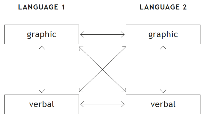
All of the issues discussed above are as relevant to bilingual documents as they are to monolingual ones. However, the theories above have yet to be applied and further developed for bilingual documents. If we accept the above views of document design where we endow verbal content with a layer of graphic presentation that serves a rhetorical function, then this rhetorical complexity would be greatly amplified when more than one language or script coexist in the same document (figure 1).
A heuristic for bilingual documents
A heuristic describes a systematic way to consider the key features of a problem, a term originally used by Aristotle (Schriver, 1999, p.272). The heuristic here attempts to unite considerations from the document producer (ie the client or commissioner of the project) and the document designer in engendering trust. The premise is that reader’s trust would be compromised if factors are not carefully considered. Seven levels of considerations are listed in this heuristic: (1) producer (2) script (3) user (4) context (5) genre (6) production and (7) content. Each of these considerations and the ways in which they are manifested in the graphic presentation of bilingual information will be discussed below. These considerations are not mutually exclusive but are interconnected.
Producer considerations
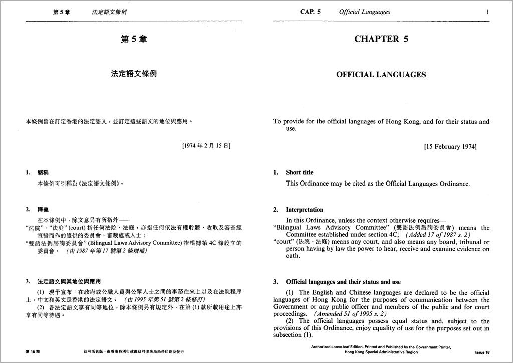
This concerns a document producer’s conscious decision to include or exclude a particular language, or to prioritise a certain language. The parity of status between two languages in a bilingual document may be influenced by three factors: political intentions, legal requirements, and the internal policy of an organisation.
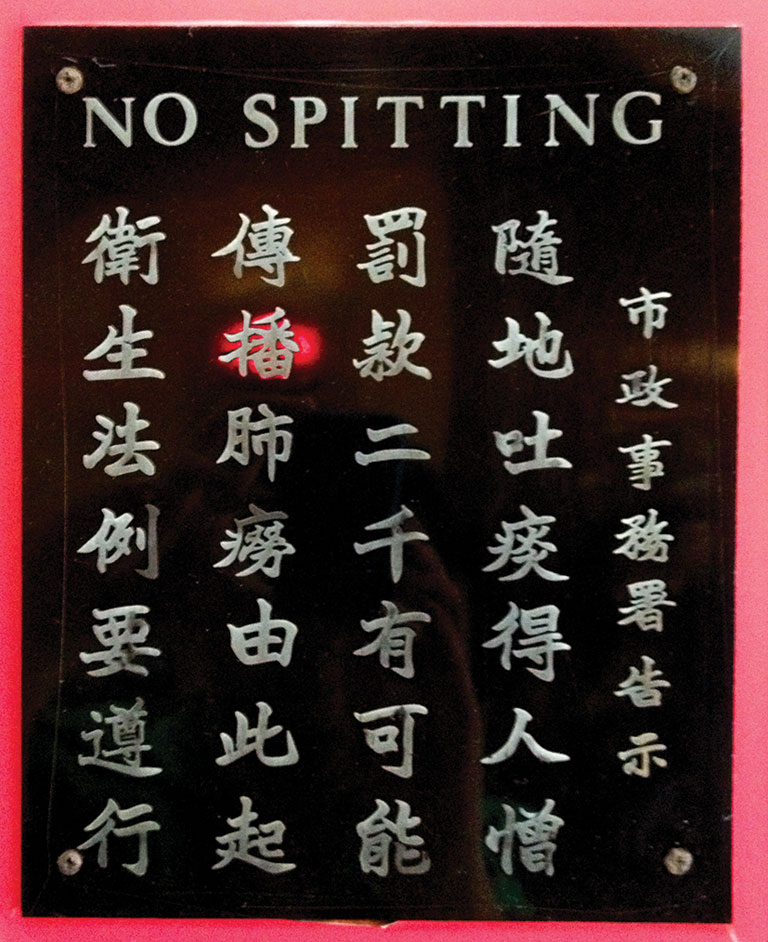
The choice of including more than one language in a document is in itself an indication of inclusivity. However, the graphic relationship between the two languages would indicate whether there are status differences between them. Disparity in type size, weight, column width, colour, etc. might render one language more difficult to access and to read, resulting in mistrust.
Script characteristics
Script characteristics refer to the comparison of linguistic and visual features of two scripts . In the case of Chinese and English, they are divergent on both linguistic and visual levels. While English is an alphabetic language that uses 26 phonetic signs of the Latin alphabet to build words, Chinese is a logographic script where each character represents an idea as well as a sound. Words can be one to several characters long, but not separated by word spaces. Characters are made up of one to 64 individual strokes, making them vary widely in density. The number of Chinese characters currently documented in the GB 18030–2005 encoding standard is totalled at 70,244 characters (Lunde 2009: 86), though the frequently used character set is around 4,808 characters (Lunde 2009: 81).
The visual form of Chinese and Latin scripts are distinctly different. Chinese characters are mono-width, with each character occupying the full em square. There is no concept of baseline, and all characters are optically centred within the em square. When set in the same point size, Chinese text would appear visually larger and graphically more salient than Latin text. While English orthography calls for two variant forms of the alphabet, small and capital letters, Chinese orthography has no such equivalence.
Since the information density of Chinese characters is higher than that of English, the same passage of translated text in Chinese would take up less space than its English counterpart. In a study conducted by George Sadek and Maxim Zhukov, the Chinese translation of a selected English text was found to only require 61% of the area occupied by its English counterpart (Sadek and Zhukov 1997, p.3). This rather large difference in text extent can result in visual disparity on the page.
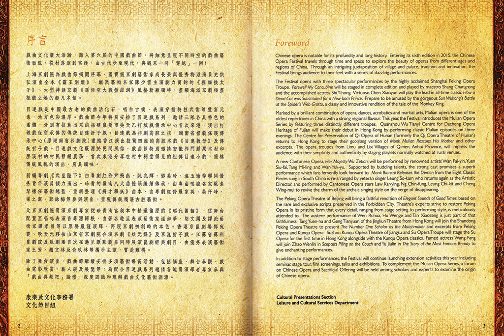
In view of these distinct differences, it is difficult to achieve linguistic and visual parity between Chinese and English. If the two scripts are intended to be perceived as equal in status, careful graphic and spatial considerations will have to be made in order to reconcile this disparity.
Reader considerations
Bilingual documents are designed for readers that represent more than one linguistic group. Readers may be monolinguals, who are only able to read in one of the languages used in the document. But they are also likely to be bilinguals who are able to read the other language to varying degrees, and have specific preferences for reading one language over the other. My speculation is that even monolingual readers would be influenced by the graphic presentation of content in the other language, because even when the reader cannot understand the text, they will be able to make comparisons between the visual cues or codes in the other language with that of his own language to understand its rhetorical structure, and interpret what that might mean. A disparity of graphical cues used to articulate the content structure of the two languages is likely to compromise trust, as cross-language comparison would be difficult.
Whether to integrate or separate the two languages graphically and spatially would influence not only the efficiency of information searching by readers with varying bilingual proficiencies, but their impressions of the document as well as genre associations (further discussions below). Further research is needed to verify this observation.
Whether to provide full parallel translations, partial or summary translations, or utilise ‘code-mixing’ or ‘code-switching’ (terms borrowed from linguistics) would depend on which linguistic groups a bilingual document is directed at. For example, while younger balanced bilinguals in Hong Kong would have no trouble reading a magazine that frequently inserts English words into a primarily Chinese text, or switch completely to English seemingly at random (figure 6), monolinguals would find this frustrating, as they cannot fully understand the content, creating mistrust.

Context considerations
‘Context of use’ refers to the situation where a document is used by the intended readers in order to achieve their desired goal. Different channels of delivery for documents, such as print, screen and environmental signage have different characteristics and constraints which would affect how bilingual information can be graphically presented. Different contexts of use also determine the conditions in which the document is used, such as reading time, distance, image quality, etc.
For example, bilingual road signage needs to be read quickly and from fair distances, and responded to in a timely fashion. Under these critical conditions, a disparity in status between the two languages (for example the two languages rendered in differing sizes or colour) would likely to disadvantage one language over the other, engendering mistrust as well as compromising safety.
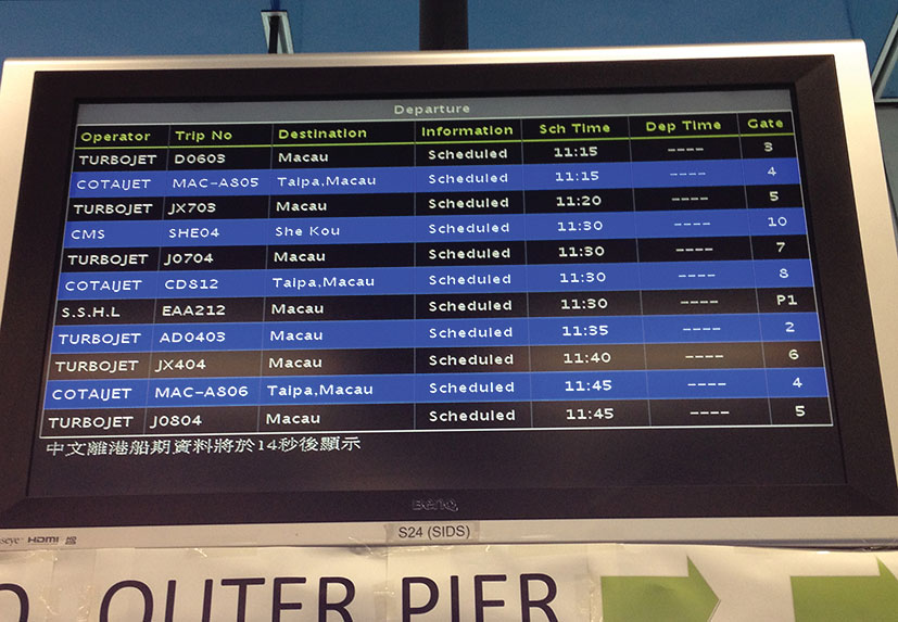
Another example would be displaying bilingual information on a small screen. The narrow width means that the two language would not be able to be put side by side, but forced to be stacked one after the other, or shown when an interaction is invoked. If cross-language comparison is an important criterion, this would become a serious constraint that could lead to mistrust. The stacking or sequential order of the two languages would also cause readers to lose track of the overall structure of the document, and create a disparity in status between the two languages.
Genre considerations
Wallers’s concept of ‘typographic genre’ mentioned above (Waller 1992) refers to the combination of variables including spatial organisation, type size, typeface, typographic cues, page format, etc. that contribute to a genre’s convention. The conventions of document genres are rarely prescriptive. Some genres have more established conventions, for example the newspaper, and others less so, for example a pamphlet. This is most likely to be cultural and specific to different locales. For example, a Hong Kong newspaper would use a rather different set of conventions from a British newspaper.
In bilingual documents, genre conventions are less established. Several strategies are possible in the graphic presentation of bilingual documents: (1) genre conventions from one language may be ‘borrowed’ and adapted to the other language; (2) the two languages apply their own respective genre conventions and combined together; and (3) a compromise is made in an attempt to create visual parity. It could be argued that all three strategies would result in a third set of genre conventions that may or may not be recognisable to the monolingual or bilingual reader.
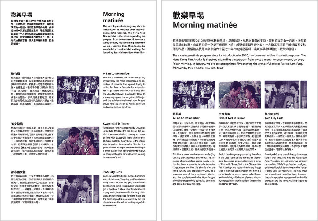
In a previous study with 16 participants who self-identify as balanced bilinguals (equally versed in reading English as they are in Traditional Chinese), Tam (2014) has found that participants showed hesitations when asked to name the genres that they associate with two pairs of bilingual documents, and acknowledged the influence of content when trying to associate the documents with genres. The range of named genres was wide, but there was a general trend to associate the layouts where Chinese and English are separate as ‘leaflet’ and where Chinese and English are integrated as ‘magazine’ (Tam, 2014, p.8) (figures 8a and 8b).
Content considerations
Content considerations are the most closely related to the graphic presentation of bilingual information. Graphical and spatial cueing of content is best understood by typographers and graphic designers as ‘information hierarchy’, but hierarchical structures are not the only way which various text components can be relate to each other, as we have seen in section 3.2 above. These functions or rhetorical relationships are articulated through the systematic use of graphic devices and spatial organisation, and have direct influence on how readers access the content of the document.
There are two access patterns for bilingual documents: (1) To prioritise the selection of language, then move onto the rhetorical structure within a language; and (2) To prioritise the overall rhetorical structure in both languages, then offer a choice of language in each rhetorical component. The first pattern spatially separates the two languages, while the second pattern integrates content from the two languages spatially. The integrated approach better supports cross-language comparison (figures 10). In a previous study (Tam 2014), it was found that while balanced bilinguals from Hong Kong exhibited no significant difference in their performance in information searching tasks in separate and integrated bilingual layouts, the participants responded to the integrated layouts more positively than the separate ones. Further research is needed to examine whether there are any differences between monolingual and bilingual readers of bilingual documents.
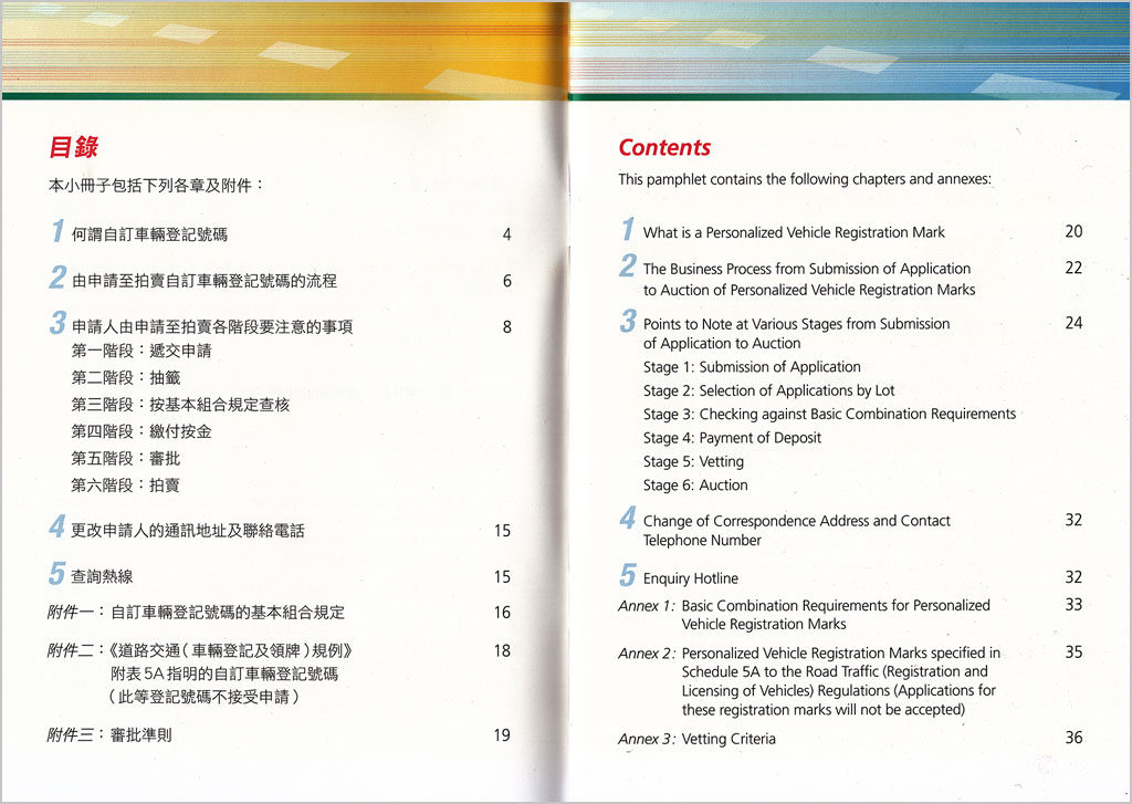
We have briefly looked at intertextual and visual parity as a principal concern in bilingual documents. This should be the aim whether the languages are separate or integrated. Content in both languages that belong to the same rhetorical component should use similar — if not identical — attributes for cueing the component, even when the scripts are very dissimilar. In my previous work (Tam, 2012) I developed a comparative descriptive framework for Chinese–English bilingual typography. In this framework, I made 76 comparisons between the graphical and spatial attributes that are commonly used to articulate Chinese and English text. The framework indicates that many of the graphical devices that are commonly used for articulating English (Latin script) text is simply not available in the Chinese script, or cannot be considered equivalents. However, spatial organisation or graphic devices that are extrinsic to the typeface (for example line rules, borders, colour, etc.) can successfully be used to delineate and group bilingual content into rhetorical clusters. The most salient graphical and spatial cues used to signal the overall rhetorical structure that are comparable across the two languages would benefit both monolingual and bilingual readers, engendering trust by making cross-language comparison accessible.
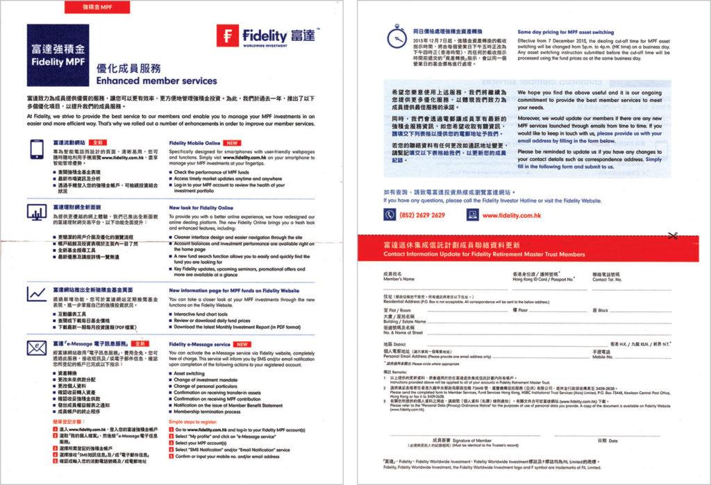
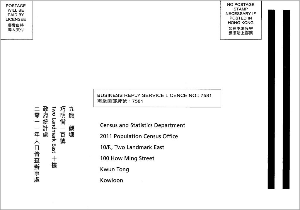
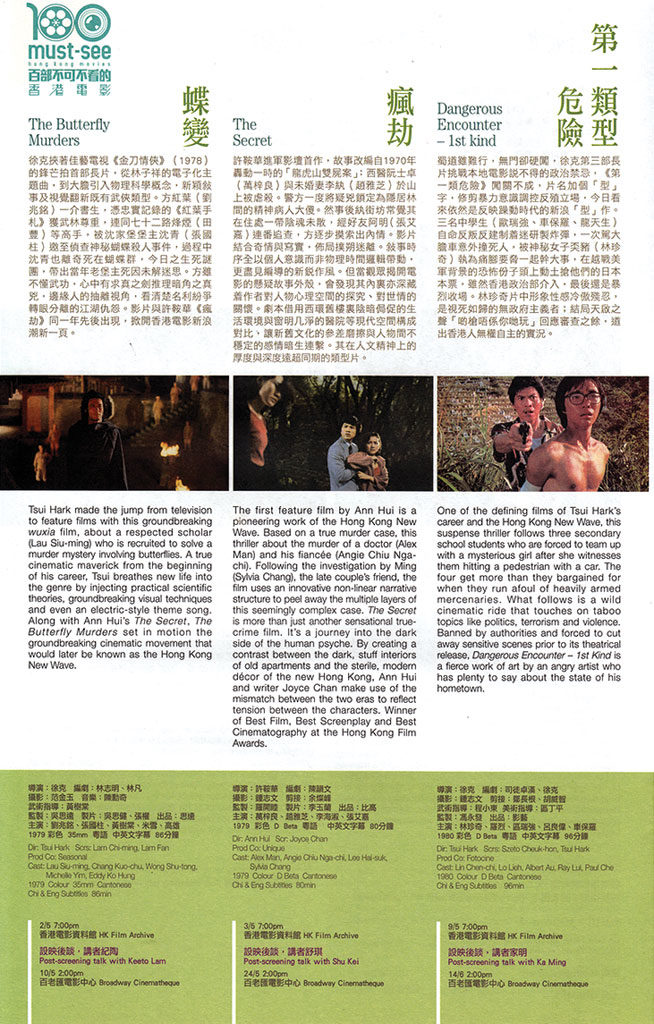
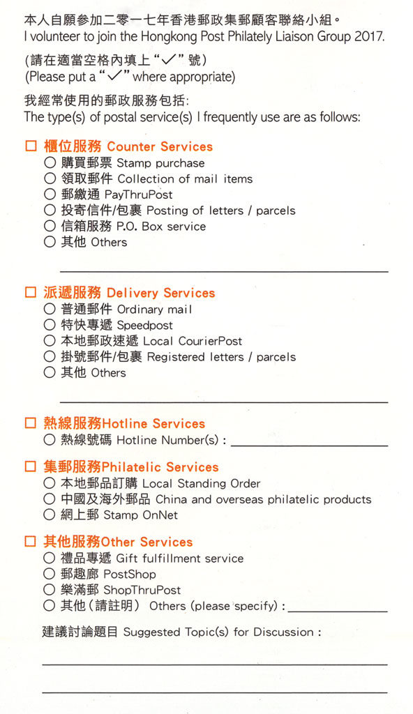
Elements that are shared between the two languages, for example images, numerals, dates, prices, checkboxes and text fields in forms etc., are often cues that signal the access structure of the document overall. The spatial arrangement of these shared elements and their relationship with content in each language is therefore crucial in information searching. Trust would be compromised when these shared elements cannot be used effectively for accessing the document (figures 12 and 13).

Production considerations
Technical constraints can sometimes result in the lack of parity between the appearance of the two scripts in a bilingual document. This is more often a problem for two scripts that are very different (such as Chinese and English), but usually less of a problem when two languages share the same script. The visual disparity due to technical constraints may undermine the authority or credibility of the document due to a difference in formality between the two scripts, or when the two scripts exhibit differing genre attributes. Walker (2001) suggests that ‘it is sometimes the case that hand-made/machine-made is a factor in determining formality’ (Walker, 2001, p.43). When one script is rendered in machine or digital typesetting while the other handwriting, a visual disparity occurs that may lower the status of the handwritten script (figure 14).
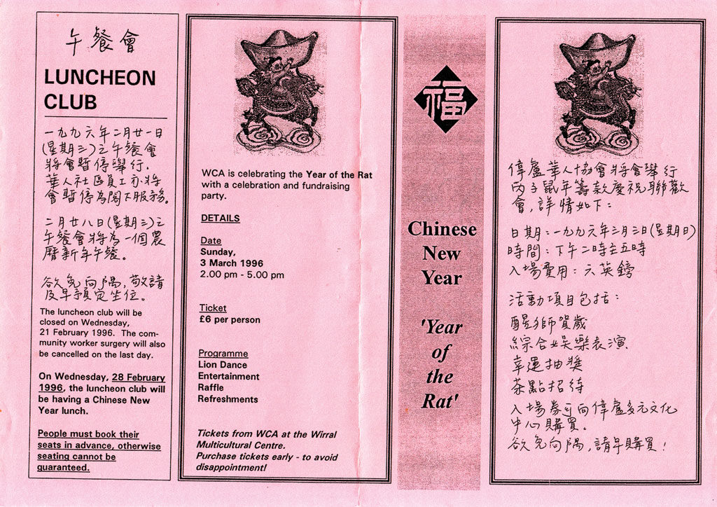
The unavailability of translation, writing or typesetting expertise in a particular script may also lead to a disparity of textual and visual quality between two scripts, resulting mistrust between a certain language group and the document producer. ‘One motive for producing books in two languages is to increase the status of minority languages but ironically, inadequate attention to typography, translation and production values can sometimes mean that the minority language is perceived as being less important than the other.’ (Walker, 2001, p.49).
The availability of resources would also determine whether full, partial, or summary translations can be provided in a document. Partial or summary translations might communicate mistrust, as readers of the partially translated language might feel that their needs are not catered for.
Conclusion
The paper has put trust squarely at the centre of discussions on bilingual documents, analysing how intertextual and visual parity engenders trust through the graphic presentation of bilingual information. The paper has explored the notion of trust within the theoretical context of document design, or what can be termed as ‘user-centred information design’. It has presented a heuristic for typographic decision-making, how different levels of considerations are realised through graphic presentation strategies. I took a ‘broad stroke’ approach to the discussions, focussing on what can be called ‘macro-typography’. It is hoped that this paper will provide a theoretical foundation for further empirical investigations on the subject of bilingual document design.
References
Bateman, J. A. (2008) Multimodality and genre: a foundation for the systematic analysis of multimodal documents. Palgrave Macmillan, New York, USA.
Giffin, K. (1967) The contribution of studies of source credibility to a theory of interpersonal trust in the communication process. In Psychological Bulletin, volume 68, number 2, pp.104–120.
Lunde, K. (2009) CJKV information processing, 2nd edition. O’Rilley, Sebastopol, CA, USA.
Oxford
Dictionary (n.d.) Definition of trust in English.
Available at <https://en.oxforddictionaries.com/definition/trust> [accessed
25 January 2017]
Sadek, G. and Maxim, Z. (1997) Typographia polyglotta: a comparative study in multilingual typesetting (2nd edition). Association Typographique Internationale, New York, USA.
Schriver, K. A. (1997) Dynamics in document design: creating texts for readers. John Wiley & Sons, New York, USA.
Tam, K. C. H. (2012) A descriptive framework for Chinese–English bilingual typography. In Typografische Monatsblätter 4 | 5 | 2012, pp.38–46.
Tam, K. (2014) Typographic cueing in bilingual documents: a pilot study. Department of Typography & Graphic Communication, University of Reading, UK (unpublished seminar paper).
Walker, S. (2001) Typography and language in everyday life: prescriptions and practices. Pearson Education, Harlow, UK.
Waller, R. (1982) Text as diagram: using typography to improve access and understanding. In Jonassen, D. H. (ed.), The technology of text: principles for structuring, designing and displaying text, pp.137–166.
Waller R. H. W. (1999) Making connections: typography layout and language. In proceedings of the 1999 autumn symposium, American Association for Artificial Intelligence.
Waller, R. and Delin, J (2003) Cooperative brands: The importance of customer information for service brands. In Design Management Journal, volume 14, no. 4, pp.62–69.