Typography: between language, technology, aesthetics and culture (Radiodada)

Back in 2010, I was invited by fellow designer Paul Ng to appear as a guest on the internet radio station Radiodada in a show called Design In-house. We spent an hour and a half talking about typography. Radiodada was conceived and founded by Tommy Li, with a then-cutting edge website designed by Pill and Pillow. This show was aired on 7 April 2010, and we were doing it live (in Cantonese) at the basement of Langham Place in Mong Kok, in a ‘fish tank’ studio with shoppers passing by. My email to Paul in preparation of the show is published here.

From: Keith Tam
Date: 6 April 2010 10:47:19 AM GMT+08:00
To: Paul Ng
Subject: Re: Topics for Radiodada

Hi Paul

Thanks for the questions.

I really hope that this programme would be less of a complaint session – we both know too well what a sorry state typography Hong Kong is in. Instead, let’s offer a fresh perspective on what typography is and could be. In Hong Kong, typography is mistaken to be just ‘playing with letterforms’, or ‘something about fonts’. All designers say that typography is important, but what do they really mean? What is often overlooked is typography as information, or, typography that is meant to be read rather than just something to be looked at or to grab attention. I would really like to give a big picture of typography and contextualise it from different perspectives.

Typography is situated at the crossroads between language, technology, aesthetics and culture.

              +------------+
              |            |
              |  Culture   |
              |            |
+-------------+------------+--------------+
|             |            |              | 
|  Language   | TYPOGRAPHY |  Technology  |
|             |            |              |
+-------------+------------+--------------+
              |            |
              | Aesthetics |
              |            |
              +------------+  

Now onto the questions:

1. Your background and experience related to typography

I’m thinking less of an interview but more of a talk show.

2. From the CVs that I’ve received all these years, I notice that the standard of typography is declining. What’s the cause of this phenomenon? What are your comments on this issue?

I’ve noticed this as well, but only in Hong Kong. In Canada/UK it doesn’t seem to be the case. I think it’s a misconception that the CV is not ‘design’ but merely a ‘document’, and documents should look a certain way, ie default settings in Word. I think the software (Word) should not be blamed. In fact pretty sophisticated documents could be produced in Word.

3. Do you think the standard of typography in Hong Kong is up to international standard?

This is a leading question ;-) and I don’t know if there’s an international standard really. Who do we go by for international standards? UK? Germany? Or the US? Or Japan? It’s difficult to define. But in terms of whether we’re taking it seriously in Hong Kong, no, we do not take it seriously, nor do we care. This is the saddest thing!

I think the standard of typography of a particular place (if there is one) has so much to do with its cultural atmosphere. At the most basic level, do people read here? Are they culturally aware? Pictures are much more valued over text in Hong Kong. It’s so widespread, it’s scary. People who read are in the minority. It seems like almost the entire Hong Kong culture is infested with this whole idea of infotainment or TVB-style consumption of popular culture. It’s all about instant gratification or the fear of boredom (whatever that means). Images are interesting; text is boring. This is the general sentiment. Text is labeled as too serious, and there is a huge segregation of people who are in the ‘cultural business’ and people who are part of the ‘mass consumers’. Knowledge is just not something that people respect or have an interest in generally.

(Of course, I’m generalizing and am hugely exaggerating in the last paragraph.)

4. As readers are getting used to web pages, are legibility and readability still important or it doesn’t matter anymore? 

I think they will be more important than ever before, because of the convergence of media and the ubiquity and explosion of information. Legibility and readability are the foundations of good typography, but to elaborate upon the traditional values of typography and to look into the future, typography and information design will have to merge and become something very sophisticated. For example, instead of merely making something easy to read, we will be thinking about how best to get ideas across for optimal clarity and understandability. To achieve this, we need to tap into content and editing in a huge way, and think about how best to organize and structure the textual information and to give it visual form (which is what typography is about).

Systems thinking will be a very important skill to have. To understand not only the textual meaning of the content but the semantic structure underneath it, and then designing information systems to support this, for example for an information-intensive, database-driven website with lots of dynamic information.

5. To what extent should we preserve the traditional typographic rules?

I’m not an advocate of rules, but I do believe that there are conventions. Unlike rules, which could seem inflexible at times, conventions continue to evolve. Communication is to ‘make common’. The designer must try to understand the codes that the user uses to communicate. Conventions are formed when there is mutual agreement between the originator, the mediator (which is the designer) and the receiver. Like the way languages evolve, so too would typographic conventions, which is a meta (visual) language imposed upon written language. 

6. Do you think design students and designers of Hong Kong get adequate training in typography?

No, not at all. It’s just an observation; if it’s adequate, then why is there bad typography everywhere? I try to do it my way and properly and uphold the values that I believe in. But, it’s not easy (see 2 and 3 above). Often teachers are not clear as to what typography is.

7. What is the essence of good typography?

This is a big question! Let’s discuss this in the show.

8. I’ve notice some common errors in the usage of punctuation marks in many designers’ work, such as using primes for quotation marks, hyphens to replace dashes, the overuse of colons. What are your comments on this phenomenon?

This is not only a typography problem, but language. One has to have an affinity to the language in order to do good typography. To what extent, I don’t know.

But, referring to the point I made earlier about the evolution of conventions (see 5 above), these conventions do change as well. As much as I dislike primes as quotation marks, hyphens as dashes, etc, this phenomenon does seem inevitable. Just like how we’re communicating here, via email. There’s no easy way to type curly apostrophes and proper dashes, and also depending on what software and hardware you use to view this message, some of these typographic niceties will get lost and become something else. Email is not a formal communication medium. Same for MSN messages, Facebook, SMS, or even blogs. The unrefined typography conveys the informality. And this proliferation of ‘informal media’, I think, is causing this phenomenon. People don’t have time to read anyway!

9. Do you consider the understanding of typographic tradition and history of typography critical for designers?

Yes, absolutely critical. Sadly not a lot of designers/students are interested, nor are they interested in reading in general. The evolution of typography, not just as pure aesthetic movements, but in relation to the technology, cultural, social and economic contexts, are really important. (I tend not to favour an art-historical approach in looking at typographic/design history.) How do we know where we stand if we don’t look back at where we came from?

10. Do you think design competitions which only honour expressive or experimental typography divert the essence of good typography?

Not necessarily. The expressive/emotive approach to typography is also very important, just that they communicate on a different level (viewed and read at the same time). No doubt it is an important part of our visual culture. It is still good to see designers pushing the boundaries of typography and to come up with new things.

11. Is post-modern typography just a revival of modern typography with digital manipulations?

Coming back to Hong Kong in mid-2006, I was surprised that ‘post-modern’ typography was (and is) still in vogue! As I student I was absolutely captivated by it, and although I’m on to something else now, I still admire what Weingart, Greimen, McCoy, Vanderlans, Carson, etc. did. It was absolutely necessary, and it provided alternative viewpoints of typography and raised many good questions. The worse thing is to see it merely as a style.

Whatever a designer produces (however small), ultimately reflects not his/her taste or aesthetic sense, but their believes and values as a designer. It’s easy to see when a piece of design only has seemingly beautiful form but not enough substance to substantiate it. Where does it come from? What is the intent? ‘Referenced’ designs are all too common in Hong Kong. There’s no honesty to the communication.

Is Hong Kong a ‘post-modern’ society? Hardly. We’re not living under a democracy, we’re not liberal, we’re not pluralistic . . . What does post-modern design stand for then in Hong Kong? Does it reflect who we are? 

12. There are many graphic designers but few typeface designers, and yet many designers are doing logotype design. I have seen many bad logotype designs in Hong Kong these days. As a typeface designer, what’s your opinion?

In terms of lettering and logotype design, ugly is the new beautiful at the moment! Especially for Chinese. All of a sudden, everyone wants custom type. And all of a sudden, everyone with Adobe Illustrator can do it! Typeface design is quite different from lettering. Typeface design requires a lot of patience and technical know-how, and the designer cannot control how the typeface will be used in an actual design piece. Lettering should form part of the foundational skills of a graphic designer really. It’s about balancing black and white, negative and positive. Shouldn’t every designer have this skill already?

* * *

I think there is more than enough ground to cover. There won’t be enough time to discuss all of these points in the programme anyway.

Let me know what you think, and where/when we should meet tomorrow.

Best
Keith
Lecture videos

Typography

Type anatomy explained through lead type (Univers Condensed 30pt): point, pica, em, en, leading (in Cantonese)
A demonstration of paragraph and character styles (including nested styles) in InDesign (in Cantonese)
On Chinese–English bilingual typography: historical origins, matching Chinese and Latin type, bilingual layout and information hierarchy, detail bilingual typography (in English and Cantonese)
A lecture on the legibility of Latin and Chinese type (in English and Cantonese)
A lecture on the small details that make typography read and look great: orthography, numerals, alignment, detailing, hyphenation & justification (in English and Cantonese)

Information design

An introduction to information visualisation, with classic/historical examples and some information design principles (in Cantonese)
A short introduction to the POEMS observational research framework (in Cantonese)
Wayfinding design principles (1) Cognitive maps (2) Kevin Lynch’s five key environmental components (3) Per Mollerup’s wayfinding strategies (in Cantonese)
A wayfinding system design case study: Jockey Club Innovation Tower (in Cantonese)

Baseline grid

Teaching notes on how to set up a baseline grid in InDesign. This document is a slightly revised and reformatted document previously available here.

Download in PDF format

A baseline grid is based on the leading of the continuous text (body text) of a publication. Leadings and paragraph spaces of all text in a complex publication would then be mathematically derived from this leading. A baseline grid ensures that the sizes and leadings all text in a complex publication are related to each other and are locked into place, so that they line up across columns as well as across pages. Baseline grids are almost always used in newspapers, and often in other complex publications such as magazines and textbooks.

Digital typography

‘In typography there is no technical step which is not at the same time an aesthetic decision’ — Emil Ruder

Some teaching notes on digital typography. This is a sightly revised version of the previous document that was available here for download.

Download in PDF format

Since the advent of printing with movable type, typography and technology have become inseparable. If we are to accept the definition of typography as the mechanical production of written language, then we must have an intimate understanding of our prevailing typesetting technology – the computer and its software and output devices – in order to become competent typographic designers. There is craftsmanship involved in digital typesetting; creativity is also built upon the foundation of understanding the technology. 

Bilingual typography: Hong Kong case studies

This keynote presentation was delivered at the Multilingual Typography Symposium at the Hong Kong Polytechnic University in 2011. Through considering the socio-political and socio-linguistic evolutions of bilingualism in Hong Kong, the presentation argues that visual harmony is not always the ultimate concern in cross-cultural typography – its effectiveness depends on how the two languages or scripts as well as their semantic components interact with each other under different contexts and purposes. With a systemic approach, the presentation examines case studies of bilingual typography in Hong Kong, considering bilingualism in terms of parallel translations, code-mixing and code-switching. A comparative descriptive framework for bilingual typography is also presented.

Bilingual typography: Hong Kong case studies from Keith Tam

Typographic hierarchy and legibility research

A seminar that discusses Michael Twyman‘s notation system for establishing typographic hierarchy (headings and paragraph) and a summary of Herbert Spencer’s review of literature of over 100 years of legibility research. Useful for typographers to inform their design decisions.

Twyman, M (1981) ‘Typography without words’, in Visible Language, XV no. 1, 5–12

Spencer, Herbert (1969) The visible word. London: Lund Humphries and Royal College of Art

Typographic hierarchy and legibility research from Keith Tam

Designing for reading: screenplay project

Skip to project brief

Typography is my main area of expertise; it is primarily where my passion lies as a design practitioner and academic, a subject that is very close to my heart. I am particularly into detail typography and typographic structures and systems. My approach is very workmanlike and pragmatic, and concerns mostly with finding the most fitting form for textual content. Style is seen as something that naturally emerges from this process rather than a purely artistic pursuit.

Since the first typography class I taught back in 2003, I have been running this project for my students at various levels. The idea of this project came when I was eating out with some friends at a restaurant called Alibi Room in Vancouver, and in the restaurant there was a small library of movie screenplays lying in a corner. I thought to myself: turning these crude documents (set entirely in one style and weight of the monospaced Courier typeface, an industry-standard format) into highly polished, publishable books would be an excellent assignment for my typography students.

I found the text document for the screenplay for the movie Brazil written by Terry Gilliam (of the famous Monty Python contingent), Tom Stoppard and Charles McKeown, one of my favourite movies of all time. Before the text could be used for professional typesetting, the file would have to be thoroughly cleaned up and prepared. This process alone would force students to look closely at the structure of content so that they could give the text an ideal form for professional publishing.

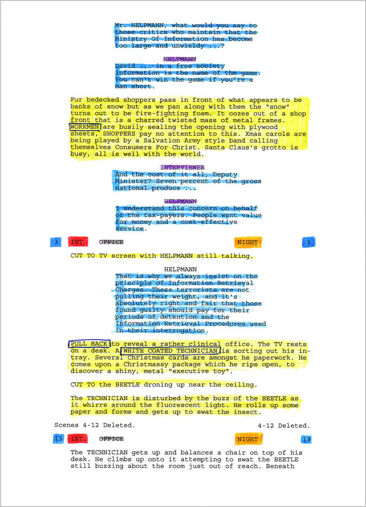
Using colours to analyse the structure of the text

This project also gives students advanced training in the use of the InDesign software: tabs, indents, spacing, leading, paragraph indications, styles and so on. The structure of the text is complex and, in order to design it successfully, students must work systematically. However I do not see this as a purely technical exercise, but a way of thinking critically and making systemic design decisions. This working methodology would prepare students for things like designing for structured content for the web and other kinds of interactive and editorial projects, and places the importance of content squarely in the centre of any design task.

The brief also trains students to look closely at details and the subtleties of typography, and to pay attention to minute spaces, punctuation usage and the craft of setting type. Students also need to gauge how explicit or subtle typographic cues need to be for readers of such publications — not exactly a (linear) novel, but not a reference work either. Do I create a strong contrast so as to aid navigation amongst the scenes within the book, or let ‘typographic distractions’ be as minimal as possible so that readers can focus on the content and read in a somewhat continuous manner?

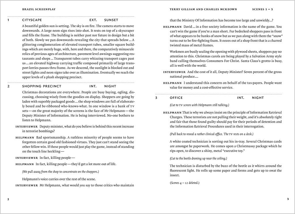
Final spread design (Kevin Kwok)
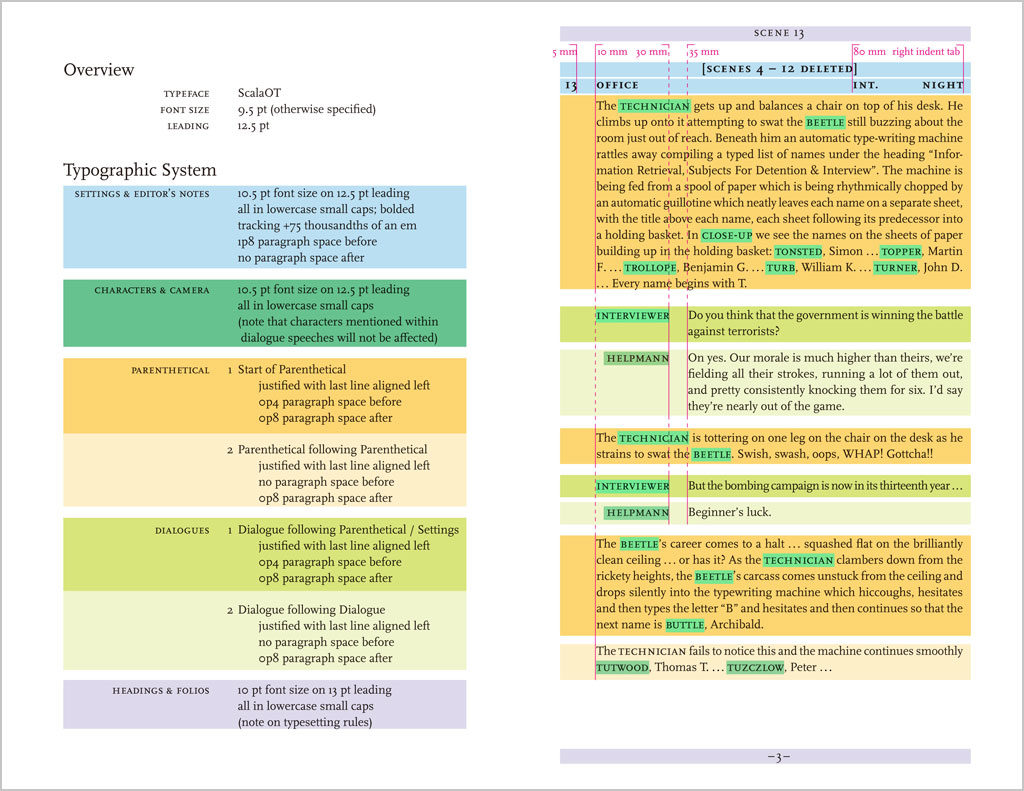
Typographic specification (Kevin Kwok)

An iterative process is essential for this project: to go through cycles of testing, refining, and correcting, until a final solution is arrived at. It takes a lot of patience and focussed attention, which graphic design students these days often lack. The final submission of this assignment is a dummy book with a series of spreads as well as a full set of specifications for the design. This is a deviation from what students often think of as a ‘final product’, which can be confusing at times. The idea that a design is not a one-of-a-kind object that a designer creates, but a set of instructions for others to follow, is increasingly important in (communication) design education. This year, I have even attached a small exercise of an HTML- and CSS-based e-book demo page to the project, extending the project from print to screen, planting the idea of parallel or multi-platform publishing in their minds, linking typography with interactivity and screen-based media.

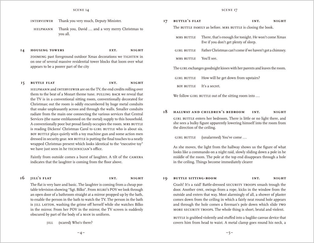
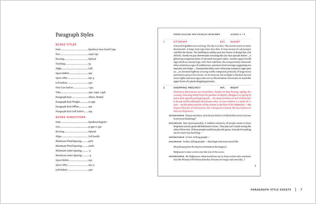
Several years ago I took the time to work on this assignment myself. I have chosen to use a sanserif typeface (Quadraat Sans) for the entire text. This is a deviation from the norm, but I do find that Quadraat Sans is an extremely smooth-reading typeface for text that is as good as a serif, though unconventional for this genre. The text is quite minimally cued, read somewhat like a linear text, only with the character names and scene headings (slugs) in bold. A baseline grid is used. The specification document is here. Hopefully this would inspire my students, though it should not be seen as the one and only ‘perfect’ solution – many possibilities abound.

Final spread design (Ross Milne)
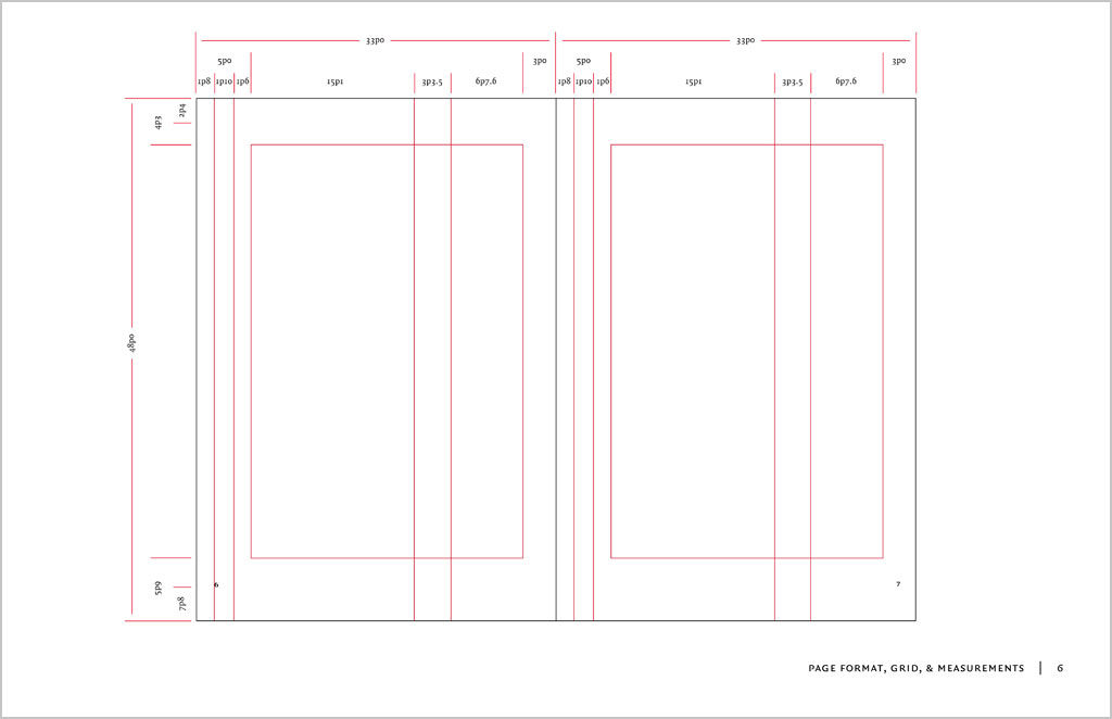
Grid (Ross Milne)
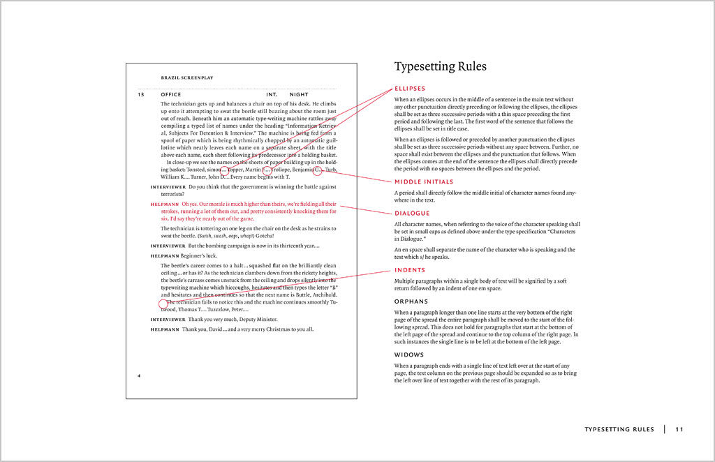
Typographic specification (Ross Milne)
Typesetting rules (Ross Milne)

Screenplay project brief

Download this project brief in PDF format

You may adopt this brief for your class, but please credit me

What is a screenplay?

A screenplay is the script for a film or television production. It outlines every scene, provides direction for each shot and contains all dialogue spoken by each character. A screenplay used in the film and television industry follows a strict format (see subsequent pages), often written using screenwriting software with a limited set of typographic variables. This format is used for all members of a production team include the actors, camera crew, directors, producers, etc. However, when screenplays are published as books for a general readership, the industry standard format does not have to be observed. A playscript is similar but for theatrical productions.

The brief

Design and devise a comprehensive set of typographic specifications for the the interior typography of a paperback screenplay series, to be sold at bookstores for a general audience who are interested in films. The series shall be titled ‘Contemporary Cinema Classics’, published by Working Titles Press. The same typography will be applied to all subsequent titles of the series.

The manuscript for Brazil, a screenplay by Terry Giliam, Tom Stoppard and Charles McKeown written in 1985 is provided for producing a prototype and typographic specifications.

Format

  • Binding: Paperback (soft cover), sewn binding
  • Trim size: Open, but probably similar to a common paperback novel. Wastage should be minimal; a full sheet should be utilised.
  • Paper stock: A cheap, off-white offset stock or newprint
  • Colour: Black and white only (screens allowed)
  • Typefaces: One seriffed typeface for the main text, or with an additional sanserif

Design criteria

Comfortable format, ease of reading, economy of space, clarity of typographic hierarchy, craftsmanship, correct use of punctuation and typographic conventions, clarity of typographic specifications.

You may only use one single text frame for the running text. All spacing adjustments should be done internally, using indents, tabs and paragraph spaces. Additional text frames may be used for the folios (page numbers) and running heads.

Deliverables and submission format

Dummy book

A booklet showing a minimum of six sample spreads of the text pages, as well as primilary matter such as half-title, title page, copyright/colophon page, table of contents as well as introduction, plot summary and cast (same material as for the exercise).

Specifications

A booklet that explains all typographic styles, measurements and design instructions in detail, to be used by the production team when executing the design. A4-size, or slightly bigger than the format of the book.

Key stages of development

A PDF document showing several key stages of your design development, with annotations.

Deadline

Final submission on Thursday 26 February. Hard copies to the General Office before 18:00. PDFs through Blackboard before 23:59. Critique on Friday 27 February at 09:30.

The process

  1. Analyze the text: print out several pages of ‘Brazil screenplay text (raw)’ document. Read through and understand how the entire text is structured. Colour-code and number the each component of the text, make an inventory.
  2. Use the ‘Brazil screenplay text (cleaned up)’ document for typesetting.
  3. Planning & layout: decide on a suitable size of the book based on economy and reading comfort. Consider margins, column widths, folio, running heads, etc.
  4. Trial settings in InDesign: print and evaluate various typefaces, point sizes, leadings and column widths.
  5. Detailed typography in InDesign: establish a typographic system using graphic and spatial cues, set up paragraph and character styles, correct typographic details.
  6. Test & refine: print out trial layouts periodically and continuously make refinements
  7. Produce specifications: once design is finalised, document all styles and typographic instructions and produce the specification document.

(Keith Tam, January 2015)