Tam, K C H (2012). ‘A descriptive framework for Chinese–English bilingual typography’ in Typographische Monatsblätter, 4 | 5 | 2012, 38–46
Download full text in PDF format
Abstract
This article introduces and discusses a comparative descriptive framework for Chinese–English bilingual typography. Using representative examples of Chinese–English typography from Hong Kong as case studies, a comparative descriptive framework that systematically describes and compares typographic attributes of the Chinese and English languages has been developed. Drawing from linguistics as well as typography theory, this comparative descriptive framework provides an important theoretical basis for the study of multilingual typography. The framework may be used to describe all possible situations in which the two languages coexist, breaking down each attribute and putting them into meaningful groupings. The framework consists of 76 attribute comparisons organised in two main classes (graphic and spatial) and 11 sub-groupings.
Introduction
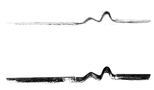
Typography can be thought of as a ‘metalanguage’ – a visual language that encodes verbal language itself. The term ‘verbal–graphic language’ (Twyman 1979) refers to this conception of typography. One could argue that any instance of typography is already ‘bilingual’, in the sense that verbal and visual languages are combined to form an integrated whole. When two or more verbal languages are represented in typographic communication, the interaction between the visual and the verbal is amplified (figure 1). A variety of complex issues arise on syntactic, semantic as well as pragmatic levels (Morris 1971).
My academic endeavours in bilingual typography are focused on Chinese–English bilingualism, specifically in the Hong Kong context. However, the framework presented here might be applicable to other languages as well, although specific graphic and spatial attributes would vary.
The Hong Kong context
Hong Kong is a Special Administrative Region of China, located at the south coast of the country. After the signing of the Treaty of Nanking between Great Britain and the Qing Dynasty government in 1842, Hong Kong was ceded to the British as a colony. English has been an official language of Hong Kong since then. However, it was not until 1974, after a series of anti-colonial riots that Chinese was elevated to the status of a co-official language along with English. The nature of bilingualism has evolved throughout the history of Hong Kong’s development, from diglossia with minimal bilingualism to bilingualism being widely incorporated into vernacular usage amongst the general population in recent decades. After the handover of Hong Kong’s sovereignty to the People’s Republic of China in 1997, English and Chinese remain official languages, although Chinese has gained increased importance in official as well as informal domains.
Traditional Chinese is the written form commonly used in Hong Kong, and Cantonese is spoken by the majority of the population. Simplified characters and spoken Putonghua (Mandarin) used in mainland China, have become more common in Hong Kong after the handover.
Types of bilingualism
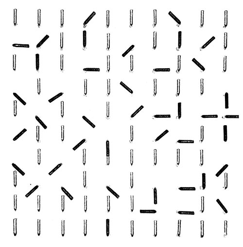
The following three types of bilingualism are commonly found in Hong Kong (figure 2):
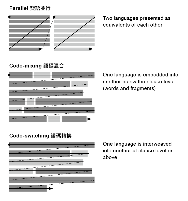
Parallel is where two languages are presented as equivalents to each other. Code-mixing is where one language is embedded into another below the clause level (words and short fragments). Code-switching is where one language is interweaved into another at clause level or above.
Parallel
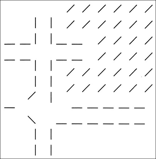
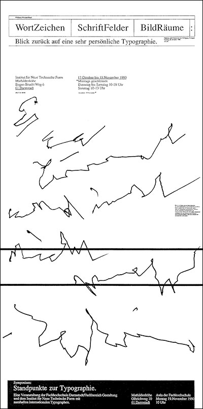
Parallel bilingualism is the most common of the three. In Hong Kong parallel bilingualism is sometimes a legal requirement, an attempt to assign equal status to the languages in question, or to provide precise cross referencing between the languages. While on a textual level both languages may assume equal status, this may or may not be apparent when it is visually designed (figure 3).
Code-mixing
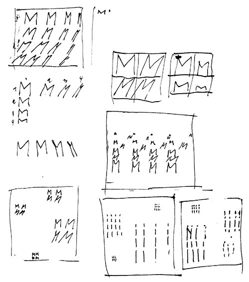
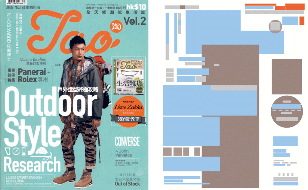
Code-mixing is where single words or short fragments of a second language are interspersed into the dominant language (figure 4 & 5). Code-mixing happens when partial translation is required, when providing clarification or translation for certain words such as specialised terms, or when phonetic transliteration is needed in a different script. In Hong Kong, code-mixing is also found in informal speech and popular print media, especially in recent years, where English words are interspersed within a primarily Chinese text, while still observing Chinese syntax. Motivations for code-mixing of this kind vary. Code-mixing may be used when it is difficult to find Chinese equivalents for certain English words. It may also serve to indicate status and cultural background, or act as emotional buffers (Li 1996).

Code-switching
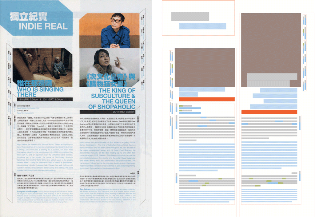
Code-switching refers to the insertion of entire clauses, sentences or paragraphs of a second language into the dominant language (figure 6). One has to be well-versed in both languages in order to understand the full meaning of the text, since vis-à-vis translation is not the intention. This type of bilingualism has been gaining in popularity in recent years. Some linguists do not differentiate between code-mixing and code-switching, as the two are functionally similar. However, I believe that this differentiation is needed, especially in the context of Hong Kong.
The context of use of a piece of typographic communication would dictate which type of bilingualism is the most appropriate. The three types of bilingualism may also occur simultaneously, as is often the case in complex documents. All three types relate to the status relationship between the two languages as well as their semantic structures on a textual level.
A comparative descriptive framework
At the outset of my research, it became apparent that a framework was needed for describing all of the available attributes that can be applied to textual content in the two languages in question. These variables may be applied in typographic designs with the intention of establishing a ‘cueing system’, in order to optimise readers’ access to the information and their ability to understand the semantic structure of content in both languages.
Similar to what translation does to verbal language, my intention was to find equivalents of graphic and spatial attributes that can be applied to both Chinese and English. Mapping these attributes according to their semantic values across the two languages help us understand which graphical and spatial cues are directly transferrable, which ones have no direct equivalents and which ones are similar but not exact counterparts of each other.
During my research process I came to a realisation that one should avoid subjective discussions of ‘visual harmony’, at least without first understanding what needs to be harmonised and how they should be harmonised. The idea of harmonisation – making two elements visual equivalents of each other – applies to the semantic and access structures of the textual information in both languages. Therefore, whether visual harmony is desirable highly depends on context.
The comparative descriptive framework is the result of collecting and analysing examples of Chinese–English bilingual typography from Hong Kong. It can be used to describe all possible situations in which the two languages coexist, breaking down each attribute and putting them into meaningful groupings. 76 attribute comparisons are organized in two main classes (graphic and spatial) and 11 sub-groupings organized in a matrix (figure 7).

Of the 76 comparisons, 30 are directly transferrable between the Chinese and English (highlighted in pale yellow in the matrix). These attributes may be shared between the two languages and are not specific to the typographic conventions of the individual languages. 25 attributes are language-specific and have no equivalence in the other language (coloured light grey in the matrix). If these attributes are used, they will have to be replaced by other attributes in the other language. The remainder of the attributes have counterparts in the other language that are similar in semantic value but are not absolute equivalents.
Graphical attributes
The graphic attributes class includes intrinsic typographic transformations as well as extrinsic graphical devices that could be applied to the text itself. The sub-groupings are: (a) type style, (b) scale and measurement, (c) weight and density, (d) typographic variants, (e) typographic adornments and (f) graphical devices.
The most apparant difference between Chinese and English is that one is logographic while the other alphabetic. Their constructions and visual qualities are very distinct. This is reflected in the descriptive framework; many of the graphical attributes have no counterparts in the other language (17 in total).
Note that type style, typographic variants and typographic adornments are divided into separate sub-groupings. Although all three of these groups refer to the form of the letters or characters, there are essential semantic differences amongst them. For example, the type style sub-group refers to the classification of typefaces in the two languages. It is apparent that the historical evolution of these major styles of typefaces for the respective languages have taken separate courses. While there may be stylistic similarities between them, the two differ in their use and connotative meanings.
The typographic variants sub-group specify the inherent transformations that can be applied to the text. Most of these attributes have specific semantic values associated with them by convention. Here, italic is differentiated from oblique effect. While italic type is not used in conventional Chinese typography, one could artificially skew the characters to achieve a similar effect, but it would not have the same semantic value as conventional italic type in the English language, unless expressly specified. English has a number of such typographic variants that are not available in Chinese, which means that other attributes must be ‘borrowed’ in order to mimic the visual effect.
Typographic adornments are graphical marks and elements that can be ‘anchored’ into the text, for example paragraph rules, underlining and emphasis marks. These are distinct from graphical devices, which are extrinsic to the text itself. Because graphical devices are extrinsic to the text, they are not rule-bound and are therefore more fluidly transferrable between the two languages.
Spatial attributes
The spatial attributes class includes spatial organization, sequence, direction and grouping. The sub-groupings are: (a) spatial sequence, (b) configuration, (c) reading direction, (d) alignment and (e) spacing. This class mainly concerns spatial attributes, but time is also implied by nature.
The spatial attributes are applicable to both the macro and the micro, whereas the graphical attributes are only relevant to the micro. Compared with the graphical attributes, spatial attributes tend to be more transferrable between the two languages. These spatial attributes can be used to describe global properties that shape the overall status relationship and semantic structure, as well as information that is shared between the two languages and groupings of information.
The spatial sequence sub-group is concerned with the spatial arrangement of textual information and how it implies temporal sequencing in various situations. Vertical and horizontal sequences denote priority in the reading process. Sequences implied in positioning work in a similar manner. Application of graphical attributes such as scale, may also suggest the reading sequence. Linear sequences impose a controlled release of information, for example in a video or motion graphic sequence. Interaction may also reveal, hide or transform the textual information via direct manipulation of textual content from one language to another.
The configuration sub-group adopted and paraphrased from Michael Twyman’s ‘Schema for the study of graphic language’ (1979) refers to the ways in which text is organized graphically. These are potentially transferrable between the two languages.
With regards to reading direction, several of the attributes are bound by language-specific conventions. While Chinese can be read vertically, horizontally from left to right as well as right to left, English cannot.
In terms of text block alignment, although both Chinese and English text can be set justified or flush left, justified setting is the most natural for Chinese as the characters are monospaced, while flush left is most natural for English.
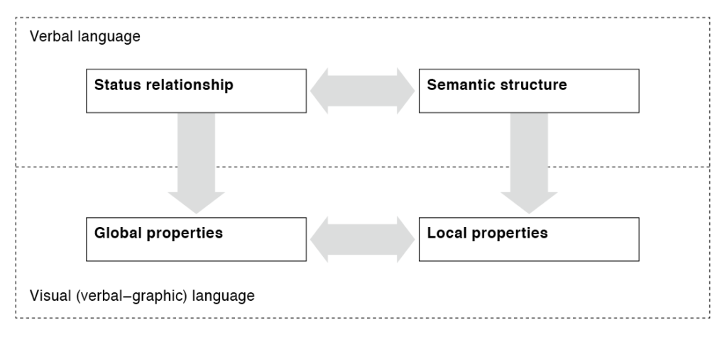
Global and local properties
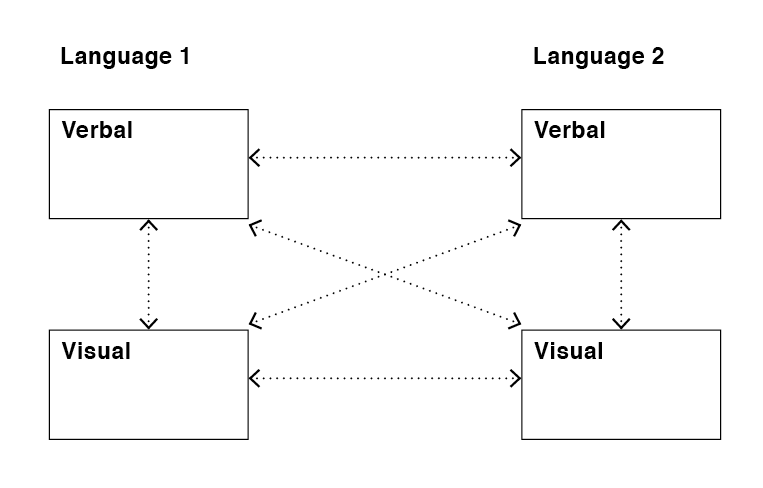
A certain amount of sensitivity and discipline is desirable for any cross-cultural typographic designers when designing complex multilingual documents. Judicious application of these attributes would ensure coherent and accessible designs. The terms ‘global properties’ and ‘local properties’ are used here to group these attributes and allude to the encoding of textual content. ‘Global properties’ refers to a class of attributes that articulate the overall status relationship between the two languages. ‘Local properties’ refers to the attributes that articulate the semantic structure of each individual language. Figure 8 illustrates the interaction between these properties on the verbal and visual levels.
Conclusion and future directions
Typography is the only means through which verbal language is visually manifested; the typographer is endowed with the capacity to mediate and transform textual content. In multilingual typography this mediation or transformation process is ever more crucial. The partnership between the originators of the textual content and typographic designers become highly critical.
Further investigation in multilingual typography that may emerge from this comparative descriptive framework presented here may include issues of performance or usability in various contexts of use, such as language education; aesthetic concerns; cultural conventions and cross-cultural hybridity; or semantic markup of multilingual dynamic textual content, amongst others.
The comparative descriptive framework also has the potential to be expanded to include other kinds of attributes and comparisons, for example temporal and interactive attributes. This framework may also be adapted for comparing other languages or for more than two languages.
To graphic designers working in one language, typography might not involve much more than the shaping the visual appearance of text for the proverbial ‘clarity’ and aesthetic enjoyment. Consequently, discussions on typographic matters often centre on syntactical aspects. When working with two or more languages, however, additional factors have to be taken into consideration. In my research, I endeavour to examine typography through the lens of information design. The perspective that I have presented here is not intended to be didactic nor prescriptive, but to provide a common language that will transpire further discussion on multilingual typography of a more critical nature.
References
Li, David C S (1996) Issues in bilingualism and biculturalism: a Hong Kong case study. New York: Peter Lang Publishing
盧丹懷著(2005)《香港雙語現象探索》。香港: 三聯書店 (香港) 有限公司
Morris, Charles W (1972) Writings on the general theory of signs. The Hague: Mouton
Pennington, Martha C ed. (1998) Language in Hong Kong at century’s end. Hong Kong: Hong Kong University Press
Twyman, Michael (1979) ‘Schema for the study of graphic language’ in Kolers, Paul A et. al., eds. Processing of visible language, Volume 1. New York: Plenum Press, 117–150
Walker, Sue (2001) Typography and language in everyday life: prescriptions and practices. Essex, UK: Pearson Education