Calligraphic tendencies in the development of sanserif type in the twentieth century

MA Typeface Design dissertation 2002, University of Reading

Download full text in PDF format

Sanserif typefaces are often perceived as something inextricably linked to the ideals of Swiss modernism. They are also often thought of as something as far as one can get from calligraphic writing. Yet, throughout the twentieth century and especially in the past decade or so, the design of sanserif typefaces have been consistently inspired by calligraphic writing. This dissertation hence explores the relationship between calligraphic writing and the formal developments of sanserif typefaces in the twentieth century. Although type design is an inherently different discipline from writing, conventions of calligraphic did and till do impose certain important characteristics on the design of typefaces that modern readers expect. This paper traces and analyses the formal developments of sanserif typefaces through the use of written forms. It gives a historical account of the development of sanserif typefaces by charting six distinct phases of sanserif designs that were in some ways informed by calligraphic writing:

  • Humanist sanserifs: Britain 1900s
  • Geometric sanserifs: 1920s–30s
  • Contrast sanserifs: 1920s–50s
  • Sanserif as a book type: 1960s–80s
  • Neo-humanist sanserifs: 1990s

Three primary ways to create calligraphic writing, namely the broadnib pen, flexible pointed pen and monoline pen are studied and linages drawn to how designers imitate or subvert the concentions of these tools. These studies are put into historical perspective and links made to the contexts of use. The focus of this dissertation is on typefaces that are generally known as humanist sans; grotesques and neo-grotesques are not included in the discussions.

The architecture of communication: the visual language of Hong Kong’s neon signs

Tam, K (2014). ‘The architecture of communication: the visual language of Hong Kong’s neon signs’, in Mobile M+ neonsigns.hk: an interactive online exhibition celebrating Hong Kong’s neon signs at http://www.neonsigns.hk. Hong Kong: M+, West Kowloon Cultural District Authority.

Read this article in traditional Chinese

Article as originally published

Slides from a keynote talk, Hong Kong Arts Centre, 28 May 2014

It is sometimes said that the wealth and prosperity of a city can be measured by how bright it is after dusk. Ask any tourist who has been to Hong Kong, and they will recall memories of the spectacular night view. ‘Pearl of the Orient’ is a term that has been synonymous with Hong Kong since at least the 1950s. The romanticism associated with this title of endearment is symbolised by Hong Kong’s eclectic and vibrant neon signs. They line Hong Kong’s major thoroughfares and neighbourhoods, making the city come to life especially after dark.

Written words and visual symbols are all around us, and in Hong Kong they permeate every corner of the city. Visual messages rendered in Chinese and English, manifested in a plethora of scales, stylistic variations, colours, arrangements, materials and degrees of transience, display our city’s energy and spirit. They represent who we are as a people, our aesthetic temperament and the life that we lead in this particular corner of the globe that is Hong Kong.

The technology of making neon signs was introduced to Hong Kong in the early 1930s. The burgeoning growth of neon signs, however, took place after the Second World War when Hong Kong was in a period of rapid economic regeneration. Neon was a perfect medium to advertise all kinds of economic activities, from restaurants, department stores and movie theatres to bars, nightclubs and saunas. Neon signs not only provided a solution to the increasingly keen competition for an ever-growing customer base with more disposable income and leisure time, but they were also a potent symbol of Hong Kong as an emerging economy and attractive tourist destination.

Signs and Hong Kong’s streetscapes

In 1972, architects Robert Venturi, Denise Scott Brown and Steven Izenour published the seminal architectural study Learning from Las Vegas. In a field that was dominated by the Modernist school of thought, Learning from Las Vegas was one of the first works to examine a kind of vernacular architecture that is defined not by the tangible forms of buildings but by textual and visual communication situated in space – in other words, signs. Venturi et al. write: ‘[The Las Vegas] architecture of styles and signs is antispatial; it is an architecture of communication over space; communication dominates space as an element in the architecture and in the landscape.’ 1Robert Venturi, Denise Scott Brown and Steven Izenour, Learning from Las Vegas (Cambridge, Massachusetts: MIT Press, 1972), p. 8. This concept of an ‘antispatial’ architecture dominated by communication is typified by nondescript buildings that are often set back from the road, far from pedestrian and vehicular traffic. When buildings are indistinctive and human activities are hidden from view, bigger and more exaggerated signs are needed in order to attract people’s attention and to strengthen the ‘sense of place’, especially when experienced from a moving vehicle, as in the case of Las Vegas in the 1970s.

Neon signs in Las Vegas, 1970s. Source: Wikimedia

Unlike Las Vegas during the 1960s and ’70s, Hong Kong’s urban development took a rather different course. Hong Kong has a high population density, and its vernacular architecture and urban planning tend to be pedestrian-centred, multifunctional and vertically oriented. Pedestrian traffic often rubs shoulders with heavy vehicular traffic, while shops and businesses occupy the ground floors of buildings, sometimes spanning several storeys above, with mixed commercial and residential uses further up in the higher storeys. Hong Kong architect and urban planner Peter Cookson Smith has closely examined Hong Kong’s organic and spontaneous street culture and how visual communication is one of the key elements that contributes to its unique urban identity. Smith writes: ‘Bland streetscapes are often unified and made pleasurable by layers of superimposed signage, incidental detail and communication devices, rather than more orthodox architectural unification through formalistic repetition of building elements.’ 2 Peter Cookson Smith, The urban architecture of impermanence: streets, places and spaces of Hong Kong (Hong Kong: MCCM, 2006), p. 48. Smith considers that spontaneity and a sense of disorder promotes growth and change that boldly subverts the framework of existing buildings. This ‘add-on’ approach is manifested in the bold and adventurous use of signage as communication in Hong Kong, with signs attached to buildings parasitically, as elaborated by Smith: ‘The iconography of consumption is used both physically and metaphorically to construct a street language, asserting a symbolic identity through its confrontational dominance.’ 3 Peter Cookson Smith, The urban architecture of impermanence: streets, places and spaces of Hong Kong (Hong Kong: MCCM, 2006), p. 73.

Calligraphy and signage

Against the backdrop of this unique urban setting of great density is China’s long tradition of integrating the art of calligraphy into architecture. Vertically arranged couplets, horizontal banners and fascias, as well as inscriptions, have adorned the entrance ways and interiors of halls, temples, residences and institutions for centuries. Artist, poet and writer Jiang Xun describes the importance of calligraphic writing in Chinese architecture: ‘Written forms have been coordinated with the functionality of architecture. In fact, ’ 4 Jiang Xun, Han Zi Shu Fa Zi Mei = The Aesthetics of Chinese Calligraphy (Taipei: Yuan Liu, 2009), p. 235. Original text in Chinese: ‘書寫線條與建築物的功能性質配合,事實上,書法也已經是建築設計美學重要的一部分。’ Calligraphy served for identification as well as artistic purposes, and was often inscribed by learned masters and calligraphers. Although neon signs are a foreign import, this Chinese signage tradition has been inherited and appropriated into the vocabulary of contemporary neon signs in Hong Kong, albeit on a much greater scale and in more amplified forms that reflect the city’s changing urban and architectural fabric. Mathias Woo Yan Wai, a Hong Kong-based cultural critic, has written about the role of Chinese characters in mixed-use buildings: ‘The “chemical reaction” between architecture and literature is the reason mixed-use architecture is a wonder of Hong Kong. Building façades are surrounded by writing and, from a functional point of view, words become symbols for pedestrians to know the different functions of the units inside the building. The words and their visual forms add dynamism to the nondescript buildings.’ 5Mathias Woo, Hong Kong Style (Hong Kong: Cite Publishing, 2012), p. 102. The English translation for this Chinese passage is missing. It has been translated from this original text in Chinese: ‘混合用途建築之所以是香港風格的奇景,是因為建築物與文學產生的化學作用,建築物的外牆被文字包圍着,功能上文字成為空間用途的代號,讓街上的途人能夠閱讀和知道個別單位的功能和用途。這些文字的組合、字款的設計,為平平無奇的石屎建築帶來了一種充滿動感和活力的景象。’

On a pragmatic level, signs provide environmental cues that help people identify and locate places and activities. Be they neon or some other type, signs are either extensions or inherent parts of buildings, injecting identity and character into otherwise homogeneous architecture and neighbourhoods. They may very well have been put there originally out of necessity, but more importantly, they are signs of human activity and ways of life, both literally and figuratively. Some signs are meant to be seen from a fair distance; some are meant to be seen from close range. Apart from those that are smaller in scale and displayed in shopfronts, most neon signs are designed to be recognised and read immediately, most likely at a high viewing angle above pedestrians’ heads. Due to their strong illumination, they can be seen with ease both in a moving vehicle and by pedestrians walking by at a leisurely pace. Neon signs are less about illuminating their surroundings than drawing viewers’ attention to the light source, which is a visual message in and of itself. The medium, indeed, is the message.

Hong Kong’s signscape: a typology

Amidst the eclecticism and chaos often associated with Hong Kong’s signscape, its manifestation in the city reveals a number of underlying patterns. Looking at how different types of signs interact with buildings, people and urban settings, a typology, or classification system, emerges. This typology represents the archetypes of 12 types of signs that may be found in Hong Kong, divided into three main classes based on how they are affixed to buildings: shop, building and extension. These types of signs recur in different permutations throughout the city. Through this typology a better understanding can be formed in terms of the visual expression, typographic design, aesthetic value, content requirements, construction methods, viewing modes and distances of these types of signs, as well as the contexts in which they exist in our urban environment.

Typology of Hong Kong’s signscape: corner building
Typology of Hong Kong’s signscape: side elevation
Typology of Hong Kong’s signscape: front elevation

Neon signs as extensions of buildings

Neon signs may fall into any of the 12 categories described in the typology, but they tend to appear most commonly in the form of ‘extension’ signs. Braced onto buildings with steel frames and cables, cantilevered signs are extensions of buildings, projecting perpendicularly from their façades and above the traffic flow.

Projecting columnar signs

Projecting columnar neon signs are the most representative of all of Hong Kong’s neon signs. They not only inherit the tradition of neon theatre signs commonly found in towns and cities throughout North America since the 1930s, but they also honour the Chinese tradition of couplets and shop signs that hang vertically by doorways or on pillars of buildings. Since Chinese can be read easily in both horizontal and vertical configurations, columnar signs in Chinese characters function better than their English counterparts, on which letters are stacked vertically atop each other, often hampering legibility and graphic impact. Moreover, projecting columnar signs extend outwards along the sides of high-rise buildings perpendicular to the direction of vehicular and pedestrian traffic, allowing maximum visibility and graphic impact. They are usually placed on major thoroughfares, or at locations where there is an unobstructed but narrow line of sight in-between buildings. They can be easily spotted from several hundred metres away, appearing to float in midair against the evening sky.

Dann Ngan Lo Herbal Tea (Yau Ma Tei) This simple projecting columnar sign for a herbal tea shop is visible from several blocks away.

In its most basic form, the projecting columnar sign may consist of only a plain rectangular shaft. There is always a border around the sign, usually double-lined or sometimes decorative, so that it stands out from the busy background. The shape of the shaft may be something other than a simple rectangle. Cascading, bursting, curvilinear or other irregular shapes were prevalent in the middle of the last century, a nod to the Art Deco tradition. The backgrounds of the shafts are either left blank or filled with a variety of geometric patterns.

The basic form of the shaft is often adorned with a business logo or pictorial element on the top (known sometimes as the ‘crown’). For example, jewellers might use a line drawing of a shining diamond to convey their line of business; a Hakka restaurant that specialised in salt-baked chicken would use a drawing of a whole hen. Mascots that represent businesses might also be used — for example, a deer for ‘Deer Garden Restaurant’. These pictorial elements are always simplified line drawings that are iconic and therefore immediately recognisable.

Fung Leung Kee Watches (Wanchai) A large-scale projecting columnar sign that is very visible along the tramway on Hong Kong Island. The crown and pedestal are occupied by brand names of watches, with the English business name in a very small size.
Golden Dragon Mahjong Parlour (Wanchai) A small yet extravagant projecting columnar sign for a mahjong parlour, crowned with the head of a dragon and with a pedestal in the shape of a cloud. The dragon is wrapped around the shaft.

At the bottom of the shaft, there is often a wider base (known as the ‘pedestal’), which usually contains the English name of the business, or other subsidiary information in Chinese or English. It is usually much smaller in size compared to the characters on the shaft, since at its lower height it is meant to be read at a relatively closer distance. This bilingual treatment favours the Chinese language, which receives more graphic attention, as Chinese are assumed to be the main clientele of the business.

Orchid Restaurant (Wanchai) Projecting columnar sign for a Western-style restaurant, with a diamond as the crown and a pedestal containing the English business name. The diamond does not have much to do with the name of the restaurant nor the nature of the business.

Projecting banner signs

Cantilevered signs projecting out from buildings may also be horizontal, at various scales and heights. These banner signs sometimes span quite far over the road, so as to accommodate the length of the message and to maximise visibility. Compared with the projecting columnar signs, banners are designed to be recognised from a closer viewing distance, especially when installed at a lower height. Banners may also consist of a crown with a pictorial element or logo. Sometimes a ‘tab’ is appended to the bottom of the sign, containing the English name of the business, a slogan or other subsidiary information.

Wing Hing Pharmacy (Jordan) A projecting banner sign for a pharmacy, with a tab at the bottom.
Yuet Heung Restaurant (Wanchai) Projecting banner sign for a restaurant on a side street, crowned with an image of a chicken, the restaurant’s specialty.

Projecting irregular signs

Projecting signs may also be irregular in shape: for example, the neon sign for Sammy’s Kitchen on Queen’s Road West is in the shape of a cow, conveying the restaurant’s steak speciality. The sign for Lo Fu Kee Congee and Noodles in Central is in the shape of a fish, representing their specialisation in fish congee. Pawn shops use an iconic symbol of a bat carrying a coin in its mouth, representing good fortune. The character for ‘pawn’ and the name of the shop are integrated into the symbol. The shape of the sign itself becomes a distinctive, easily recognized symbol as it stands out from the rest of the environment.

Tung Tak Pawn Shop (Wanchai) A traditional pawn shop sign in the shape of a bat carrying a coin in its mouth.
Kings Sauna (North Point) An irregular shape projecting sign, crowned literally with a crown, a symbol of the business.
Tai Ping Koon Restaurant (Causeway Bay) An irregular shape projecting sign, crowned with the logo of the restaurant. Note that the Chinese name reads from right to left, while English is the opposite.

It is unlikely that businesses made concerted efforts to create a harmonised view with each other’s neon signs, say, along Nathan Road. In fact, the opposite might be true: each business wanted to outsize and outshine the others in an extremely competitive environment. Curiously, many businesses are courteous enough to not deliberately obscure their competitors’ signs entirely. Reasonable distances are kept between the signs, and the mixture of columnar and banner signs not only serves a practical purpose in this sense, but also accidentally creates a cascading effect that is multilayered and dynamic. This organic development can be seen as being better than any deliberate planning or legislation, and as a testimony to ingenuity in Hong Kong.

Neon signs on buildings

Neon may also be used on the façades of buildings, visible to pedestrians on the opposite side of the road or travelling in a moving vehicle. The shapes of these signs tend to articulate the shape or structure of buildings: (building fascia); (building columnar); (building corner fascia); or , including windows (façade coverage).

In the case of the façade coverage sign, an entire façade or building is effectively turned into a sign in and of itself, drawing attention to the building. The façade sign of the now-defunct on Nathan Road, a shop that sold home appliances, covers the entire façade of a six-storey building, with two Chinese characters each with a height of around six metres, rendered in Lishu calligraphy.

Neon signs on shopfronts

Neon plays a less important role at the street level, where pedestrians are very close to the shops. If neon is used at all, it tends to be on a very small scale, attracting the attention of potential shoppers and drawing them into the shops. In neighbourhoods where traditional tenement buildings with overhangs extend above pavements, the scale of shop signs depends on how high the overhang is above the pedestrians. To ensure they can be seen from across the street, neon signs tend to be positioned at heights above pedestrian traffic.

Design and production of neon signs

Neon signs usually consist of a base panel made with sheet metal, upon which the glass neon tubes are affixed. Text and other graphic elements are extruded and cut out of sheet metal, then welded onto the base panel and spray-painted in various colours. Sometimes ridges are welded along the contours of the text and graphics, for the neon tubes so that light can be contained within the shape of the characters or symbols, improving the definition of the graphic forms. The colour scheme of the base panel is often different from that of the neon tubes, so that the sign appears different under daylight than when it is lit at night.

Designs for neon signs are usually rendered at a reduced scale by a graphic artist for client approval before production begins. These are very detailed colour renderings executed in gouache paint with a fine brush, showing the design of the base panel as well as the configuration of the neon tubes. Translucent overlays are sometimes used to simulate the effect of the neon tubes on top of the base panel when lit.

A gouache rendering of a sign at a reduced scale for client approval.
Gouache rendering of a sign with a translucent overlay showing the arrangement of neon tubes.

Sometimes a calligrapher is hired to first render the Chinese characters in reduced scale in a requested style. This work is then transferred onto the colour rendering. After client approval, the calligrapher provides full-scale characters rendered either with a large brush or in the form of an outline, keeping in mind the strokes’ thickness when executed in neon. Sometimes the colour renderings are manually enlarged to full-scale with the use of a grid. These full-scale drawings are then used as templates for the neon master to craft the glass tubes by hand.

An actual-size template of a Chinese character, drawn with markers on white craft paper.

Using these full-scale drawings as guidelines, the neon master has to make careful plans as to the length of glass tubes needed and where and how to bend them so that the final result is as faithful to the graphic artist’s vision as possible – while not burning his hands. Considerations also have to be made as to how the tubes are connected with each other and to the power source.

Typography in neon signs

Words are central to the design of a typical neon sign: for identifying the business with its name as well as communicating the nature of its products and services in the most concise way. Typography (broadly defined as the style and arrangement of lettering) is perhaps less about pictorially expressing the nature or type of business than it is about the clarity of a written message and the atmosphere or ambiance that it evokes. The qualities that can be associated with different styles of typography may include reliability, tradition, distinction or formality, for example. Typography is never a pure form of artistic expression; it is influenced by technical factors such as production methods and materiality; pragmatic concerns such as legibility, scale and viewing distance; as well as prevailing aesthetic trends and the inheritance of visual traditions.

A neon sign as a whole is meant to create a visual impression as much as it is meant to be read, functioning as a symbol or landmark in its own right. When considering the design of neon signs, immediacy is key: sidewalk pedestrians and passengers in moving vehicles do not have enough time to decode a complicated visual–verbal message. Good neon signs tend to have a simplicity in their use of words as well as their visual forms, with ample negative space so that the message is not muddled when viewed from a distance.

Wah Hong Restaurant (Wanchai) Projecting columnar sign for a restaurant. Legibility is sacrificed by the visual excess created by a complex background that does not provide enough contrast for the textual information.

The influence of Chinese calligraphy

Chinese characters lend themselves very well to neon tubes, especially calligraphic forms, commonly used in neon signs up until the late 1990s. Though sharp turns in certain scripts and excessively cursive characters tend to pose tricky problems for the neon craftsmen, calligraphic script continues to be a style of choice.

Kaishu has long been favoured for Chinese characters in neon signs. Kaishu (literally ‘standard script’) is a calligraphic script that originated in the Han Dynasty (206 BC–220 AD) and reached its height in the Tang Dynasty (618–907 AD). Exemplars from master calligraphers of times past are often imitated and reinterpreted by sign-makers.

Many styles of Kaishu exist, but the Beiwei (or ‘Northern Wei’) style has been the most common in Hong Kong, used in neon as well as other types of signs. Well-known local calligrapher, teacher and sign-writer Au Kin Kung (1887–1971) was responsible for popularising Beiwei in signage. Compared with Kaishu from the Tang Dynasty, Beiwei is asymmetric in construction, with heavier stroke weights and a lower contrast between thick and thin strokes, and is more angular in form, reminiscent of stone inscriptions. Stroke endings and beginnings are emphasised. Beiwei has a rustic sensibility that works very well in terms of legibility at a large scale and when viewed from long distances. It is a style that is exuberant, lively and dynamic yet very pragmatic. Beiwei is widely used for many different types of business, ranging from restaurants and nightclubs to pharmacies and pawn shops.

Besides Kaishu, another style of calligraphy often found in neon signs is Lishu, which originated in the Qin Dynasty (246–207 BC). Lishu is a historical calligraphic script that is horizontally compressed and slightly less formal compared with Kaishu. Calligraphers such as Tse Hei (1896–1983) specialised in a very bold and rounded Lishu. It is a popular choice for Chinese as well as Western-style restaurants, conveying an air of honesty and informality.

A comparison of Chinese lettering styles used in neon signs (from left to right): regular Kaishu, Beiwei Kaishu,Lishu, and a Songti typeface. The Songti typeface, originally designed for print, lacks graphic impact compared with the more traditional calligraphic scripts.

In recent decades, digital typefaces have taken over calligraphy, and the results are sometimes less than desirable. Since most digital typefaces are designed to work at a much smaller size, in print, the graphic impact is all but lost on an architectural scale.

English Lettering Styles

While Chinese characters are often rendered in a range of calligraphic forms, the typography for English words tends to be simpler in style. The use of capital letters has a long tradition in architectural lettering in the Western world. Narrow sans serif capital letters are the norm when combined with Chinese characters, providing a good contrast to the Chinese calligraphy, and offering a dignified and monumental quality. As Chinese names are often shorter in length, the smaller, condensed letterforms also bring the two languages closer, though the legibility invariably suffers for those who do not read Chinese. Possibly due to the complexity of the letter constructions, serif styles are not often used for neon signs. The styles of sans serif letterforms are reminiscent of European ‘grotesque’ typefaces from the nineteenth century.

A selection of English lettering styles (from top to bottom): sans serif condensed block capitals, cursive script, and serif capitals.

Another style of lettering often seen in neon signs is cursive script in a variety of forms. Cursive scripts mimic handwriting, and are perhaps seen as the English counterpart to Chinese brush calligraphy. When combined with Chinese calligraphy, the bricolage of styles is perhaps not the most harmonious visually, but it is nevertheless characteristic of Hong Kong and representative of certain periods. Cursive scripts can be seen as less formal and tend to be a popular choice for entertainment venues.

American Restaurant (Wanchai) Projecting banner sign. Combination of cursive Chinese calligraphy and cursive English script.

in both Chinese and English were fashionable from the 1930s until around the 1960s, and were largely influenced by the Art Deco style that was prevalent in Shanghai. It is a style that is relatively easy to make in neon tubes, but as with most things fashionable, this style has all but disappeared in Hong Kong with only a few examples remaining.

Whether in Chinese or English, letterforms are rendered either as single strokes or in an outline, depending on scale. Letters or characters that are under 50mm in height cannot be easily rendered in outline. Very large letterforms are often ‘filled in’ with single or multiple contour lines or with parallel neon tubes.

A selection of Chinese characters rendered in different styles (from left to right): single-stroke, outline, single inline, multiple inline, and parallel lines.

Looking forward: where do we go from here?

As we have seen in this essay, neon and other types of signs shape our urban experiences in Hong Kong through not only their visual language but also how they interact with architecture, the urban fabric and people’s ways of life. This ‘architecture of communication’, however eclectic and spontaneous, has an underlying pattern that addresses viewing requirements and therefore prescribes visual form. Neon, an agreeable and infinitely malleable medium, not only continued an aesthetic sensibility originating in North America, but it adapted to the local context by inheriting the rich traditions of Chinese calligraphy, thanks to the boldly inventive local neon craftsmen. All of these influences in turn have produced a vernacular visual culture that is unique to Hong Kong, creating a memorable and highly meaningful urban experience as we know it today.

In the past decade or so, we’ve seen a steady decline of neon signs in Hong Kong. The romanticism and almost surreal streetscape once created by the soft glow of neon signs is sadly being displaced by oversized billboards making blatant statements of globalisation and rampant consumerism, forever changing the face of our city. The large variety of neon signs that represent diverse independent, locally owned businesses are gradually being replaced by chain stores and global brands. Hyperreal photoshopped images of human figures and consumer products rendered in lifeless oversize inkjet prints are the new norm, covering entire façades of buildings. Lit with flood lighting, they make it sometimes difficult to differentiate between night and day, leaving little to the imagination.

The spirit of this essay is not to lament over a ‘lost art’ or to wax nostalgic over a glorious past. It is about forming a clearer understanding of the value and significance of neon and other types of signs in Hong Kong so that we are able to continue this heritage well into the future — transforming it, reinterpreting it and taking it to new heights. It is hoped that this essay will initiate many future discussions, and that it will spark an interest in the appreciation and preservation of an important part of our visual culture.


Designing for reading: screenplay project

Skip to project brief

Typography is my main area of expertise; it is primarily where my passion lies as a design practitioner and academic, a subject that is very close to my heart. I am particularly into detail typography and typographic structures and systems. My approach is very workmanlike and pragmatic, and concerns mostly with finding the most fitting form for textual content. Style is seen as something that naturally emerges from this process rather than a purely artistic pursuit.

Since the first typography class I taught back in 2003, I have been running this project for my students at various levels. The idea of this project came when I was eating out with some friends at a restaurant called Alibi Room in Vancouver, and in the restaurant there was a small library of movie screenplays lying in a corner. I thought to myself: turning these crude documents (set entirely in one style and weight of the monospaced Courier typeface, an industry-standard format) into highly polished, publishable books would be an excellent assignment for my typography students.

I found the text document for the screenplay for the movie Brazil written by Terry Gilliam (of the famous Monty Python contingent), Tom Stoppard and Charles McKeown, one of my favourite movies of all time. Before the text could be used for professional typesetting, the file would have to be thoroughly cleaned up and prepared. This process alone would force students to look closely at the structure of content so that they could give the text an ideal form for professional publishing.

Using colours to analyse the structure of the text

This project also gives students advanced training in the use of the InDesign software: tabs, indents, spacing, leading, paragraph indications, styles and so on. The structure of the text is complex and, in order to design it successfully, students must work systematically. However I do not see this as a purely technical exercise, but a way of thinking critically and making systemic design decisions. This working methodology would prepare students for things like designing for structured content for the web and other kinds of interactive and editorial projects, and places the importance of content squarely in the centre of any design task.

The brief also trains students to look closely at details and the subtleties of typography, and to pay attention to minute spaces, punctuation usage and the craft of setting type. Students also need to gauge how explicit or subtle typographic cues need to be for readers of such publications — not exactly a (linear) novel, but not a reference work either. Do I create a strong contrast so as to aid navigation amongst the scenes within the book, or let ‘typographic distractions’ be as minimal as possible so that readers can focus on the content and read in a somewhat continuous manner?

Final spread design (Kevin Kwok)
Typographic specification (Kevin Kwok)

An iterative process is essential for this project: to go through cycles of testing, refining, and correcting, until a final solution is arrived at. It takes a lot of patience and focussed attention, which graphic design students these days often lack. The final submission of this assignment is a dummy book with a series of spreads as well as a full set of specifications for the design. This is a deviation from what students often think of as a ‘final product’, which can be confusing at times. The idea that a design is not a one-of-a-kind object that a designer creates, but a set of instructions for others to follow, is increasingly important in (communication) design education. This year, I have even attached a small exercise of an HTML- and CSS-based e-book demo page to the project, extending the project from print to screen, planting the idea of parallel or multi-platform publishing in their minds, linking typography with interactivity and screen-based media.

Several years ago I took the time to work on this assignment myself. I have chosen to use a sanserif typeface (Quadraat Sans) for the entire text. This is a deviation from the norm, but I do find that Quadraat Sans is an extremely smooth-reading typeface for text that is as good as a serif, though unconventional for this genre. The text is quite minimally cued, read somewhat like a linear text, only with the character names and scene headings (slugs) in bold. A baseline grid is used. The specification document is here. Hopefully this would inspire my students, though it should not be seen as the one and only ‘perfect’ solution – many possibilities abound.

Final spread design (Ross Milne)
Grid (Ross Milne)
Typographic specification (Ross Milne)
Typesetting rules (Ross Milne)

Screenplay project brief

Download this project brief in PDF format

You may adopt this brief for your class, but please credit me

What is a screenplay?

A screenplay is the script for a film or television production. It outlines every scene, provides direction for each shot and contains all dialogue spoken by each character. A screenplay used in the film and television industry follows a strict format (see subsequent pages), often written using screenwriting software with a limited set of typographic variables. This format is used for all members of a production team include the actors, camera crew, directors, producers, etc. However, when screenplays are published as books for a general readership, the industry standard format does not have to be observed. A playscript is similar but for theatrical productions.

The brief

Design and devise a comprehensive set of typographic specifications for the the interior typography of a paperback screenplay series, to be sold at bookstores for a general audience who are interested in films. The series shall be titled ‘Contemporary Cinema Classics’, published by Working Titles Press. The same typography will be applied to all subsequent titles of the series.

The manuscript for Brazil, a screenplay by Terry Giliam, Tom Stoppard and Charles McKeown written in 1985 is provided for producing a prototype and typographic specifications.

Format

  • Binding: Paperback (soft cover), sewn binding
  • Trim size: Open, but probably similar to a common paperback novel. Wastage should be minimal; a full sheet should be utilised.
  • Paper stock: A cheap, off-white offset stock or newprint
  • Colour: Black and white only (screens allowed)
  • Typefaces: One seriffed typeface for the main text, or with an additional sanserif

Design criteria

Comfortable format, ease of reading, economy of space, clarity of typographic hierarchy, craftsmanship, correct use of punctuation and typographic conventions, clarity of typographic specifications.

You may only use one single text frame for the running text. All spacing adjustments should be done internally, using indents, tabs and paragraph spaces. Additional text frames may be used for the folios (page numbers) and running heads.

Deliverables and submission format

Dummy book

A booklet showing a minimum of six sample spreads of the text pages, as well as primilary matter such as half-title, title page, copyright/colophon page, table of contents as well as introduction, plot summary and cast (same material as for the exercise).

Specifications

A booklet that explains all typographic styles, measurements and design instructions in detail, to be used by the production team when executing the design. A4-size, or slightly bigger than the format of the book.

Key stages of development

A PDF document showing several key stages of your design development, with annotations.

Deadline

Final submission on Thursday 26 February. Hard copies to the General Office before 18:00. PDFs through Blackboard before 23:59. Critique on Friday 27 February at 09:30.

The process

  1. Analyze the text: print out several pages of ‘Brazil screenplay text (raw)’ document. Read through and understand how the entire text is structured. Colour-code and number the each component of the text, make an inventory.
  2. Use the ‘Brazil screenplay text (cleaned up)’ document for typesetting.
  3. Planning & layout: decide on a suitable size of the book based on economy and reading comfort. Consider margins, column widths, folio, running heads, etc.
  4. Trial settings in InDesign: print and evaluate various typefaces, point sizes, leadings and column widths.
  5. Detailed typography in InDesign: establish a typographic system using graphic and spatial cues, set up paragraph and character styles, correct typographic details.
  6. Test & refine: print out trial layouts periodically and continuously make refinements
  7. Produce specifications: once design is finalised, document all styles and typographic instructions and produce the specification document.

(Keith Tam, January 2015)

Trust in Chinese–English bilingual documents: a heuristic for typographic decision-making

Tam, K (2017). ‘Trust in Chinese–English bilingual documents: a heuristic for typographic decision-making’. Typography Day Sri Lanka 2017 conference proceedings. Katubedda, Sri Lanka: University of Moratuwa.

Download full text in PDF format

Abstract
This paper explores the notion of trust in bilingual documents. A heuristic is presented, examining various levels of decision-making carried out by the producer and designer of a bilingual document that will influence the perception of trust on the reader’s part. The seven interrelated considerations are (1) producer (2) script (3) reader (4) context (5) genre (6) content (7) production. Although some of these decisions are purely strategic and invisible to the reader, this paper argues that they can always be inferred in a bilingual document’s graphic presentation. Decisions on graphic presentation work across all seven levels of consideration, establishing the status relationship between two languages as well as providing cues for readers to access a document’s rhetorical structure in myriad ways. Examples of Chinese–English bilingual documents from Hong Kong are used to illustrate the discussions. The heuristic aims to promote further discussions and research on bilingual document design issues as well as to guide practice.

Document

What is a document?

The term ‘document’ is used in this paper to consciously align with what can be termed as the ‘rhetorical tradition’ of writing and graphic design: that the primary function of a designer is to serve the needs of the intended audience or user (Schriver, 1997, p.59). In this paper, a ‘document’ is defined as a physical or digital artefact that contains text, images or other elements, produced for the purposeful communication to specific groups of users for a specific context of use. The term ‘typography’ or ‘graphic design’ have deliberately been avoided, as they are often ambiguous and prone to misinterpretation. The focus of the discussions here is goal-oriented communication rather than visual expression.

Designing for strategic reading

The kinds of document that this paper examines can be classified as of the ‘reading to do’ variety: reading with the intention to perform a task (Schriver, 1999, p.209). They are designed for ‘strategic reading’ – reading in a non-linear fashion involving active reading and rereading, scanning, skimming, and searching (Pugh, 1973) – so that readers can easily find what is relevant to them. This mode of reading is selective, meaning that the content is likely to be broken down into many different components, cued visually through typography and layout, so as to facilitate information searching. One could argue that the reading mode of bilingual documents are always strategic or selective, as there are always two language options available to the reader, regardless of genre or structural complexity.

Trust

What is trust?

According to the Oxford Dictionary (n.d.), ‘trust’ is defined as: a ‘firm belief in the reliability, truth, or ability of someone or something’. Trust is a quality that describes the relationship between two entities. In establishing a theory of interpersonal trust in the communication process, communication theorist Kim Giffin provides a formal definition of trust: ‘reliance upon the characteristics of an object, or the occurrence of an event, or the behaviour of a person in order to achieve a desired but uncertain objective in a risky situation’ (Giffin, 1967, p.105).

Trust in documents

Waller and Delin (2003) use the term ‘cooperative document’ to describe documents that form a two-way interaction between an organisation and its customer. In documents, trust is established through its content, graphic presentation, as well as material quality. The degree to which a reader relies on a document based on its visual characteristics falls under the remit of a document designer, since his primary concern is to assist readers in achieving their objectives. In documents that include more than one language or script, uncertainty and risk come into play: the needs of two or more groups of readers with different linguistic abilities will need to be duly addressed, or communication would be obfuscated, engendering mistrust.

Trust in bilingual documents: intertextual and visual parity

I propose that trust in bilingual documents is principally concerned with intertextual parity, achieved through visual parity in the graphic presentation. Intertextual parity in bilingual documents can be understood from two angles: (1) the connectedness between the various text components within one language; and (2) the cross-language textual and visual coherence and consistency of the text components. The status relationship between the two languages is the main factor which affects this parity.

Graphic presentation of bilingual documents

Graphical and spatial cues

The primary function of the graphic presentation of textual content is to articulate the text in order to make meanings clear to readers. Graphical devices and spatial organisation are used to achieve this (Walker, 2001, p.11). Typographic attributes such as typeface, type size, colour, etc., as well as spatial organisation are used to visually code and cue various components of a text, so that the reader is able to understand the relationship between these components and to navigate between them.

Rhetorical functions

Bateman (2008) describes the concept of ‘rhetorical structure’ in his genre and multimodality framework as: ‘the rhetorical relationships between content elements: ie, how the content is “argued”, divided into main material and supporting material, and structured rhetorically.’ (Bateman, 2008, p.19)

Waller (1982) suggests that typography is a form of ‘macro-punctuation’ with four essential functions: interpolation (insertion of cross-references); delineation (marking where a unit of text begins and ends); serialisation (sequences and structures); and stylisation (indication of different voices, genres, or modes of discourse that deviate from the main argument) (Waller, 1982, p.151–158, paraphrased).

Typographic genres

Waller has argued that there are ‘typographic genres’ that originally arose out of design imperatives that were once functional, but have now become resources that document designers can draw from ‘to signal the genre of a document, and trigger appropriate expectations, interpretations and strategies amongst its users’ (Waller 1999).

Graphic presentation in bilingual documents

All of the issues discussed above are as relevant to bilingual documents as they are to monolingual ones. However, the theories above have yet to be applied and further developed for bilingual documents. If we accept the above views of document design where we endow verbal content with a layer of graphic presentation that serves a rhetorical function, then this rhetorical complexity would be greatly amplified when more than one language or script coexist in the same document (figure 1).

Figure 1 A diagram showing the complexity of interactions between verbal and graphic language in bilingual information.

A heuristic for bilingual documents

A heuristic describes a systematic way to consider the key features of a problem, a term originally used by Aristotle (Schriver, 1999, p.272). The heuristic here attempts to unite considerations from the document producer (ie the client or commissioner of the project) and the document designer in engendering trust. The premise is that reader’s trust would be compromised if factors are not carefully considered. Seven levels of considerations are listed in this heuristic: (1) producer (2) script (3) user (4) context (5) genre (6) production and (7) content. Each of these considerations and the ways in which they are manifested in the graphic presentation of bilingual information will be discussed below. These considerations are not mutually exclusive but are interconnected.

Producer considerations

This concerns a document producer’s conscious decision to include or exclude a particular language, or to prioritise a certain language. The parity of status between two languages in a bilingual document may be influenced by three factors: political intentions, legal requirements, and the internal policy of an organisation.

The choice of including more than one language in a document is in itself an indication of inclusivity. However, the graphic relationship between the two languages would indicate whether there are status differences between them. Disparity in type size, weight, column width, colour, etc. might render one language more difficult to access and to read, resulting in mistrust.

Figure 2 Textual and visual parity was the aim for this spread from Laws of Hong Kong, describing the legal status of Chinese and English in Hong Kong as co-official languages. Note the difference in paragraph lengths in the two languages, the rather unconventional use of slanted Chinese characters, and the use of a bolder Heiti (equivalent of sans-serif). Original size 297 × 210 mm.

Script characteristics

Script characteristics refer to the comparison of linguistic and visual features of two scripts . In the case of Chinese and English, they are divergent on both linguistic and visual levels. While English is an alphabetic language that uses 26 phonetic signs of the Latin alphabet to build words, Chinese is a logographic script where each character represents an idea as well as a sound. Words can be one to several characters long, but not separated by word spaces. Characters are made up of one to 64 individual strokes, making them vary widely in density. The number of Chinese characters currently documented in the GB 18030–2005 encoding standard is totalled at 70,244 characters (Lunde 2009: 86), though the frequently used character set is around 4,808 characters (Lunde 2009: 81).

The visual form of Chinese and Latin scripts are distinctly different. Chinese characters are mono-width, with each character occupying the full em square. There is no concept of baseline, and all characters are optically centred within the em square. When set in the same point size, Chinese text would appear visually larger and graphically more salient than Latin text. While English orthography calls for two variant forms of the alphabet, small and capital letters, Chinese orthography has no such equivalence.

Since the information density of Chinese characters is higher than that of English, the same passage of translated text in Chinese would take up less space than its English counterpart. In a study conducted by George Sadek and Maxim Zhukov, the Chinese translation of a selected English text was found to only require 61% of the area occupied by its English counterpart (Sadek and Zhukov 1997, p.3). This rather large difference in text extent can result in visual disparity on the page.

Figure 3 The areas that both the Chinese and English versions of the text are equal in this example. The Chinese text is set in a larger point size, and it seems that the character spacing has also been expanded in order to achieve this. Original size 410 × 274 mm (spread).

In view of these distinct differences, it is difficult to achieve linguistic and visual parity between Chinese and English. If the two scripts are intended to be perceived as equal in status, careful graphic and spatial considerations will have to be made in order to reconcile this disparity.

Figure 4 A self-addressed reply envelope for the Hong Kong Census in 2011, showing the address of the government department in English and Traditional Chinese. Each language follows their respective conventions. The Chinese is set vertically, with the address lines in a different order from the English (region, district, street name, street number, building name, floor number, department name, office name). It is interesting to note that Hongkong Post do not require letters to be addressed in both languages. Also, note that the building name has no Chinese equivalent, and is rotated 90 degrees within the vertically-set Chinese address. Original size 221 × 151 mm.

Reader considerations

Bilingual documents are designed for readers that represent more than one linguistic group. Readers may be monolinguals, who are only able to read in one of the languages used in the document. But they are also likely to be bilinguals who are able to read the other language to varying degrees, and have specific preferences for reading one language over the other. My speculation is that even monolingual readers would be influenced by the graphic presentation of content in the other language, because even when the reader cannot understand the text, they will be able to make comparisons between the visual cues or codes in the other language with that of his own language to understand its rhetorical structure, and interpret what that might mean. A disparity of graphical cues used to articulate the content structure of the two languages is likely to compromise trust, as cross-language comparison would be difficult.

Whether to integrate or separate the two languages graphically and spatially would influence not only the efficiency of information searching by readers with varying bilingual proficiencies, but their impressions of the document as well as genre associations (further discussions below). Further research is needed to verify this observation.

Whether to provide full parallel translations, partial or summary translations, or utilise ‘code-mixing’ or ‘code-switching’ (terms borrowed from linguistics) would depend on which linguistic groups a bilingual document is directed at. For example, while younger balanced bilinguals in Hong Kong would have no trouble reading a magazine that frequently inserts English words into a primarily Chinese text, or switch completely to English seemingly at random (figure 6), monolinguals would find this frustrating, as they cannot fully understand the content, creating mistrust.

Figure 5 While the English message of this old public sign consists of only two words, the Chinese text spans 35 characters, written as a rhyme. The smaller characters show the issuing department. The great textual and visual disparity would make the English monolingual reader feel that they are provided with incomplete information, weakening trust.
Figure 6 A magazine targeted at a young readership who are likely to be bilinguals. Code-mixing and code-switching are used throughout. Monolinguals would find this difficult to comprehend. It is interesting to note that most headlines are in English. Original size 212 × 271 mm.

Context considerations

‘Context of use’ refers to the situation where a document is used by the intended readers in order to achieve their desired goal. Different channels of delivery for documents, such as print, screen and environmental signage have different characteristics and constraints which would affect how bilingual information can be graphically presented. Different contexts of use also determine the conditions in which the document is used, such as reading time, distance, image quality, etc.

For example, bilingual road signage needs to be read quickly and from fair distances, and responded to in a timely fashion. Under these critical conditions, a disparity in status between the two languages (for example the two languages rendered in differing sizes or colour) would likely to disadvantage one language over the other, engendering mistrust as well as compromising safety.

Another example would be displaying bilingual information on a small screen. The narrow width means that the two language would not be able to be put side by side, but forced to be stacked one after the other, or shown when an interaction is invoked. If cross-language comparison is an important criterion, this would become a serious constraint that could lead to mistrust. The stacking or sequential order of the two languages would also cause readers to lose track of the overall structure of the document, and create a disparity in status between the two languages.

Figure 7 This dynamic display at a ferry terminal shows one language at a time, with a note at the bottom of the screen telling readers that the Chinese version will be shown in 14 seconds. The constraints of the screen size and resolution do not allow both languages to be displayed on a single screen, but in a situation where time is of importance, this might compromise trust.

Genre considerations

Wallers’s concept of ‘typographic genre’ mentioned above (Waller 1992) refers to the combination of variables including spatial organisation, type size, typeface, typographic cues, page format, etc. that contribute to a genre’s convention. The conventions of document genres are rarely prescriptive. Some genres have more established conventions, for example the newspaper, and others less so, for example a pamphlet. This is most likely to be cultural and specific to different locales. For example, a Hong Kong newspaper would use a rather different set of conventions from a British newspaper.

In bilingual documents, genre conventions are less established. Several strategies are possible in the graphic presentation of bilingual documents: (1) genre conventions from one language may be ‘borrowed’ and adapted to the other language; (2) the two languages apply their own respective genre conventions and combined together; and (3) a compromise is made in an attempt to create visual parity. It could be argued that all three strategies would result in a third set of genre conventions that may or may not be recognisable to the monolingual or bilingual reader.

In a previous study with 16 participants who self-identify as balanced bilinguals (equally versed in reading English as they are in Traditional Chinese), Tam (2014) has found that participants showed hesitations when asked to name the genres that they associate with two pairs of bilingual documents, and acknowledged the influence of content when trying to associate the documents with genres. The range of named genres was wide, but there was a general trend to associate the layouts where Chinese and English are separate as ‘leaflet’ and where Chinese and English are integrated as ‘magazine’ (Tam, 2014, p.8) (figures 8a and 8b).

Figures 8a and 8b Participants tended to associate 8a as ‘leaflet’ and 8b as ‘magazine’ (Tam, 2014) Original size of study material 210 × 297 mm.

Content considerations

Content considerations are the most closely related to the graphic presentation of bilingual information. Graphical and spatial cueing of content is best understood by typographers and graphic designers as ‘information hierarchy’, but hierarchical structures are not the only way which various text components can be relate to each other, as we have seen in section 3.2 above. These functions or rhetorical relationships are articulated through the systematic use of graphic devices and spatial organisation, and have direct influence on how readers access the content of the document.

There are two access patterns for bilingual documents: (1) To prioritise the selection of language, then move onto the rhetorical structure within a language; and (2) To prioritise the overall rhetorical structure in both languages, then offer a choice of language in each rhetorical component. The first pattern spatially separates the two languages, while the second pattern integrates content from the two languages spatially. The integrated approach better supports cross-language comparison (figures 10). In a previous study (Tam 2014), it was found that while balanced bilinguals from Hong Kong exhibited no significant difference in their performance in information searching tasks in separate and integrated bilingual layouts, the participants responded to the integrated layouts more positively than the separate ones. Further research is needed to examine whether there are any differences between monolingual and bilingual readers of bilingual documents.

Figure 9 This document prioritises language selection, where Chinese and English are presented separately across a spread. The English version appears after the Chinese within the pamphlet. Note that there is intertextual and visual parity across the two language, with graphic and spatial cues consistently applied. Original size 292 × 210 mm (spread).

We have briefly looked at intertextual and visual parity as a principal concern in bilingual documents. This should be the aim whether the languages are separate or integrated. Content in both languages that belong to the same rhetorical component should use similar — if not identical — attributes for cueing the component, even when the scripts are very dissimilar. In my previous work (Tam, 2012) I developed a comparative descriptive framework for Chinese–English bilingual typography. In this framework, I made 76 comparisons between the graphical and spatial attributes that are commonly used to articulate Chinese and English text. The framework indicates that many of the graphical devices that are commonly used for articulating English (Latin script) text is simply not available in the Chinese script, or cannot be considered equivalents. However, spatial organisation or graphic devices that are extrinsic to the typeface (for example line rules, borders, colour, etc.) can successfully be used to delineate and group bilingual content into rhetorical clusters. The most salient graphical and spatial cues used to signal the overall rhetorical structure that are comparable across the two languages would benefit both monolingual and bilingual readers, engendering trust by making cross-language comparison accessible.

Figure 10a and 10b This bilingual document prioritises rhetorical structure through a consistent use of graphical and spatial cues to create intertextual and visual parity between Chinese and English. Original size 210 × 297 mm.

Elements that are shared between the two languages, for example images, numerals, dates, prices, checkboxes and text fields in forms etc., are often cues that signal the access structure of the document overall. The spatial arrangement of these shared elements and their relationship with content in each language is therefore crucial in information searching. Trust would be compromised when these shared elements cannot be used effectively for accessing the document (figures 12 and 13).

Figure 11 The relationship between different kinds of rhetorical functions of text across two languages. If the two languages are equal in status, the graphic and spatial cues that are used to differentiate the rhetorical structure would be similar in both languages. If the status relationship between the two languages are unequal, the graphic and spatial cues would show disparity across the two languages (adopted from Waller 1982).
Figure 12 The images are shared between Chinese and English, but their placements segregate the subheadings in English with the associated paragraphs, thus weakening the overall rhetorical structure. Original size 190 × 296 mm.
Figure 13 The checkboxes in this bilingual form are directly adjacent to the Chinese text, with the English text directly after it. The form design favours Chinese readers rather than English. Original full leaflet size 205 × 210 mm, detail is shown here.

Production considerations

Technical constraints can sometimes result in the lack of parity between the appearance of the two scripts in a bilingual document. This is more often a problem for two scripts that are very different (such as Chinese and English), but usually less of a problem when two languages share the same script. The visual disparity due to technical constraints may undermine the authority or credibility of the document due to a difference in formality between the two scripts, or when the two scripts exhibit differing genre attributes. Walker (2001) suggests that ‘it is sometimes the case that hand-made/machine-made is a factor in determining formality’ (Walker, 2001, p.43). When one script is rendered in machine or digital typesetting while the other handwriting, a visual disparity occurs that may lower the status of the handwritten script (figure 14).

Figure 14 A Chinese association newsletter in the UK showing Chinese text handwritten directly on camera-ready copy generated with desktop publishing software, then photocopied. The visual disparity caused by the lack of Chinese typesetting software at the time makes the Chinese text less formal than the English, undermining trust from the primary linguistic group that this document is intended for. Original size 297 × 210 mm.

The unavailability of translation, writing or typesetting expertise in a particular script may also lead to a disparity of textual and visual quality between two scripts, resulting mistrust between a certain language group and the document producer. ‘One motive for producing books in two languages is to increase the status of minority languages but ironically, inadequate attention to typography, translation and production values can sometimes mean that the minority language is perceived as being less important than the other.’ (Walker, 2001, p.49).
The availability of resources would also determine whether full, partial, or summary translations can be provided in a document. Partial or summary translations might communicate mistrust, as readers of the partially translated language might feel that their needs are not catered for.

Conclusion

The paper has put trust squarely at the centre of discussions on bilingual documents, analysing how intertextual and visual parity engenders trust through the graphic presentation of bilingual information. The paper has explored the notion of trust within the theoretical context of document design, or what can be termed as ‘user-centred information design’. It has presented a heuristic for typographic decision-making, how different levels of considerations are realised through graphic presentation strategies. I took a ‘broad stroke’ approach to the discussions, focussing on what can be called ‘macro-typography’. It is hoped that this paper will provide a theoretical foundation for further empirical investigations on the subject of bilingual document design.

References

Bateman, J. A. (2008) Multimodality and genre: a foundation for the systematic analysis of multimodal documents. Palgrave Macmillan, New York, USA.

Giffin, K. (1967) The contribution of studies of source credibility to a theory of interpersonal trust in the communication process. In Psychological Bulletin, volume 68, number 2, pp.104–120.

Lunde, K. (2009) CJKV information processing, 2nd edition. O’Rilley, Sebastopol, CA, USA.

Oxford Dictionary (n.d.) Definition of trust in English.
Available at <https://en.oxforddictionaries.com/definition/trust> [accessed 25 January 2017]

Sadek, G. and Maxim, Z. (1997) Typographia polyglotta: a comparative study in multilingual typesetting (2nd edition). Association Typographique Internationale, New York, USA.

Schriver, K. A. (1997) Dynamics in document design: creating texts for readers. John Wiley & Sons, New York, USA.

Tam, K. C. H. (2012) A descriptive framework for Chinese–English bilingual typography. In Typografische Monatsblätter 4 | 5 | 2012, pp.38–46.

Tam, K. (2014) Typographic cueing in bilingual documents: a pilot study. Department of Typography & Graphic Communication, University of Reading, UK (unpublished seminar paper).

Walker, S. (2001) Typography and language in everyday life: prescriptions and practices. Pearson Education, Harlow, UK.

Waller, R. (1982) Text as diagram: using typography to improve access and understanding. In Jonassen, D. H. (ed.), The technology of text: principles for structuring, designing and displaying text, pp.137–166.

Waller R. H. W. (1999) Making connections: typography layout and language. In proceedings of the 1999 autumn symposium, American Association for Artificial Intelligence. 

Waller, R. and Delin, J (2003) Cooperative brands: The importance of customer information for service brands. In Design Management Journal, volume 14, no. 4, pp.62–69.

Developing a new curriculum in communication design:
challenges and opportunities

Tam, K C H (2012). ‘Developing a new curriculum in communication design: challenges and opportunities’ (in Chinese) in the proceedings of Crossover/Comprehensive symposium, Hangzhou, China, 181–189. (This article was published in Chinese. This is the original manuscript written in English.)

Download full text in PDF format

Abstract
The graphic design discipline has witnessed rapid technological developments and evolving contexts in the past two decades. In order to address the challenges presented by an increasingly knowledge-based society, the School of Design at the Hong Kong Polytechnic University has developed a new four-year BA (Hons) in Communication Design degree programme. This new curriculum situates what is traditionally known as graphic design – a largely medium-specific and artefact-driven discipline – under a purposeful, user-centred framework, putting communication squarely at the centre of the discipline. A conscious move away from the realm of visual arts, this new curriculum has given the discipline a renewed sense of identity and has reconsidered the role of a communication designer not only as a form-giver, but also a strategist, planner as well as system creator for tackling complex communication problems

Introduction

Background

In the last few years, the School of Design at the Hong Kong Polytechnic University (PolyU) has been developing a new four-year undergraduate degree curriculum in communication design. Due to launch in September 2012, this new curriculum aims to address the new challenges and opportunities presented by a society that is becoming increasingly knowledge-based. This new curriculum situates what is traditionally known as ‘graphic design’ – a largely medium-specific and artefact-driven discipline – under a purposeful, user-centred framework, putting communication squarely at the centre of the discipline. It is a conscious move away from the realm of visual arts, which often emphasises on individual approaches and personal intuition. This paper is intended to discuss the philosophy, design rationale and curriculum structure behind the new BA (Hons) in Communication Design degree programme, and to provide discussion points for future development of the communication design profession.

From three years to four years

The PolyU School of Design currently offers a three-year BA (Hons) in Design degree in four disciplines: Advertising Design, Environment & Interior Design, Industrial & Product Design and Visual Communication Design. Common subjects are shared between the four disciplines, as are programme administration and assessment schemes. The current programme structure was implemented in 2005 and has now been running for seven years. In accordance with the Hong Kong SAR government’s region-wide education reform, all university undergraduate degree programmes will shift from the current three-year model to a four-year one in the 2012–13 academic year. Work began in 2008 to redevelop these disciplines into new four-year degree programmes. Spearheaded by the leaders of the four disciplines, the curriculum reform was a long process of planning, review, negotiation and validation. At the time of writing, this process is nearing completion and the programmes are ready to launch in September 2012. The previous Visual Communication Design discipline has been restructured and renamed as a BA (Hons) in Communication Design degree. The new curriculum will be implemented in phases during a three-year transition period, with an additional cohort of 24 students admitted to year one. The first cohort to complete the full four-year curriculum will graduate in 2016.

Practical constraints

Credit distribution

Under the new four-year structure, the number of credits will increase from 96 to 126, of which 29% (36 credits) will be general university requirements intended to broaden student’s scope of knowledge in non-design areas. 59% (75 credits) will be dedicated to subjects specific to the Communication Design discipline. This credit distribution is imposed by the University and had to be taken into consideration when developing the new curricula. 

Background of prospective students

70% of the students currently admitted to year one have already had one to two years of sub-degree education in design, via the large numbers of public and privately-funded higher diploma and associate degree programmes. 30% are admitted into the programme with little to no prior training in design, directly after their seventh year of secondary education through the A-level public examination system.

With the future four-year programme structure, all of the students admitted to year one will be from the new Diploma of Secondary School public examination system, having completed six years of secondary education. This means that students will be one year younger than previous applicants, all with little to no experience in design. More places will be offered for direct admission to year three, which are mainly taken up by graduates of sub-degree programmes.

Being a programme funded by the University Grants Council of the Hong Kong SAR government, the intake quotas are somewhat limited and are allocated judiciously on an annual basis by the Council.

Medium of instruction

As mandated by the University, all undergraduate programmes at the PolyU School of Design are taught in English, with the exception of Chinese language subjects. While local students begin to learn English at a young age, English is not their native language. Students’ English language abilities are quite varied and individual tutorials are sometimes supplemented by Cantonese if the tutor is able to speak it. While using English as the medium of instruction is an advantage for developing an international outlook, it could also mean that students receive somewhat less exposure to Chinese culture.

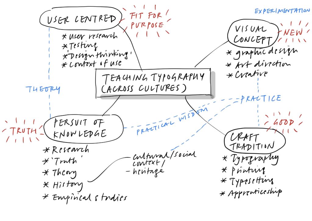
Curriculum philosophy: defining an evolving discipline

The term ‘graphic design’ and its many permutations

The term ‘graphic design’ was coined in 1922 by American artist–designer William Addison Dwiggins to replace the term ‘commercial art’, which has its roots in decorative and applied arts. While graphic design has since been a common identifier for the discipline, a plethora of alternative terms began to appear in the past two decades. ‘Visual communication’, ‘graphic communication’ and ‘communication design’ are some examples. These alternative terms reflect attempts to address the changing contexts of the practices of graphic design, or may show a desire to elevate the status of graphic design beyond mere styling. In the industry however, the term ‘graphic design’ is still the most widely used.

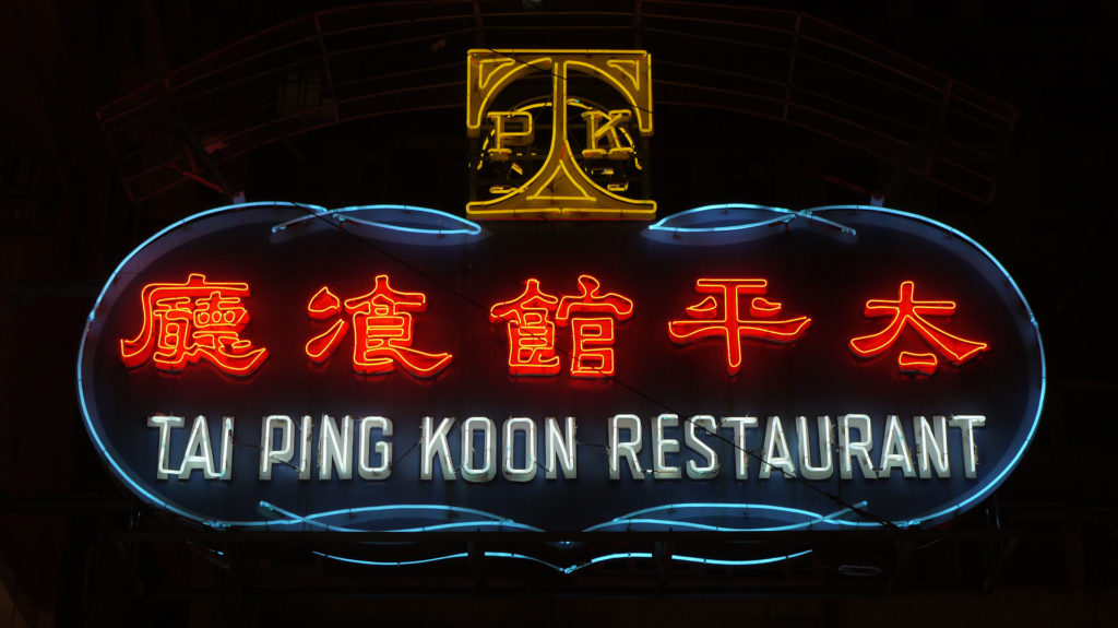
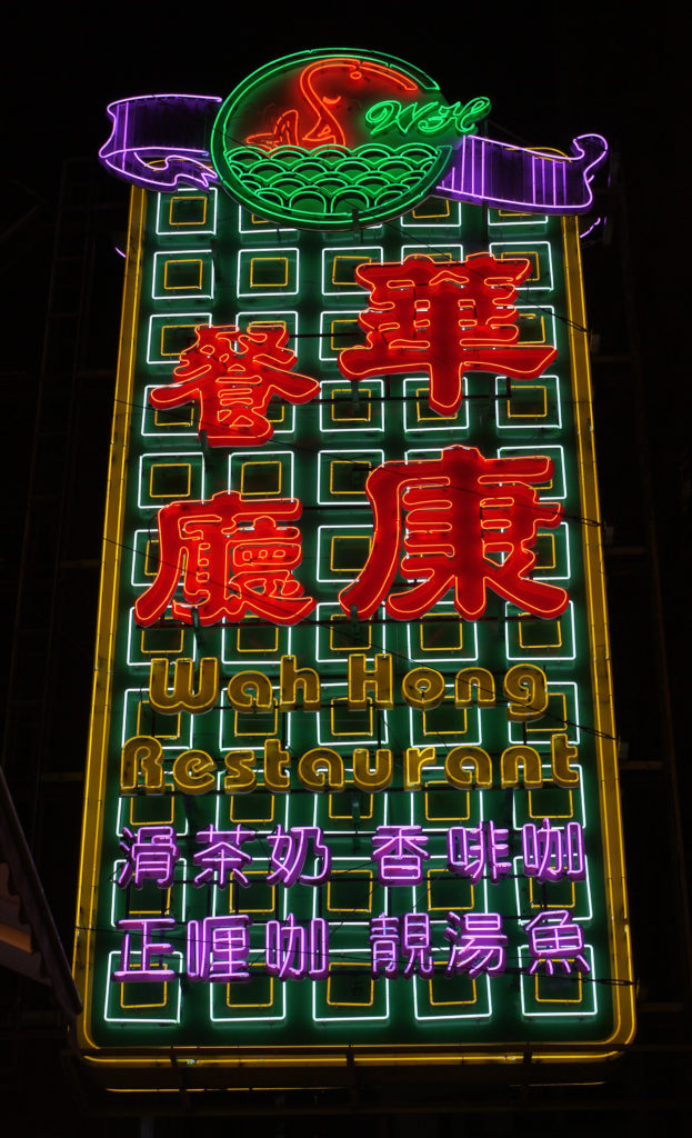
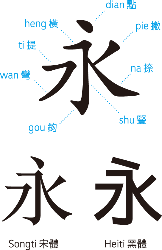
‘Graphic design’, ‘visual communication’ as well as ‘graphic communication’ are terms that emphasise the means of communication. While ‘visual’ and ‘graphic’ may seem similar, they are distinct from each other. ‘Graphic’ implies a combination of the visual as well as the verbal, forming a symbolisation system, while ‘visual’ is more general and refers to anything that can be taken in by sight. In Chinese, graphic design translates as ping mian she ji (平面設計), literally ‘flat surface design’, which refers to the two-dimensional nature of the discipline. All of these terms are constrained by the medium or means of communication and focus on the artefacts produced rather than the process of communication itself.

Technological influence: printing

Printing technology has been inextricably linked to the practices of communication design: from woodblock printing to letterpress to lithography and digital printing. Paper, as a cheap and portable medium, has been fuelling the advances of the printing industry, and has been the single most important medium for communication designers to work with for centuries. Mass production of information has always been at the heart of the discipline. To this end, text (as opposed to images) plays an extremely important role. The invention of moveable type printing was a defining moment in the history of human communication, which enabled the industrialisation of the dissemination and preservation of knowledge with highly improved efficiency and enormous scale. With the wide adoption of desktop publishing since the 1980s, the traditional roles of the printer and the graphic designer are being redefined as the communication designer is now able to handle typesetting, image processing and the generation of press-ready artwork without leaving one’s desk.

Technological influence: digital technology

The proliferation of the internet since the early 1990s and the rapid growth of mobile devices and related technologies in recent years are transforming the way we navigate and interact with information, knowledge, environments and above all, people. Digital technology has gone far beyond being a mere tool for visualisation and production; it is the very means through which people communicate and has become a way of life. With Web 2.0, the semantic web, mobile networked devices, location-based services and beyond, users are also generating vast amounts of information and knowledge. The flow of information is no longer top-down but in a networked manner that is shared by everyone.

These digital technologies gave rise to new disciplines such as multimedia design, web design and human–computer interaction design, which focus exclusively on these digital media. A communication designer may also play an active role in strategising, structuring and visualising information for these media. Communication in this context is no longer the simple case of a message delivered to a passive audience, or porting content from one medium to another. The processes becomes much more complex, requiring an acute awareness of user behaviours and systems thinking. Instead of producing simple visual representations of ideas and standalone artefacts, designers are now likely to be called on to create tools, systems, services as well as experiences. This technological shift presents communication designers with unprecedented challenges and opportunities. John Heskett (2011) writes:

‘The result [of the shift from mass to flexible technology] is that designers are no longer simply the manipulators of visual form (although many will continue to perform this role). In addition, however, many other designers are becoming responsible for creating and implementing systems that enable users to determine for themselves how they will be used and implemented in their lives and work. In addition, new functions for design at the level of planning and strategic management are opening up. This provision of flexible resources on a massive and complex scale opens up new and powerful possibilities in technology, production and economy, and for new approaches to design, the potential for which has barely begun to be tapped.’

Designing in a knowledge-based society

As our society and economy become increasingly knowledge-based, communication comes to the fore as an essential activity in every facet of our lives. Much of this communication is manifested through visual and verbal means, but may also involve other human senses, delivered via a variety of media to form complex communication experiences. These experiences enable users to sieve through, learn and share information, make appropriate choices, accomplish tasks and, at a deeper level, reflect on who we are as members of our cultures and communities. In this context, communication designers not only have to possess aesthetic sensitivity and an intuitive ability to think creatively, but managerial, planning and analytical skills for tackling complex communication problems have also become essential.

The production of tangible artefacts is at the centre of most design practices. Designers are usually concerned about the material quality and aesthetics of the artefacts that they produce. There is nothing inherently wrong with this, and much communication is still accomplished via the production of tangible artefacts. But it is important to take a step back and consider the processes that influence understanding and how they engender desired actions on the user’s part through the use of artefacts. Artefacts, therefore, play an intermediary role in such cognitive processes and resulting actions. 

Despite frequent declarations announcing the demise of print, much communication is still published in the printed format, and communication designers continue to engage in designing for print. However, it is vital that communication designers assess which medium or channel of communication is the most appropriate and effective for a given purpose and audience, rather than defaulting to print media. 

As communication technology continues to advance and our world becomes ever more connected, graphic design education and practices need to evolve in order to meet the new challenges and opportunities that arise in these new circumstances. The term ‘communication design’ accurately captures the essence of the discipline and calls for a renewed set of skills and knowledge that enables designers to think in strategic, systemic and innovative ways.
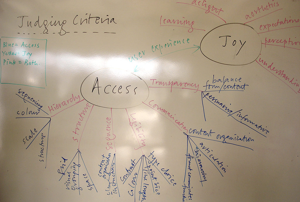
Theoretical models

One of the major threats to communication design lies in the difficulty of measuring the success of a piece of work. Is it based on visual impact? Craftsmanship? The originality in its visual style (something that the world has not seen before)? Or should it be based on improved business returns? There does not seem to be an agreed set of criteria for evaluating the success of a piece of communication design. From a survey of 1,500 US graphic designers conducted by Paul Nini (Nini 1997), it was found that large percentages of respondents do not seek user input during the concept development stage, nor solicit user evaluation of communication prototypes and final design communications. Nini writes:

‘My experience in, and observation of, the field [of graphic design] seems to suggest that graphic designers are quite adept at designing, producing and introducing solutions (as designed messages), but that these are based on little if any information gathering and analysis. Likewise, it is rare to find graphic designers who solicit end-user evaluation of their efforts, whether in prototypical or final form.’

Communication design, like other forms of fine and applied arts, is often dismissed as self-expressive. It is important that more objective frameworks are established to gauge the effectiveness of communication design, so that professionalism is assured rather than relying on a designer’s reputation and fame. Shifting communication design from a designer-oriented activity to a user-centred one is therefore essential. The following three models have been useful for communication design students at the PolyU School of Design. Although the concepts behind these models sometimes overlap, they provide ways to situate the practices of communication in wider contexts and offer a holistic and all-encompassing perspective on what communication designers do.

Syntactic, semantic, pragmatic

The model for semiotic analysis devised by Charles Morris in 1972 provides a good framework for evaluating any communication design products. Students are encouraged to evaluate their peer’s work not only based on their subjective feelings or artistic preferences but in a more holistic, objective manner.

The syntactic level deals with form – the use of visual elements and principles in creating a graphically coherent design piece. Of the three levels, this one is the most familiar to students as well as most practicing communication designers, as it is primarily concerned with how a design piece looks. ‘Process schools’ that are based on the Swiss model of graphic design teaching work mainly on the syntactic level and encourage students to experiment with form, combining imagery and text in inventive ways to create engaging graphics. This method alone is wholly inadequate in assessing a communication design piece, as its main focus is on aesthetic concerns.

The semantic level is about content – the meanings conveyed to the audience in terms of visual as well as verbal language. Through the symbolisation methods used and the structure and organisation of words, images and graphical forms, meaning is derived by the audience. The audience’s ability to decode linguistic and cultural codes highly depends on how much of these are shared between the originator of the message and the audience or user. Ambiguity should be kept to a minimum and clarity in communication on a semantic level should be sought.

The pragmatic level pertains to context – the purpose of the communication, who it is designed for and how effectively it performs in serving its purpose. The pragmatic level is primarily about performance and suitability for purpose; whether the audience or user is able to perform the desired tasks accordingly after viewing and/or using a communication design piece. Pragmatic concerns are implicit in disciplines such as industrial and environment design but are often overlooked by communication designers. Usability studies, psychology of learning, user-centred research, legibility studies, etc. contribute to pragmatic considerations, helping communication designers in making informed design decisions, lending credibility and value to the work t

Physical, cognitive, affective

Another model, a three-part framework for information design (Carliner 2000) is also very useful for communication designers. Carliner suggests that there are three technical levels that should be considered, namely, the physical, cognitive and affective. Carliner writes:

‘[ . . . ] design is a problem-solving discipline. It considers more than the appearance of the designed product, but also the underlying structure of the solution and its anticipated reception by users. Because design is focused on solving problems, a design theory must provide more than a series of guidelines about discrete characteristics of the solution; it must focus designers on identifying and considering the interrelated issues that must be addressed in a solution.’ (Carliner 2000)

The physical level helps users to find and locate information that is of interest or relevance to them. This level considers issues related to the physical properties as well as the organisation within a design artefact. 

The cognitive level considers whether users are able to understand and make use of the information once they find it. This level is concerned with the processes of visual perception and cognition, and how ‘performance goals’ are achieved. 

The affective level is concerned with motivating users to perform their intended tasks after finding and understanding the information. This has to do with the emotional response that a communication product is able to elicit from its users, so that their attention is captured and they are motivated to act accordingly.

Visceral, behavioural, reflective

In the book Emotional design, Don Norman (1999) suggests a three-level model for processing and design: visceral, behavioural and reflective. All three levels work together to form a user experience that is significant and meaningful. The visceral level relates to the immediate sensorial response when a users first interact with a designed product. It is concerned with the aesthetic appearance of a product and the ability to generate an emotional response towards the product. The behavioural level is about the function and usability of the product, how easy is it to understand and interact with it in order to achieve the tasks intended. The reflective level focuses on the connotative or associative meanings of a designed product and involves deeper meanings such as status, prestige, beliefs etc.

These three models, form a robust theoretical basis for formulating a clear philosophy that underpins the new curriculum. Ideas in these models underpin the programme learning outcomes as well as the curriculum structure.

Programme learning outcomes

As stipulated by the university, we adopt an ‘outcome-based’ approach to teaching and learning at the PolyU School of Design. Also known as ‘constructive alignment’ (Biggs and Tang 2007), this approach is student-oriented rather than teacher-centred. Instead of viewing the curriculum simply as content areas that need to be covered by the teacher, the outcome-based approach begins with planning sets of competencies (learning outcomes) that students are expected to achieve, and then deciding what areas of knowledge are required and what assessment tasks are able to indicate these competencies. Demonstrable outcomes are developed at the programme level with a more general view, and are further broken down into more specific outcomes developed for each subject at each stage of learning.

A set of nine learning outcomes have been developed for the Communication Design programme. These outcomes are intended to be comprehensive, with the aim to graduate not only competent job-ready professionals, but practitioners who are resilient in the face of change, with a vision to advance their careers and themselves become agents of change. The outcomes listed below encompasses traditional as well as contemporary values in a knowledge-based society. Subjects in the curriculum are organised in such a way that systematically address these outcomes at various stages in a student’s learning. On completion of the programme, it is hoped that students will possess the following competencies:

Professional competencies

  1. Situate the practices of communication design within social, cultural, sustainable, technological, business and professional contexts
  2. Adopt a user-centred approach to communication design through the application of appropriate research methods to the understanding of contexts and users in order to make informed design decisions
  3. Adopt an iterative design process that involves divergent and convergent modes of thinking; to think creatively, strategically as well as systemically in solving communication problems 
  4. Shape communication experiences for a variety of media through typography, imagery, interactivity and time with sensitivity to aesthetics and craft
  5. Reflect critically on the practices of communication design and anticipate future developments of the profession in local and global contexts

Generic competencies

  1. Communicate with clarity and conviction via verbal, written and visual means
  2. Approach problems critically from multiple perspectives; assess needs, identify opportunities, question the status quo and substantiate arguments
  3. Work independently and collaboratively, manage projects and deadlines
  4. Be inquisitive and sustain a passion for lifelong learning

Curriculum design

The new curriculum in communication design is based on the notion that graduates should be equipped with the professional skills necessary to meet current and future needs of the industry in Hong Kong, as well as a critical mind that will enable them to question the social and cultural roles of communication design in local, regional and global contexts. 

Teaching and learning modes

The master–apprentice approach

Learning by doing has been the norm in design education where students experiment with visual concepts, manipulate visual forms and come up with creative solutions. An iterative process is encouraged, where students generate numerous concepts before deciding on one, which is then further developed into a final solution. Finding an original concept or visual language is often the main concern, aside from the purpose that the brief is destined to serve. Teachers work with students in a studio environment in a master–apprenticeship mode. Students are often encouraged to develop an individual approach or style. This mode of teaching has its roots in visual art education. While learning by doing is still relevant in today’s practices of communication design, by itself it is insufficient as the complexity of the problems that communication designers encounter continue to increase.

Balancing tacit and coded knowledge

Tacit knowledge is accumulated by continuous practice, and it must be complemented by a structured body of coded knowledge, providing a theoretical basis to what we do as communication designers. This is important for communication designers so that they are able to make educated, informed design decisions and are able to substantiate arguments in front of clients.

It is important to not only put emphasis on the know-how of design, but also the know-whys as well as the know-whats. In other words, we challenge students to consider why a design should exist in the first place, what situation and who they are designing for, what to design, and finally how to go about designing it. 

The role of research

Under a user-centred approach to communication design, research becomes a crucial activity for designers to gather knowledge about the users and contexts that they are designing for. Successful designs are not based solely on the designer’s assumptions or hunches. Careful consideration must be made regarding the context of use; the situation or series of activities that people experience when they encounter, interact with and make sense of a communication product. Collection of primary and secondary data as well as the analysis and synthesis of the data gathered generate insights and conclusions which help designers immensely in identifying issues and problems and informing their design decisions. Research at the undergraduate level should focus on this mode of research, which is pragmatic and closely linked to studio practice. In the new Communication Design degree programme, research methods and theoretical knowledge are introduced in a seminar subject that runs parallel with studio subjects.

Studio practice and teaching

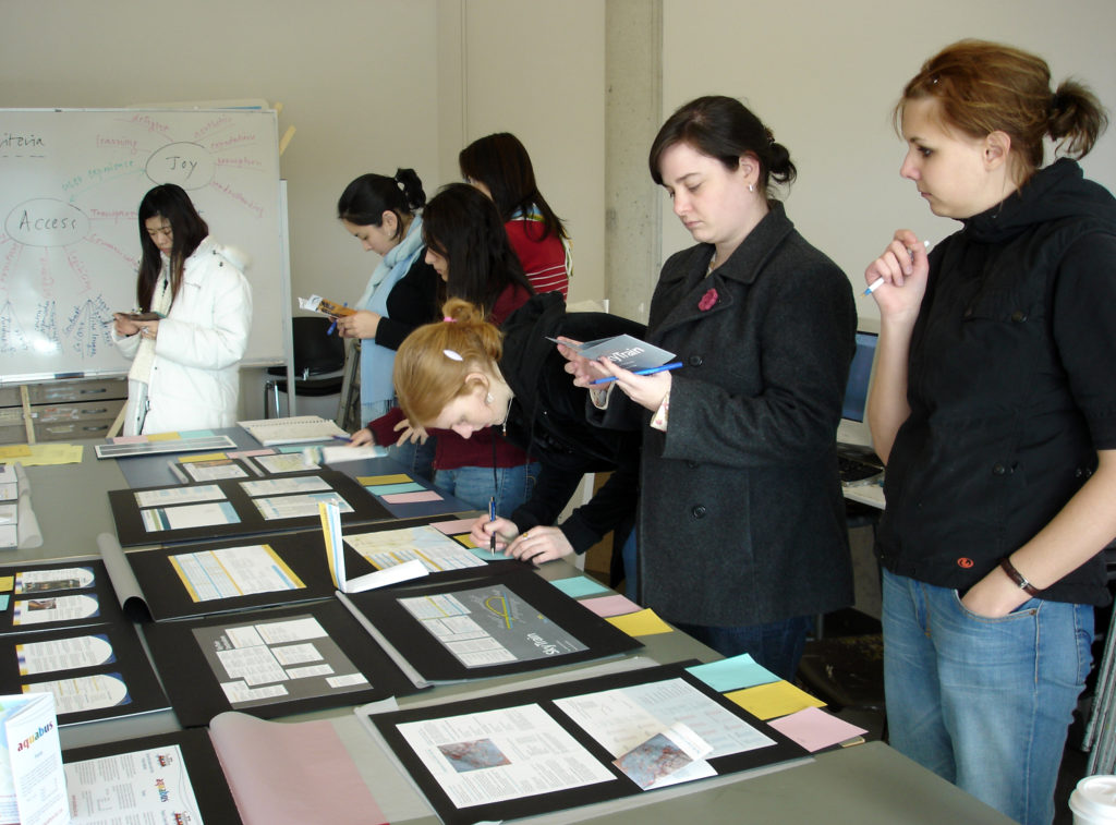
Much of the teaching and learning happens inside each year group’s studio space, a designated place that is a vital part of a communication design student’s life. Students work both individually and collaboratively in the studio where they share knowledge and resources, generate concepts, make and test artefacts, engage in discussions and debates as well as charting their processes. These spaces are vibrant and active communities of practice. 

Workshops and tutorials

Workshops and tutorials, which are intended for building tacit knowledge and skills, are usually held at these studios. Teachers teach by example through demonstrations and participating in discussions and debates.

Critiques

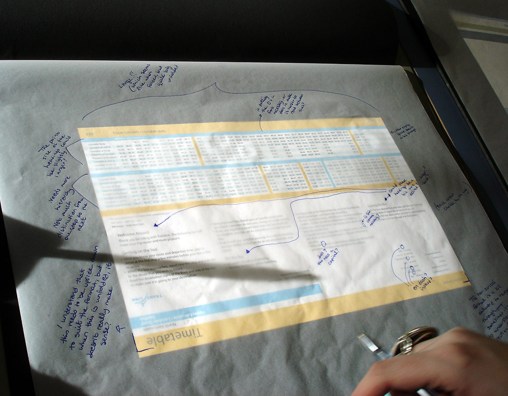
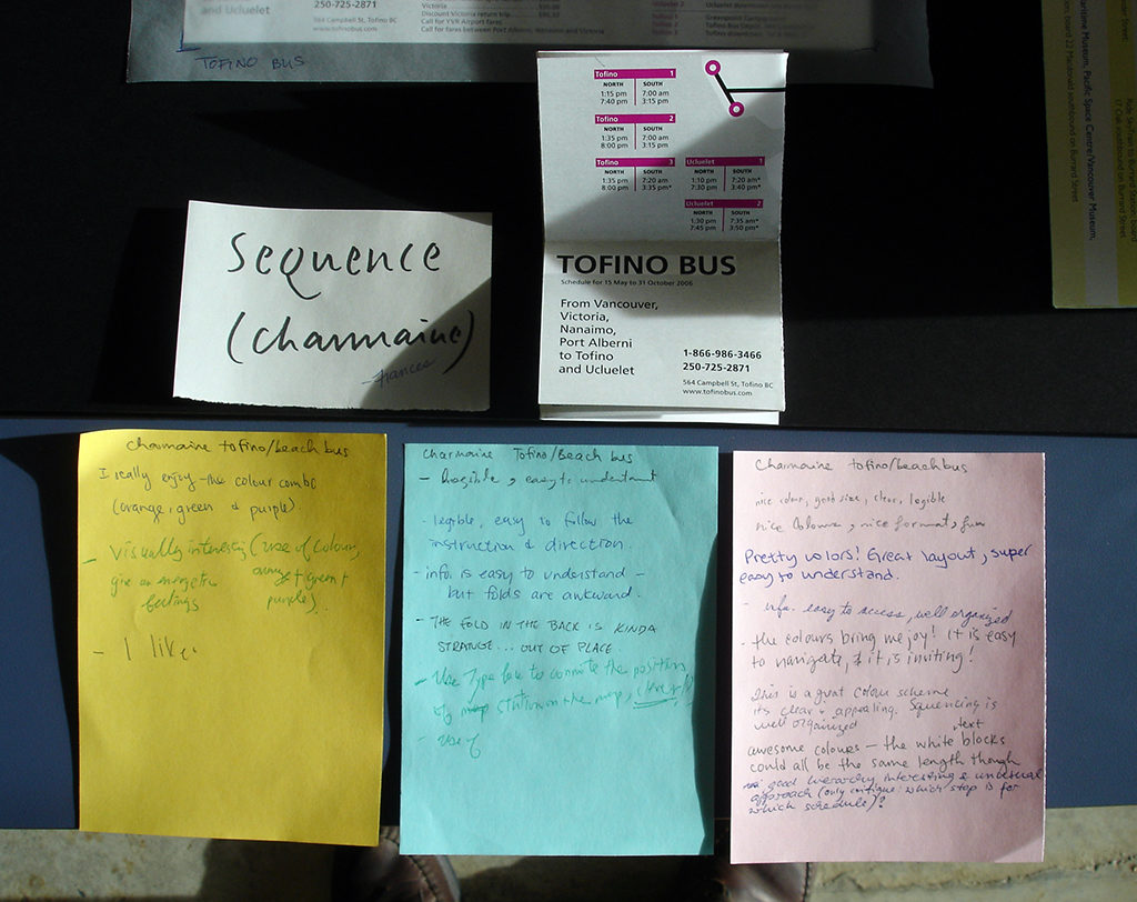
Critiques are an important component of studio learning. Before students present their work, frameworks with criteria are established for objective evaluations of the projects. Students can hence assess the effectiveness of the work from different perspectives and learn from the strengths and weaknesses of their peers.

Seminar- and lecture-based subjects

History, theory, research and other contextual topics are typically taught through lectures and seminars. Lectures may be followed by workshops that reinforce the concepts introduced. Topical readings and case studies are discussed and debated amongst students and tutor.

Three key stages of learning

The four-year curriculum is divided into three key stages of learning. The first stage focusses on making and developing fundamental skills in visual–verbal language, with an overview of the discipline, underpinned by historical and theoretical discussions. The second stage involves studio practice informed by context, where fundamental skills are integrated and applied in lifelike projects, with further studies in history, theory and culture. The third stage emphasises the synthesis of skills, methods and concepts and prepare students for professional practice, working collaboratively as well as independently. The curriculum consists of 38% practice-based subjects, 21% context-based seminar subjects, 12% electives and 29% general studies required by the university.

Stage one: building tacit knowledge

The first stage of the students’ learning is dedicated to developing students’ tacit knowledge. Five key areas are identified as fundamental to the learning of communication design: typography, drawing, images, time and interactivity. Mentions of specific media are deliberately avoided in the subject titles, as they are likely to evolve over time; though students will be developing affinities to a wide variety of different media. Emphasis is placed on the application of these skills in lifelike communication contexts and the interrelations between them.

Typography, drawing and images are traditional skills in graphic design, while time and interactivity are new additions and are mandatory subjects. Time deals with storytelling and sequential narratives, most likely to be applied to motion graphics but also essential in communicating design scenarios. Interactivity deals with interface design, how users interact with and manipulate information for digital devices as well as physical interfaces. 

These fundamental subjects are complemented by seminar subjects that lend a theoretical perspective to studio practice, such as media, information and visual literacy, emerging issues of the discipline, the role of research in design as well as visual culture and design history.

After gaining fundamental knowledge and skills in their first year, students then move on to integrating these skills in two specific directions: information design and art direction. These are intermediate level subjects that act as bridges to subsequent contextual studio projects in stage 2 below.

Stage 2: contextual studio projects

There are four themed contextual studio subjects: (1) Text & Image, (2) Information, (3) Identities and (4) Experiences. With the exception of Text & Image, contextual studio subjects are supported by concurrent seminar subjects that introduce research methods and theories related to the studios’ themes, such as user research methods, brand strategy and cultural identity.

The themes of these studios were chosen to address the core issues that the communication design discipline is concerned with. Text and image is concerned with the shaping of simple messages using words and images. Information concentrates on lending clarity and accessibility to complex information. Identities is about strategising and building visual systems that reflect the identities of cultural, social and commercial communities. Experiences deals with the creation of complex communication experiences with many different components such as product–service systems. These studio projects begin with the simple problems gradually build up in complexity.

Students may choose from one of several briefs related to the theme of the studios, led by one faculty member whose role is similar to a team leader or manager. Real-life projects could be brought into these studio subjects, and the intention is to make these studio experiences as close to professional practice as possible.

While designing for persuasion is also a possible theme, it is somewhat deemphasised in the Communication Design programme, as advertising is offered as a separate programme at the PolyU School of Design.

Stage 3: professional practice preparation

The final stage of learning is intended to prepare students to enter the professional workforce upon graduation. Students will have the opportunity to work collaboratively in an interdisciplinary team on a real-life project, and embarking on a substantial self-directed final project after an intensive study of a topic of their choice. It is worth noting that students are encouraged to explore issues that are contextual and of relevance to the needs of the society in their final project investigations. They are encouraged to think beyond a particular medium of expression and steer away from overly personal topics.

Future challenges and conclusion

This paper has outlined the many changes and new challenges that the communication design discipline is currently facing and how the conceptualisation and design of a new curriculum has addressed some of these issues. The successes and failures of this new curriculum design philosophy have yet to be proven when the first batch of students graduate in 2016 and enter the workforce as a new breed of designers. There are many uncertainties that lie ahead both within the Greater China region and around the world as the economy continues to evolve and the definitions of the profession continue to expand. 

One of the major challenges for the communication design profession is its fragmented identity. The lack of a unified body of disciplinary knowledge makes it more difficult to draw the boundaries of the profession and to agree on a definitive set of knowledge and skills that communication designers should possess. In turn, people outside of the profession has formed superficial assumptions of what graphic or communication design means. As much as design academics have continued to engage in debates about the core issues of the discipline, the graphic design industry is rather insular and slow to respond to change.

As higher education becomes more expensive and commodified, undergraduate education becomes increasingly career-driven. There is pressure from institutions, potential employers as well as students to be more career-minded. Producing immediately employable designers who possess all of the necessary form-making and technical skills that match the existing rules of the game seems to be the norm. The idea of success under this frame of mind constitute the winning of design awards that mostly reward style over substance and effectiveness, and the relentless pursuit of stardom in the design world. This potentially has a negative effect on the growth of the communication design as a profession in the long term, if our ultimate goal is to improve human conditions through designing communications. The working definition that Jorge Frascara (Frascara 1995) offers for graphic design eloquently stresses this: ‘graphic design is the activity that organises visual communication in society. It is concerned with the efficiency of communication, the technology used for its implementation, and the social impact it effects – in other words, its social responsibility’. 

A university-based education in design certainly has the responsibility to go beyond professional know-hows and embark on critical debates of the present as well as future of the discipline. Nurturing visionaries and change agents who are critical in thinking and broad in their scope seems to be far-fetched for the industry, but absolutely necessary if universities are to continue to be cradles of academic discourse and proponents of the advancement of any profession. It is hoped that the curriculum design philosophy presented in this paper would give rise to a renewed identity of the discipline that will transpire further debates and developments in the practices and education of communication design in China and beyond.

Bibliography

Carliner, S. (2000). ‘Physical, cognitive and affective: a three-part framework for information design’ in Technical Communication, fourth quarter 2000, pp. 561–576

Frascara, J. (1995). ‘Graphic design: fine art or social science?’ from Margolin, Victor and Buchanan, Richard (eds.) The idea of design. Cambridge MA: MIT Press

Heskett, J. (2011). Continuity and change, design for Hong Kong: a strategic review of design education and practice. Hong Kong: Hong Kong Polytechnic University

Nini, P. J. (1996). ‘What graphic designers say they do’ in Information Design Journal, volume 8, number 2, pp. 181–188

Norman, D.A. (2004). Emotional design: why we love (or hate) everyday things. New York: Basic Books

A few thoughts on critiques

Critiques form a very important part of any designer’s education, and are an essential learning tool in a studio setting. Critiques are most effective when the teacher prepares it in a structured way rather than giving random comments. Students should be leading the discussions in a critique; the teacher’s role is to guide the discussions lead by the students. My view is that learning in design cannot happen when the subjectivity of the teacher gets in the way. I believe that it is in both the learner’s and the teacher’s interest to shift the focus of discussions away from the self, and instead directed at the context and the communication effectiveness of the project.

Here are a few methods that I use in critiques:

Establish judging criteria first

It is extremely helpful (before the critique proper begins) to revisit the design brief and ask students to contribute to establishing a set of criteria for judging the work. Ask, ‘what would make this a good piece of design?’.

Whiteboard showing judging criteria for a transport information pamphlet project established collectively between students and myself

Give students some time to preview the work in detail

Give the students 20 minutes or so to closely study their peers’ work. Some work require more time to appreciate than others (eg book designs). Posters might require less time. Get the students familiar with what their fellow students have been working on.

Critique session for the transport information pamphlet project at Emily Carr University of Art & Design, Canada), 2004

Presenting someone else’s work as if the students’ own

This is an interesting technique that students always find fun. Get each student to choose one of their peer’s work, give them some time to examine it, and then ask them to present it to the whole class as if they did it themselves. After the presentation, the student who originally created the work would have to ask two critical questions about the work as a member of the audience. This reversal of roles invites students to view their own work with some distance and objectivity, and also to enable students to decipher someone else’s work and verbally rationalize what they see. The effectiveness of communication is very easily revealed.

Assigning someone to lead the discussions

After an initial ‘preview’, each student could choose one piece of work that interests them and write down one word on a Post-It note to describe one thing that does not work in the design. The student will then lead the discussions based on this word. This ensures that the subsequent discussions are purposeful and does not lose focus.

Silent critique

The teacher prepares self and peer evaluation forms with bipolar scales of qualities that describe the student work. Students will evaluate their own and two other peers’ work using this form, and write comments on them. Students can then modify their designs based on these evaluations.

Students annotate each other’s work

Three colours

This technique is interesting in that it encourage students to think of the priority of their peers when they designed the piece. Three slips of coloured paper are attached to each piece of work: blue, yellow and green. At the beginning of the critique, the class as a whole decide what those colours mean, for example blue means the work is ‘functional’, while yellow means that it is ‘aesthetically pleasing’. The green (which is a combination of blue and yellow), then, should be a sum of the blue and yellow, ie the work both serves its function well and it is aesthetically pleasing. After carefully reviewing each piece of work, students put a mark on one of the colours.

Students using three colours to make comments on each other’s work, using the three criteria that were established earlier: yellow = joy, blue = access, pink = both

Teaching typography across cultures: a few tentative thoughts

Teaching typography across cultures diagram

At the ATypI working seminars in Colombo, Sri Lanka, I shared my experience in teaching typography across cultures. My focus was not the differences between teaching in Canada, UK and Hong Kong (where I have taught), but the different perspectives of design education that are expressed in terms of believes, values and actions.

Typography teaching usually happens within the context of communication design education (or graphic design, visual communication). The degree to which typography is emphasised or valued in a specific programme varies. Some view typography as an expressive visual element, some view it as the most fundamental aspect of communication. Some see it as a technical skill (ie typesetting, desktop publishing), while others view it as a specialised area of academic study. The meaning of the term typography hence has many different interpretations.

I perceive at least four perspectives or ‘schools of thoughts’ of typography (and communication design) education, each one I have held to varying degrees throughout my teaching career so far. Let me briefly outline these four perspectives:

Visual concept: creating something new

This perspective typifies the art school ethos where the visual concept reigns supreme. Typography serves the purpose of making a concept visible, communicating a tone and manner, reaching a specified demographic, visually differentiating from competitors or persuading a specified audience to act on something. The key consideration is the emotive power of type and typography – extending the semantics of text beyond the literal – as well as aesthetic sensitivity, or indeed taste. This is a perspective widely held by graphic designers and art/creative directors, or those who work in the branding and advertising fields. Creating something new and original is the grand mission here. An iterative creative process is often adopted, and an apprenticeship approach to teaching that encourages experimentation. The typographer/designer is typically inward-focussed and self-driven, and is interested in pushing the creative envelope and coming up with novel forms. Those who excel under this mode of practice are rewarded with awards that recognise work with stylistic currency and formal innovation, and celebrated for their artistic flair and individuality.

Craft tradition: creating something good

The practices of typography was born out of letterpress printing, at least in the West. It has been inextricably linked to the craft and technics of printing. The training of typographers was through apprenticeship, and later in trade or technical schools. Before desktop publishing, typesetting and page composition were tasks that graphic designers had to outsource. Craft knowledge in typesetting was held mainly by typesetters and printers, as they were the ones who had access to the technology. This division of labour has now largely disappeared. The rules and conventions of typesetting was renewed with the coming of age of desktop publishing in the 1990s with sophisticated software and digital fonts, now a widely accessible technology. This craft tradition is still very much with us today in the digital age and is not restricted to print media. It is found in pockets within the practices of graphic design, book and publication design, typography, type design as well as niche letterpress printing. The emphasis here is to create artefacts that are inherently good – well crafted – rather than being new or innovative. Standards and values are upheld by communities of practice.

User-centred: creating something that fits the purpose

User-centred design is often associated with things that have very specific contexts of use, where effectiveness and performance are of utmost concern. Wayfinding systems, forms, instructions, user interfaces, documents, etc. are what practitioners of user-centred communication design focus on. A user-centric approach sprang from the human–computer interaction (HCI), web usability and information design fields, where the psychological aspects of the graphic presentation of information are studied. Affordances of graphic attributes – such as the legibility of typefaces, effectiveness of page layouts, user interaction of interface elements – are backed by findings from user research, informing design decisions. With digital transformation, typographers and communication designers increasingly blend their practices with that of information or user experience design, designing systems that enable content to be fed into that are usable and effective. The typographer/designer is outward-focussed and is empathic to others’ needs. Fitness of purpose is the key consideration here, with an emphasis on the logical rather than the novel.

Pursuit of knowledge: finding truth

Typography and communication design are first and foremost practice-based disciplines. Skills have traditionally been passed down from master to protégé through a ‘learning by doing’ approach. As typography and communication design became areas of academic study in formal education, internalised tacit knowledge held by masters (‘practical wisdom’) needed to be made explicit and transmittable. Reflections on practice and analyses of historical artefacts and documents are ways to understand the circumstances under which communications are produced, distributed and used: how processes are managed, how decisions are made, the social, cultural and economic contexts, technological influences, etc. Empirical studies that relate to the affordances of graphic presentation mentioned above is another area of research, sometimes using experimental and quantitative approaches with statistical analyses to verify hypotheses. Many avenues exist for the dissemination of research, including academic journals, conferences, trade publications, etc., though the degree which practitioners pick up on these vary. Regardless, research plays an important role in advancing knowledge of our profession, and the focus here is truth-finding.

What is your perspective?

My aim here is not to generalise; it is merely a reflection on my own practice as a practitioner, teacher and researcher. These four perspectives do not exist in isolation of course. An educator or practitioner may hold these perspectives simultaneously or move fluidly between them without even realising. Or they might deeply hold one perspective and practice only in that realm. Different types of educational institutions might also hold one (or more) of these as their primary value.

Designing with the Hanzi script

Tam, K (2018) ‘Hanzi’, in Wittner, B; Thoma, S; Hartmann, T, eds. Bi-scriptual: typography and graphic design with multiple script systems. Salenstein, Switzerland: Niggli, 204–211

Download full text in PDF format

An introductory article to designing with the Hanzi (Chinese) script, discussing the characteristics of the script and typographic issues.

Background

The Chinese language is written in the Hanzi script, where Han refers to the dynasty (202 BC–220 AD) as well as the largest ethnic group in East Asia. Other languages also use subsets or variant forms of Hanzi: Kanji for Japanese, Hanja for Korean, and Chữ Nôm for Vietnamese. The origins of the Hanzi script date back to the Shang Dynasty (1600–1046BC), with inscriptions etched onto bones and animal shells used for divination. Hanzi is a logographic script, where each character represents a morpheme. The Hanzi script is made up of six kinds of characters known as liushu: pictographs, simple ideograms, compound ideographs, rebuses, phono-semantic compound characters, and derivative cognates. Each character represents one syllable, but pronunciation bears little relationship to the form of the character except in phono-semantic compounds, where pronunciation is imprecisely denoted. The Chinese language also consists of large numbers of homonyms – characters that share one pronunciation. The totalled number of Chinese characters currently documented in the GB18030–2005 encoding standard is 70,244, 4,808 of which are frequently used.

Figure 1 The eight types of strokes illustrated by the character yong in Kaiti, Songti and Heiti

Strokes are the most elemental building block of Chinese characters. The character yong (永) is used to illustrate the eight types of basic strokes in Chinese calligraphy [figure 1]. Strokes are used to construct a total of 213 radicals (部首). These are root characters that can either exist as individual characters, or combined to form composite characters. A word in Chinese can be made up of one to three characters, with an average word length of 1.5 characters. 55% of words comprise of one character, 40% of two characters, and 5% of three characters. There is no spatial separation between words; they can only be differentiated in context. 

There are eight main varieties of speech in China, often referred to as dialects rather than languages. Mandarin and Cantonese are the two that are most widely spoken. Mandarin was designated as the official form of Chinese in 1932 during the Republic of China era. Mandarin – called Putonghua (普通话) in Mainland China – is the official language on the Mainland, Taiwan and Singapore. While the majority of the population in Hong Kong and Macau speak Cantonese, they have been taught to write in a way that closely resembles Putonghua.

Hanoi Pinyin (汉语拼音or simply Pinyin) is a standard romanisation system for Putonghua. It was introduced after the establishment of the People’s Republic during the 1950s by Zhou Yonghuan (周永光). This system uses the Latin alphabet with four diacritical marks that denote the flat (macron ¯), rising (acute ´), falling (grave `) and falling-rising (caron ˇ) tones. Wade–Giles, Sin Wenz, and Yale are other romanisation systems, but are now largely superseded by Pinyin. Zhuyin (注音, also known as Bopomofo ㄅㄆㄇㄈ) is a phonetic notation system that uses 37 phonetic characters and four tone marks [figure 2]. This system is commonly used for teaching reading and writing in school books in Taiwan, but not used on the Mainland. 

Figure 2 The Zhuyin phonetic system used in Taiwan. Source: Wikimedia

There are two forms of Chinese orthography: Traditional Chinese (繁体中文) and Simplified Chinese (简体中文). Simplified Chinese characters were derived from the traditional forms by reducing the number of strokes, and were first proposed during the Republic of China era in 1935. The official set of Simplified Chinese characters was later expanded and then imposed by the government of the People’s Republic of China during the 1960s and went through several iterations. The current national standard consists of 8,150 characters. Simplified Chinese is the official script in Mainland China, and it is also used by Chinese diasporas in Malaysia, Singapore and other parts of the world. Traditional Chinese is used in Hong Kong, Macau and Taiwan, and in some overseas Chinese communities. A reader’s preference of one form over the other can be owed to his reading proficiency, habit, cultural propensity, or regional sentiment.In addition to Traditional and Simplified Chinese, further regional orthographic variations exist between Mainland China, Taiwan and Hong Kong. Kanji (Japanese) and Hanja (Korean) also have their own regional orthographic variations [figure 3].

Figure 3 Simplified Chinese, Traditional Chinese, Japanese and Korean regional variations of a selection of characters in Noto Serif.

Chinese text is traditionally written vertically from top to bottom, with lines running from right to left. Books and publications were almost exclusively printed vertically until the Republic of China era (1912–1949), foreign influences and bilingual publications encouraged the adoption of Western style horizontal typesetting. Since 1955, the Government of the People’s Republic of China has enforced horizontal setting for all printed matters. In Taiwan, Hong Kong and Macau however, both vertical and horizontal settings can be found.

The use of a soft, pointed brush for writing Hanzi characters dates back some 5,000 years ago. By varying the pressure applied, different thick–thin stroke transitions are achieved. Calligraphic scripts such as Bronze Script (金文) or Zhuanshu (篆书, zeal script) show less brush manipulations, with almost monolinear characteristics. Lishu (隶书, clerical script) shows more variations in pressure and finial treatments. Kaishu (楷书, standard script), Xingshu (行书, running script) and Caoshu (or grass script) display appreciably more sophisticated variations in stroke contrast and finial manipulations. [figure 4]

Figure 4a An example of Bronze Script, San Shi Pun (散氏盤), late Western Zhou dynasty. Source: Wikimedia
Figure 4b An example of Lishu script, from Cao Quan Bei (曹全碑), 185 AD. Source: Wikimedia
Figure 4c An example of Xingshu script, copy of the Preface to the Poems Composed at the Orchid Pavilion (蘭亭序) by Wang Xizhi (王羲之), 353 AD. Source: Wikimedia

The development of Kaishu in 219–265 [figure 5] paved the way for the subsequent development of standardised lettering styles used in woodblock and subsequently typefaces used in movable type printing. Kaishu reached its height during the Tang Dynasty (618–906). The work of four master calligraphers from the Tang Dynasty – Ou-yang Hsun (欧阳询), Yen Chen-ching (颜真卿), Liu Gong-chuen (柳公权) and Zhao Meng-fu (赵孟頫) – became archetypes, widely imitated as the major lettering styles for xylographic printing. Kaishu was the last development in the evolution of the Chinese script, and it has remained largely unchanged to this day.

Figure 5a An example of Kaishu by Liu Gongquan (柳公权), Xu Mi Ta Bei (玄秘塔碑) c841 AD. Source: Wikimedia
Figure 5b An example of Kaishu by Yen Zhenqing (顏真卿), Duo Bao Ta Bei (玄秘塔碑), Tang Dynasty. Source: Wikimedia

Xylographic (woodblock) printing was first developed during the Sui Dynasty around 1,400 years ago. At first, Kaishu was the style used for book production. The intricate curves of Kaishu soon proved to be inefficient for carving onto wood. A new style called Songti (宋体) evolved from Kaishu in order to speed up production [figure 6]. This style took the essence of Kaishu and regularised and standardised its features. The development of Songti reached maturation during the Ming Dynasty, hence the style is sometimes referred to as Mingti (明体) or Minchōtai (明朝体) in Japan. Songti was a development that signalled a typographic rather than calligraphic aesthetic to printing, later fuelled by the work of missionaries such as William Gamble, who brought the industrialised process of moveable type printing from the west in the late 19th century. 

Figure 6 A xylographic book page from a Ming Dynasty edition of the Book of Qi, printed with Songti. Source: Wikimedia

Punctuation has a long history in Chinese books, dating back to the Qin Dynasty (219–207 BC). These marks were originally added to text as a form of annotation to aid reading, between columns of vertically run text. These were once added by the reader by hand, and later printed with xylography, usually in second colour such as red. Punctuation was not standardised until the end of the Qing Dynasty towards the end of the 1920s, when Western punctuation marks were introduced. Until the end of the Republican era, punctuation was always interlinear rather than within the text flow (with the exception of quotation marks and brackets).

Anatomy and typography of Hanzi characters

Hanzi characters are customarily monowidth; they sit within a notional square. This is defined as the em square in typesetting, referred to as the ‘body frame’. Spacing between Chinese characters are defined internally within each glyph, with a margin within the body frame called the ‘surface frame’. The surface frame is often defined as percentages of the body frame. The larger this percentage, the more tightly spaced and the larger the typeface appears. If a typeface’s surface frame is 90%, given that the em square consists of 1000 units, the space between two characters would be 200 units [figure 7]. This data is usually not known to the user of typefaces and can only be judged by eye. Condensed typefaces such as most Fangsongti (仿宋体) appear very widely spaced on the body frame, whereas typefaces with small surface frames such as Kaiti often appear small compared with other typefaces of the point size [figure 8]. In the Hanzi script, all strokes and characters are centred optically within the body frame, and sized and aligned optically between each character. This makes it possible for most Chinese fonts to be set horizontally as well as vertically. 

Figure 7 The (average) surface frames and internal character spacing of Microsoft Ya Hei (top), ST Songti (middle) and ST Kaiti (bottom).
Figure 8 A comparison of Songti (top left), Heiti (top right), Kaiti (bottom left) and Fangsongti (bottom right). Note that the appearing size and spacing of the characters vary.

Type classification

Chinese typefaces can be broadly classified into four major categories: SongtiFangsongtiKaiti (Kaishu), and Heiti [figure 9]. These categories of typefaces are considered general purpose and conventional, most suitable for continuous text as well as display use. Typefaces that are outside of these four categories can generally be considered novelty display typefaces.

Figure 9 Top to bottom: Four major categories of Hanzi typefaces: Songti, Fangsong, Kaiti and Heiti

Kaiti (楷体) is a calligraphic typestyle that closely follow the style of Kaishu (楷书). All strokes are made up of curves, with no orthogonal lines. Conveying traditionalism, this style is conventionally used for correspondence, business cards or invitations, suggesting formality. It is also often used for Children’s readers or textbooks, because it most closely resembles handwritten forms. Kaiti may be preferred by elderly readers, but can sometimes appear too traditional, and may slow down reading if used in long texts. 

Songti (宋体) is the most ubiquitous category of typefaces for continuous reading. Its modulated stroke contrast and emphasised stroke terminals can make it comparable to Latin seriffed typefaces. It is also sometimes called Mingti (明体) in Chinese, especially in Taiwan and Hong Kong. Songti has a literary quality that works well for both text and display use. 

Fangsongti (仿宋体) was a style developed for interlinear notes in small sizes in xylographic printing during the Song Dynasty. The stroke contrast is low, with condensed proportions and often very light stroke weights. Fansong typefaces are usually very light in weight, therefore unsuitable for lengthy continuous reading, especially in small sizes. Its condensed proportions make it suitable for vertical setting.

Heiti (黑体) appears to be the most contemporary style amongst the four major categories. It is most similar to monolinear sans serif Latin typefaces. During the letterpress era, Heiti was used for display purposes or as emphasis within continuous text, and was only available in medium or bold weights. Much wider ranges of weights are now available, and they are popular for continuous reading as well as display use in contemporary graphic design.

Reading direction

Vertical setting is suitable for continuous, immersive reading, often associated with literary works. When vertical setting is used in a publication, binding is always on the right with the fore-edge on the left. Horizontal setting is often more suitable for complex content structures and publications that are designed to be read selectively or consulted. For parallel bilingual texts, horizontal setting is often more convenient for both the designer and the reader.

Alignment and justification

Continuous prose in Chinese is customarily set justified. The fact that Chinese characters are monowidth makes flush left, ragged right alignment impractical. Flush left alignment can only be achieved satisfactorily when line breaks are manually forced. Column widths should be defined as multiples of the point size of the text in order for the spacing to be optimal as defined by the type designer [figure 10]. Chinese justification and spacing rules should be used to ensure good spacing.

Figure 10 Chinese typesetting is based on a character grid set on multiples of the point size of the body text.

Punctuation

Chinese punctuation marks usually occupy the space of a full em square. However, the space around punctuation can be flexibly reduced to improve spacing. Larger display or short texts usually benefit from reducing the spacing around punctuation to half-width [figure 11]. There are two types of Chinese punctuation marks [figure 12]. In simplified Chinese fonts, punctuation normally sit near the bottom of the em square, aligned to the left (except the dash, ellipses and brackets). Punctuation in Traditional Chinese fonts are centred within the em square, making them function for both horizontal and vertical setting. Note that the single and double quotation marks are different in these two kinds of punctuation. Line-beginning and line-ending rules for punctuation should always be observed [figure 13]. Mainland China and Taiwan have separate guidelines for punctuation usage. These should be consulted when designing for different locales.

Figure 11 By using half-width quotation marks and angled brackets (work title marks) in the bottom line, five full character spaces have been saved, and the text appears more coherent and aesthetically pleasing.
Figure 12 Traditional and Simplified Chinese fonts come with different sets of punctuation which are positioned differently within the body frame. Note that Simplified Chinese uses English style quotation marks.
Figure 13 Certain punctuation should not fall at the beginning or the end of a line of Chinese text.

Line spacing (leading)

Ascenders and descenders in Latin text make it require relatively less line spacing compared to Chinese. For Chinese typesetting, a line space of at least half an em (half the point size of the text) is recommended, so that lines of text can be clearly differentiated. For example, for a type size of 10 point, the line spacing (leading) should be at least 15 point. The gap between two lines of type is hence half an em, 5 point.

Signalling new paragraphs

In Chinese text, new paragraphs are usually signalled by using first-line indents. Traditionally, this indent is two-em wide. A blank line may also be used between paragraphs when a larger break is required. When the column width is narrow, a one-em first-line indent may be used instead. 

Comparison between Hanzi and Latin scripts

From both linguistic and visual points of view, Hanzi and Latin are at the polar opposites of the spectrum. While the Latin alphabet is made up of 26 letters in lower- and uppercase with simple, somewhat modular strokes and shapes, Hanzi is an open system consisting of tens of thousands of characters which are much more complex in form and construction. Hanzi characters do not have obvious alignment references such as baseline, x-height or cap-height as in the Latin script. This makes alignment with Latin or other scripts slightly inconvenient. [figure 14]

Figure 14 A comparison of the anatomy of Chinese and Latin characters.

Hanzi characters occupy the em square quite fully and, without such components as ascenders and descenders, appear to be much larger than Latin letters, given the same point size. Judicious adjustments should be made in order to make both scripts work well together, not compromising legibility.

No two Hanzi characters are absolutely the same width, height and proportion in the same typeface, as the profiles and structure of individual characters vary greatly. But on average they are optically equal in height and in width. They are comparable to uppercase Latin letters, which are of equal height. As the Hanzi script has no casing, it is rather difficult to compare Latin lowercase letters with Hanzi. The x-height would be a key reference for size matching and alignment. 

The lack of any variant forms in Hanzi typefaces that are comparable to upper- and lowercase, small caps, italic make text articulation different in the Hanzi script. Other variables such as colour, weight, size, change of typeface and use of graphic devices will have to be used instead to signal text structure or differentiation. The lack of word spaces make Hanzi and Latin quite different in texture in a passage of text. Punctuation provide the only breaks in reading a passage of Hanzi text. 

It would be difficult to compare the styles of characters between Latin and Hanzi, as their historical developments took completely different courses. However, both Latin and Hanzi have typefaces with modulated and modulated stroke contrast. Songti and seriffed typefaces have modulated stroke contrast and are considered similar in form and construction, though the logic and features are different, with Latin based on calligraphy with broad-edge and flexible pointed writing tools, while Hanzi is based on manipulations of the brush. Heiti and sans serif share obvious similarities with little stroke contrast. Obviously calligraphic typefaces such as Lishu and English Roundhand for example would share little similarity, if at all.

Considerations when combining Hanzi with Latin

Text extent

A passage translated from English into Chinese is usually shorter. In a study conducted by George Sadek Maxim Zhukov in 1997, the Chinese translation of a selected English text is found to only require 61% of the area occupied by the English counterpart. This rather large difference in text lengths can create a difference in visual effect on the page. If the two scripts are intended to be given equal status, careful layout and typographic considerations have to be made in order to create visual parity. 

Type size

The anatomical differences between Chinese and Latin characters make them appear different in size even when they are both set in the same point size. Chinese characters appear larger, as they occupy the em square more fully than Latin characters. Latin typefaces with large x-heights and relatively shorter ascenders and descenders tend to match better with Hanzi characters. The type size and baseline of Latin type may be adjusted in relation to the Chinese typeface used so that they are better harmonised visually. Common type sizes for body text in modern Chinese typesetting is between 9 and 12 points, which is similar to typesetting in Latin-based languages. The most common size for Chinese body text in lead type used to be 10.5 point. Xylographic books used much larger character sizes still, around 1cm square. Due to the shear stroke densities of Chinese characters, it is important that the size of Chinese text is not so small that reading comfort and legibility is compromised.

Weight and density

Chinese characters can have anywhere between one to 64 strokes, making their densities vary quite considerably. A page of Chinese text can appear spotty compared with the even grey value in Latin script. This variation in density is natural and aids legibility, though poorer quality typefaces would appear rather spottier. Many Chinese typefaces offer a range of weights. Differences in weight is achieved by varying the average stroke widths in relation to characters with varying stroke densities, so that a reasonably consistent overall visual weight is achieved. When matching weights between Latin and Chinese typefaces, look for an approximate equivalence of overall density rather than an absolute match of stroke widths. Very heavy weights of Chinese typefaces should be avoided for small sizes, as the small counters tend to be filled in, hindering legibility.

Inserting Latin characters within a Hanzi text

When inserting Latin characters within a Hanzi text, it would be helpful if a more condensed Latin typeface is used, as words in Latin-based languages tend span longer than several Hanzi characters. Latin characters that are too wide would disrupt the overall spacing. Spacing between Latin letters and Hanzi characters often need to be adjusted in order to appear visually balanced. A word space would be too large; a space of the width of one-eighth of an em would usually suffice. [figure 15]

Figure 15 Xin Gothic has rather condensed Latin glyphs and a moderately large x-height. A space of one-eighths of an em gives an appropriate distance between the Latin and Hanzi glyphs.

A few points to note when designing with Hanzi

  1. Alignment of Hanzi characters are based on the centre line, with no precise references such as the baseline in Latin letters. It is normal that very few parts of adjacent characters line up, if at all – this is how it should be. Do not try to force elements to align.
  2. Optimal spacing in Hanzi text is achieved by having a column width that is precisely the width of the point size of the text multiplied by the number of characters desired in a line.
  3. Hanzi text is customarily set justified. If flush left, ragged right is desired, manual line breaks would be necessary, and this should be done by someone who knows the language.
  4. Hanzi requires more generous leading compared with Latin text. A leading of 1.5 times of the text size is the minimum.
  5. The grey values of Traditional and Simplified Chinese text can be quite different due to the difference in complexity of the characters, and more different still when compared with Latin text. Comparing overall densities rather than exact stroke widths would be more useful. Latin typefaces with larger x-heights tend to harmonise better with Hanzi text.
  6. Since Hanzi characters can be very dense, a slightly larger body text size is usually advisable. 10 point is a good starting point. 8 point or below would be arduous to read.
  7. Some Chinese and Latin punctuation marks are very similar, especially comma, colon, semicolon, dashes, ellipses, and parentheses. Check that proportional-width punctuation is not used within a Chinese text. 
  8. Use lining figures where there are Arabic numerals within Chinese text. 

Further reading

Heijdra, Martin J. (2004). The development of modern typography in East Asia, 1850–2000. The East Asian Library Journal 11, no. 2. 100–168.

Minick, Scott and Ping, Jiao (1990). Chinese graphic design in the twentieth century. London: Thames and Hudson.

Takagi, Mariko (2014) Hanzigraphy: a typographic translation between Latin letters and Chinese characters. Hong Kong: MCCM Creations.

Tam, Keith (2012). ‘A descriptive framework for Chinese–English bilingual typography’ in Typographische Monatsblätter, 4 | 5 | 2012, 38–46

Typographische Monatsblätter, 4 | 5 | 2012

Xiaofeng Wang 王小枫(2013). 中西文字并排设计 [Chinese & Latin typography]. Dalian, China: Dalian University of Technology Press.

Adobe, Arphic, DynaComware, Founder Type, Hanyi Fonts, Monotype, Sinotype

A descriptive framework for Chinese–English bilingual typography

Tam, K C H (2012). ‘A descriptive framework for Chinese–English bilingual typography’ in Typographische Monatsblätter, 4 | 5 | 2012, 38–46

Download full text in PDF format

Abstract
This article introduces and discusses a comparative descriptive framework for Chinese–English bilingual typography. Using representative examples of Chinese–English typography from Hong Kong as case studies, a comparative descriptive framework that systematically describes and compares typographic attributes of the Chinese and English languages has been developed. Drawing from linguistics as well as typography theory, this comparative descriptive framework provides an important theoretical basis for the study of multilingual typography. The framework may be used to describe all possible situations in which the two languages coexist, breaking down each attribute and putting them into meaningful groupings. The framework consists of 76 attribute comparisons organised in two main classes (graphic and spatial) and 11 sub-groupings.

Analyses of two bilingual magazine layouts: light blue indicates Chinese, light grey English, dark grey images, orange shared elements and orange bounding boxes show how the information is nested.

Introduction

Typography can be thought of as a ‘metalanguage’ – a visual language that encodes verbal language itself. The term ‘verbal–graphic language’ (Twyman 1979) refers to this conception of typography. One could argue that any instance of typography is already ‘bilingual’, in the sense that verbal and visual languages are combined to form an integrated whole. When two or more verbal languages are represented in typographic communication, the interaction between the visual and the verbal is amplified (figure 1). A variety of complex issues arise on syntactic, semantic as well as pragmatic levels (Morris 1971).

Figure 1 The interaction between the verbal and visual aspects of two languages

My academic endeavours in bilingual typography are focused on Chinese–English bilingualism, specifically in the Hong Kong context. However, the framework presented here might be applicable to other languages as well, although specific graphic and spatial attributes would vary.

The Hong Kong context

Hong Kong is a Special Administrative Region of China, located at the south coast of the country. After the signing of the Treaty of Nanking between Great Britain and the Qing Dynasty government in 1842, Hong Kong was ceded to the British as a colony. English has been an official language of Hong Kong since then. However, it was not until 1974, after a series of anti-colonial riots that Chinese was elevated to the status of a co-official language along with English. The nature of bilingualism has evolved throughout the history of Hong Kong’s development, from diglossia with minimal bilingualism to bilingualism being widely incorporated into vernacular usage amongst the general population in recent decades. After the handover of Hong Kong’s sovereignty to the People’s Republic of China in 1997, English and Chinese remain official languages, although Chinese has gained increased importance in official as well as informal domains. 

Traditional Chinese is the written form commonly used in Hong Kong, and Cantonese is spoken by the majority of the population. Simplified characters and spoken Putonghua (Mandarin) used in mainland China, have become more common in Hong Kong after the handover.

Types of bilingualism

The following three types of bilingualism are commonly found in Hong Kong (figure 2):

Figure 2 Types of bilingualism commonly found in Hong Kong

Parallel is where two languages are presented as equivalents to each other. Code-mixing is where one language is embedded into another below the clause level (words and short fragments). Code-switching is where one language is interweaved into another at clause level or above.

Parallel

Parallel bilingualism is the most common of the three. In Hong Kong parallel bilingualism is sometimes a legal requirement, an attempt to assign equal status to the languages in question, or to provide precise cross referencing between the languages. While on a textual level both languages may assume equal status, this may or may not be apparent when it is visually designed (figure 3).

Figure 3 An example of parallel bilingualism

Code-mixing

Code-mixing is where single words or short fragments of a second language are interspersed into the dominant language (figure 4 & 5). Code-mixing happens when partial translation is required, when providing clarification or translation for certain words such as specialised terms, or when phonetic transliteration is needed in a different script. In Hong Kong, code-mixing is also found in informal speech and popular print media, especially in recent years, where English words are interspersed within a primarily Chinese text, while still observing Chinese syntax. Motivations for code-mixing of this kind vary. Code-mixing may be used when it is difficult to find Chinese equivalents for certain English words. It may also serve to indicate status and cultural background, or act as emotional buffers (Li 1996).

Figures 4 and 5 Examples of code-mixing

Code-switching

Code-switching refers to the insertion of entire clauses, sentences or paragraphs of a second language into the dominant language (figure 6). One has to be well-versed in both languages in order to understand the full meaning of the text, since vis-à-vis translation is not the intention. This type of bilingualism has been gaining in popularity in recent years. Some linguists do not differentiate between code-mixing and code-switching, as the two are functionally similar. However, I believe that this differentiation is needed, especially in the context of Hong Kong. 

The context of use of a piece of typographic communication would dictate which type of bilingualism is the most appropriate. The three types of bilingualism may also occur simultaneously, as is often the case in complex documents. All three types relate to the status relationship between the two languages as well as their semantic structures on a textual level.

Figure 6 An example of code-switching

A comparative descriptive framework

At the outset of my research, it became apparent that a framework was needed for describing all of the available attributes that can be applied to textual content in the two languages in question. These variables may be applied in typographic designs with the intention of establishing a ‘cueing system’, in order to optimise readers’ access to the information and their ability to understand the semantic structure of content in both languages. 

Similar to what translation does to verbal language, my intention was to find equivalents of graphic and spatial attributes that can be applied to both Chinese and English. Mapping these attributes according to their semantic values across the two languages help us understand which graphical and spatial cues are directly transferrable, which ones have no direct equivalents and which ones are similar but not exact counterparts of each other.

During my research process I came to a realisation that one should avoid subjective discussions of ‘visual harmony’, at least without first understanding what needs to be harmonised and how they should be harmonised. The idea of harmonisation – making two elements visual equivalents of each other – applies to the semantic and access structures of the textual information in both languages. Therefore, whether visual harmony is desirable highly depends on context.

The comparative descriptive framework is the result of collecting and analysing examples of Chinese–English bilingual typography from Hong Kong. It can be used to describe all possible situations in which the two languages coexist, breaking down each attribute and putting them into meaningful groupings. 76 attribute comparisons are organized in two main classes (graphic and spatial) and 11 sub-groupings organized in a matrix (figure 7). 

Figure 7 Comparative descriptive framework for Chinese–English bilingual typography

Of the 76 comparisons, 30 are directly transferrable between the Chinese and English (highlighted in pale yellow in the matrix). These attributes may be shared between the two languages and are not specific to the typographic conventions of the individual languages. 25 attributes are language-specific and have no equivalence in the other language (coloured light grey in the matrix). If these attributes are used, they will have to be replaced by other attributes in the other language. The remainder of the attributes have counterparts in the other language that are similar in semantic value but are not absolute equivalents.

Graphical attributes

The graphic attributes class includes intrinsic typographic transformations as well as extrinsic graphical devices that could be applied to the text itself. The sub-groupings are: (a) type style, (b) scale and measurement, (c) weight and density, (d) typographic variants, (e) typographic adornments and (f) graphical devices.

The most apparant difference between Chinese and English is that one is logographic while the other alphabetic. Their constructions and visual qualities are very distinct. This is reflected in the descriptive framework; many of the graphical attributes have no counterparts in the other language (17 in total).

Note that type style, typographic variants and typographic adornments are divided into separate sub-groupings. Although all three of these groups refer to the form of the letters or characters, there are essential semantic differences amongst them. For example, the type style sub-group refers to the classification of typefaces in the two languages. It is apparent that the historical evolution of these major styles of typefaces for the respective languages have taken separate courses. While there may be stylistic similarities between them, the two differ in their use and connotative meanings.

The typographic variants sub-group specify the inherent transformations that can be applied to the text. Most of these attributes have specific semantic values associated with them by convention. Here, italic is differentiated from oblique effect. While italic type is not used in conventional Chinese typography, one could artificially skew the characters to achieve a similar effect, but it would not have the same semantic value as conventional italic type in the English language, unless expressly specified. English has a number of such typographic variants that are not available in Chinese, which means that other attributes must be ‘borrowed’ in order to mimic the visual effect.

Typographic adornments are graphical marks and elements that can be ‘anchored’ into the text, for example paragraph rules, underlining and emphasis marks. These are distinct from graphical devices, which are extrinsic to the text itself. Because graphical devices are extrinsic to the text, they are not rule-bound and are therefore more fluidly transferrable between the two languages. 

Spatial attributes

The spatial attributes class includes spatial organization, sequence, direction and grouping. The sub-groupings are: (a) spatial sequence, (b) configuration, (c) reading direction, (d) alignment and (e) spacing. This class mainly concerns spatial attributes, but time is also implied by nature.

The spatial attributes are applicable to both the macro and the micro, whereas the graphical attributes are only relevant to the micro. Compared with the graphical attributes, spatial attributes tend to be more transferrable between the two languages. These spatial attributes can be used to describe global properties that shape the overall status relationship and semantic structure, as well as information that is shared between the two languages and groupings of information.

The spatial sequence sub-group is concerned with the spatial arrangement of textual information and how it implies temporal sequencing in various situations. Vertical and horizontal sequences denote priority in the reading process. Sequences implied in positioning work in a similar manner. Application of graphical attributes such as scale, may also suggest the reading sequence. Linear sequences impose a controlled release of information, for example in a video or motion graphic sequence. Interaction may also reveal, hide or transform the textual information via direct manipulation of textual content from one language to another.

The configuration sub-group adopted and paraphrased from Michael Twyman’s ‘Schema for the study of graphic language’ (1979) refers to the ways in which text is organized graphically. These are potentially transferrable between the two languages.

With regards to reading direction, several of the attributes are bound by language-specific conventions. While Chinese can be read vertically, horizontally from left to right as well as right to left, English cannot. 

In terms of text block alignment, although both Chinese and English text can be set justified or flush left, justified setting is the most natural for Chinese as the characters are monospaced, while flush left is most natural for English.

Global and local properties

A certain amount of sensitivity and discipline is desirable for any cross-cultural typographic designers when designing complex multilingual documents. Judicious application of these attributes would ensure coherent and accessible designs. The terms ‘global properties’ and ‘local properties’ are used here to group these attributes and allude to the encoding of textual content. ‘Global properties’ refers to a class of attributes that articulate the overall status relationship between the two languages. ‘Local properties’ refers to the attributes that articulate the semantic structure of each individual language. Figure 8 illustrates the interaction between these properties on the verbal and visual levels.

Figure 8 A diagram that illustrates the interaction between the verbal and visual aspects of bilingual documents

Conclusion and future directions

Typography is the only means through which verbal language is visually manifested; the typographer is endowed with the capacity to mediate and transform textual content. In multilingual typography this mediation or transformation process is ever more crucial. The partnership between the originators of the textual content and typographic designers become highly critical. 

Further investigation in multilingual typography that may emerge from this comparative descriptive framework presented here may include issues of performance or usability in various contexts of use, such as language education; aesthetic concerns; cultural conventions and cross-cultural hybridity; or semantic markup of multilingual dynamic textual content, amongst others.

The comparative descriptive framework also has the potential to be expanded to include other kinds of attributes and comparisons, for example temporal and interactive attributes. This framework may also be adapted for comparing other languages or for more than two languages. 

To graphic designers working in one language, typography might not involve much more than the shaping the visual appearance of text for the proverbial ‘clarity’ and aesthetic enjoyment. Consequently, discussions on typographic matters often centre on syntactical aspects. When working with two or more languages, however, additional factors have to be taken into consideration. In my research, I endeavour to examine typography through the lens of information design. The perspective that I have presented here is not intended to be didactic nor prescriptive, but to provide a common language that will transpire further discussion on multilingual typography of a more critical nature.

References

Li, David C S (1996) Issues in bilingualism and biculturalism: a Hong Kong case study. New York: Peter Lang Publishing

盧丹懷著(2005)《香港雙語現象探索》。香港: 三聯書店 (香港) 有限公司

Morris, Charles W (1972) Writings on the general theory of signs. The Hague: Mouton

Pennington, Martha C ed. (1998) Language in Hong Kong at century’s end. Hong Kong: Hong Kong University Press

Twyman, Michael (1979) ‘Schema for the study of graphic language’ in Kolers, Paul A et. al., eds. Processing of visible language, Volume 1. New York: Plenum Press, 117–150

Walker, Sue (2001) Typography and language in everyday life: prescriptions and practices. Essex, UK: Pearson Education

Wolfgang Weingart’s typographic landscape

Tam, K C H (2003). ‘Typograficzny pejzaz Wolfganga Weingarta’ (‘Wolfgang Weingart’s typographic landscape’) in 2+3D, i–2003, Nr 6, pp.18–23 (in Polish).

Full text and full Q&A session transcript in PDF format

He started it all. It was he who ignited the spark of ‘typographic anarchy’ that exploded on the verge of the nineteen nineties. It was he who fathered what was subsequently dubbed ‘Swiss Punk’, ‘New Wave’ or whatever you care to call it – perhaps even post-modernism. His name is Wolfgang Weingart. Weingart was born in the midst of the World War II in Germany. Most famous for his experimental, expressive work that broke the mould of classical Swiss typography, Weingart began his typographic career in the early sixties as an apprentice of hand composition at a typesetting firm. He then decided to further his studies at the Basel School of Design in Switzerland, the cradle of classical Swiss typography. Following his rather unsuccessful attempt at completing his course, Armin Hoffmann, who was then the head of the Basel School, invited him to teach there, by the sheer admiration of his work. He has been teaching there ever since and had made extraordinary impact on the contemporary typographic landscape.

What exactly is ‘Swiss typography’? Swiss typography was founded upon the teachings of the Bauhaus in Germany soon after World War II and became a rational approach to typography. The use of grid systems was the key to the logical disposition of type and images on the page, along with sanserif typefaces for clear, functional communication. Figures such as Armin Hoffmann and Emil Ruder were the major proponents of Swiss typography, who were teachers at the Basel School of Design at the time. They believed that typography should be unobtrusive and transparent, in order to clearly communicate its textual content. By the beginning of the sixties, the language of Swiss typography had already gained reputation the world over. Swiss typography became synonymous with corporate design for multinationals, and subsequently referred to as the ‘international typographic style’.

At this point, our dear Mr Weingart barges in, hurriedly corrects my one-sided viewpoint of Swiss typography: ‘not only one conception of typography exists in Switzerland’. He would proudly acknowledge that his experimental typography is also Swiss, because it was a ‘natural progression’ from the classical Swiss typography as we know it. To call what he did and still does as ‘deconstructive’ would be too simplistic a comment. His typographic experiments were strongly grounded, and were based on an intimate understanding of the semantic, syntactic and pragmatic functions of typography. Whereas ‘traditional’ Swiss typography mainly focused on the syntactic function, Weingart was interested in how far the graphic qualities of typography can be pushed and still retain its meaning. This is when the semantic function of typography comes in: Weingart believes that certain graphic modifications of type can in fact intensify meaning. ‘What’s the use of being legible, when nothing inspires you to take notice of it?’ How true.

Weingart’s work is characterized by his painterly application of graphical and typographical elements. The emotionally-charged lines, the potent, image-like qualities of his type, the almost cinematic impact of his layouts, all speak of his great passion of creating with graphical forms. His typographic layouts are compelling yet lucid, free yet controlled. Some of his personal work is almost akin to landscape paintings, only that his paintbrush is replaced by type, rules and screens. He doesn’t seem to perceive a divide between fine art and typography. His inspirations were mainly drawn from the processes of typesetting and reproduction, where he finds great pleasure in discovering their characteristics and pushing them to their limits.

Since the first day when he arrived at Basel as a student, it was clear that Weingart was a rebel. In a class he had with Armin Hoffmann, the students were asked to work on a line composition using ruling pens. Instead of drawing the lines as he was told, he went over to the type shop and made a contraption that he could use to print lines. Weingart’s ingenuity is simply impressive: he took a plank of wood, screwed L-shaped hooks on it in a grid format, then turned them at 0, 45 and 90 degree angles to form compositions, inked it and printed it on a letterpress. He screwed the hooks into the wood at different levels so some received ink at type-high and some did not. Perhaps ‘rebel’ is too harsh of a description – he was simply inquisitive. There is no doubt that Weingart bent the rule of classical Swiss typography – both literally and figuratively. When he was an apprentice at a letterpress workshop, he was pondering about why the brass rules that were used to print tabular matter always had to be straight and at 90-degree angles to each other. He created highly abstract letterpress prints with rules shaped into elegant curves, almost resembling rolling hills in a beautiful countryside.

Weingart works with a very limited palette of typefaces. He suggests that four typefaces are enough to address all typographic problems. One of these typefaces would certainly be Akzidenz Grotesk, an early sanserif of the grotesque genre designed by the Berthold Foundry in Germany at the close of the 19th century. ‘I grew up with Akzidenz Grotesk and I love it. Akzidenz Grotesk has a certain ugliness to it, that’s why it has character.’ He feels that Univers, which is Emil Ruder’s favorite, is too slick and cosmetic for his taste. The simplicity of his choice of typefaces speaks of his fondness of simple tools.

Weingart’s fascination with everything mechanical started at an early age. When he was a young boy, he once completely disassembled his bicycle and put it back together again. In his typographic work, Weingart has been equally fascinated by the technology and mechanical reproduction processes. ‘For me, typography is a triangular relationship between design idea, typographic elements, and printing technique,’ writes Weingart. The possibilities that these technologies offer seem endless to him, and he finds it hugely satisfying to explore the materials: ‘The thing that is so special for me… is the variability of the materials under the influence of idea and technique.’

Technological progression eventually led Weingart to experiment with photographic reproduction processes. Not satisfied with the rather limited range of sizes that metal type offered, Weingart began to explore the possibilities of the repro camera. He found that with the repro camera, a more fluid range of type sizes was possible. Working alongside Emil Ruder’s class at Basel, Weingart was able to continue pursuing his letter ‘M’ series of typographic studies that he had begun when he was working part time at a typesetting firm. He printed a few letter Ms by letterpress, pasted them down on a cube, and photographed them from different perspectives. This unique process yielded dramatic black and white letterforms in perspective and formed the basis of many engaging abstract compositions.

In the midst of his emotionally satisfying work one will also occasionally encounter work in his repertoire that is undeniably Swiss in its original flavor – calm, rational and clear. ‘That’s my schizophrenic personality,’ says Weingart. As much as he tries to be expressive with type, he feels that there are times when the clients’ wishes and the users’ needs are of a more urgent priority. Weingart simply knows when he has to put his ego aside and emphasize on solving particular design problems. It is the tension between his desire to express and his consideration for communication that creates this interesting mix of work and his perpetually inquisitive working ethos.

How well was his progressive idea about typography received at that time? Weingart recalls, ‘in my presentations in 1972, there was always a group of audience that hated it, one group that loved it, and the rest would all leave during the lecture.’ The people who were against his experimentations dismissed it as something that could never be adopted commercially. It wasn’t until the early eighties, when his American students like April Greiman and Dan Friedman brought back to the US a wealth of typographic arsenals from Basel and co-opted it into the mainstream of graphic design. From April Greiman’s ‘hybrid imagery’ to David Carson’s deconstructive page layouts, anarchy reigned supreme in the nineties. Those were the days for graphic design superstars, whose style many a graphic designer adored and imitated. While no one can give a definitive answer as to whether these American graphic designers took what Weingart did and brought it to new heights, they certainly managed to make it a huge commercial success. ‘They were doing it as a style and it was never my idea to create fashion’, denotes Weingart. The teaching at Basel for Weingart is not about trends but a ‘stability’ that they try to move away from, but never totally.

Weingart’s typographic experimentations spanned across three different eras of typesetting technology: letterpress, phototypesetting and the computer. Yet, despite how readily he accepted and pushed the boundaries of the letterpress and phototypesetting processes, he is rather unenthusiastic about the computer technology. The computer, to him, is too illusive. He compares the computer to a digital watch: a traditional watch shows a ‘landscape’, it tells a story; a digital watch only shows a particular moment. That’s why Weingart’s students do not design on the computer – they are asked to first work out their ideas by hand. Weingart wants his students to experience design as a tactile, hands-on experience. It is surprising that he was probably also the first person to introduce the Macintosh computer into the type shop in Switzerland.

In 2000, Weingart published a substantial monologue simply titled My way to typography, a remarkable object of design in itself. If you haven’t read it, I suggest that you do because it is just about as much as one can look into any designer’s life, work and influences. The book doesn’t just give you glimpses, but detailed accounts of his life and times, leaving no stones unturned. ‘Every page of the book is a handmade cookie.’ He had spent five years to put this book together, and it contains much of his personal exploratory work that had not seen the light of day until now. Flipping through the book is almost a voyeuristic experience – it is almost as if you were looking through one’s personal sketchbook or diary. ‘Sometimes I wish I was living in the nineteenth century,’ writes Weingart in one of the pages. Why? ‘I’m an old granny you know? I miss many things that I grew up with during and after the war that can never be found any more.’ These provocative statements are sprinkled throughout the book, intended as foods for thought for students to contemplate what it is that they are doing. This book is perhaps a token for his passion about teaching. Or perhaps it is an antidote for his rather grim view on the future of graphic design: ‘graphic design is in a big crisis. The education in our school is not the best any more. The value of living has changed. The computer and electronic tools in general are destroying our natural needs.’ The natural needs, perhaps, is our need to create, to express.

Let me leave you with these wonderful words from Weingart: ‘what still surprises and inspires me today: to turn blank paper into a printed page.’ Nothing can be more reassuring than to read words like these from someone who has almost forty years of experience behind him. What more can you ask for in a career?

Epilogue

This article is the result of my personal encounter with Wolfgang Weingart at the Emily Carr Institute of Art & Design in March 2001, where I was a student at the time. We had an immensely enjoyable afternoon of discussions and an insightful lecture in the evening. His visit was certainly one of the main highlights of my days at design school. I also consulted several sources when writing this article, and corresponded with Weingart on a couple of occasions. I would like to extend my personal thanks to Mr Weingart here.